Nail Trends
28 Back to School Nail Art Designs for the New Semester (2026)
New semester, new nails. Whether you are heading back to campus, starting a new job, or just want your hands to match the "fresh start" energy of September, the right manicure can set the tone for the entire season. Here are 28 designs ranging from minimalist solids to detailed hand-painted art, so there is something here for every skill level and aesthetic preference. Grab your favorite drink, settle in, and let these designs inspire your next nail appointment.
Choosing Your Back-to-School Palette: Colors That Work
The back-to-school color palette sits somewhere between summer brightness and winter depth. Think muted earth tones, dusty pastels, and rich jewel tones rather than neons or pastels. Warm neutrals like cream, camel, and terracotta pair beautifully with the fall wardrobe you are already pulling out of storage. Cool tones like dusty blue, sage green, and burgundy feel seasonally appropriate without being heavy.
Your nail shape also determines how the design registers. Short squoval is the most practical choice for school. It is low-maintenance, chips less easily, and works with every design on this list. Medium almond adds elegance and works especially well for floral art and gradients. Long coffin gives you the most surface area for detailed illustrations, but requires more upkeep.
In This Guide
1.Blue Cloud Watercolor Fade
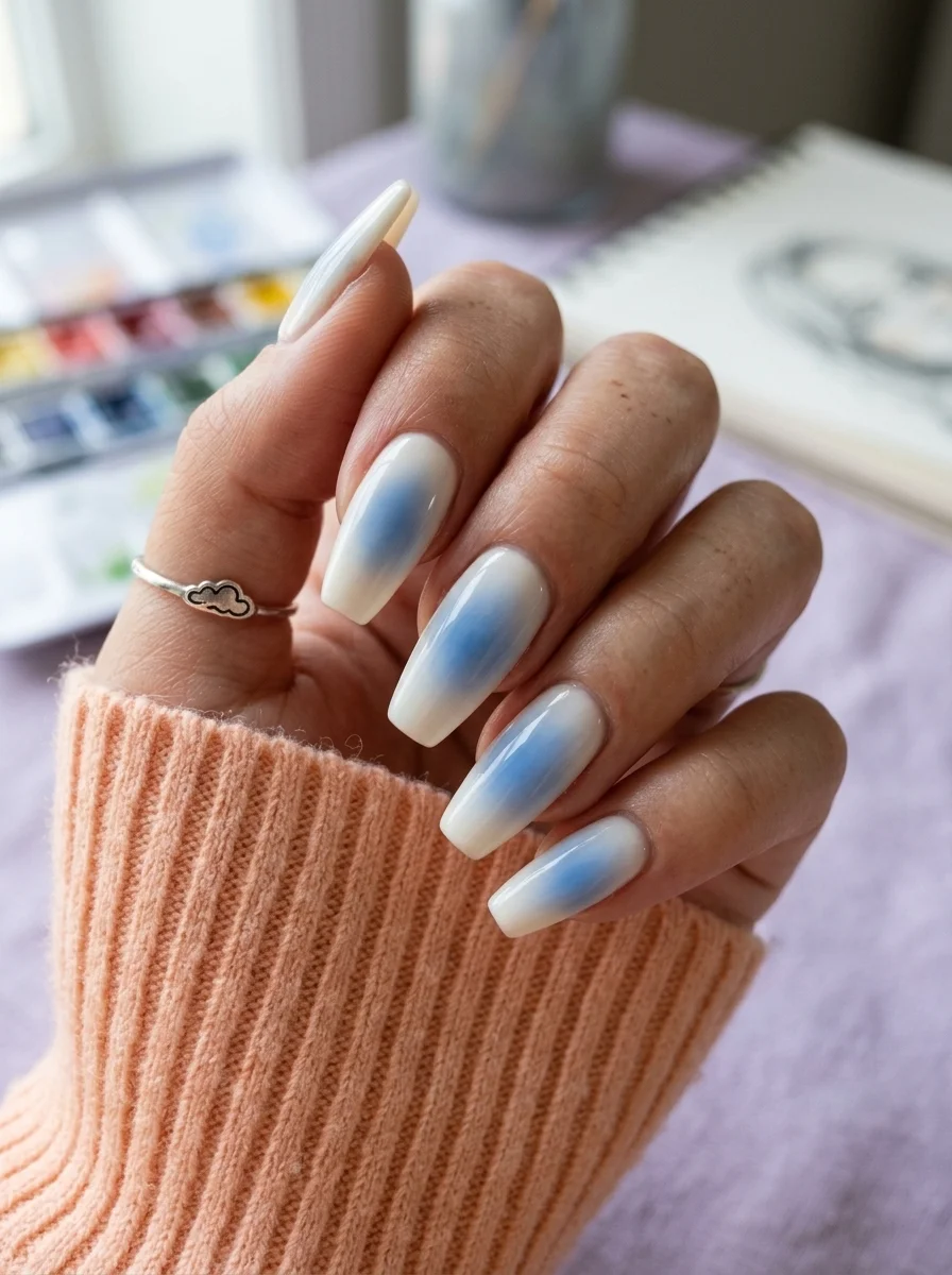
A dreamy, ethereal gradient that feels like looking up at the sky on the first day of school.
Overview:
There is something about a soft blue gradient on a white base that immediately reads as "new beginnings." Maybe it is the sky association, maybe it is the clean palette, but this design captures that specific feeling of fresh notebook pages and sharpened pencils without being literal about it.
The watercolor technique is what makes this version work. A standard sponge ombre would create a more uniform gradient, but the cloud-like diffusion here looks organic and slightly imperfect in the best way. Your eye follows the blue as it blooms outward from the center of each nail, fading into the milky white edges like ink spreading on wet paper.
The long almond shape is doing critical work. Shorter nails would compress the gradient and lose the airy quality that makes the design feel weightless. You need enough surface area for the blue to genuinely fade rather than just ending abruptly. One practical note: milky white bases are less forgiving than opaque ones. Any ridges or unevenness in the nail surface will show through, so a ridge-filling base coat is worth the extra step.
Design Breakdown:
A watercolor gradient that relies on diffusion rather than precision. The "messiness" is the design.
Base Color: Milky, semi-sheer white. Not stark opaque white, something with enough translucency to let the blue breathe.
Nail Shape: Long almond. The tapered tip extends the gradient and keeps the design feeling light.
Design Element: Blue watercolor bloom concentrated at the center of each nail, diffusing outward into the white edges.
Finish: High-gloss top coat to saturate the blue and create that "wet paint" look.
Get The Look at Home:
The watercolor effect depends on working into a wet surface. Have your supplies ready before you start.
- Milky base: Two coats of semi-sheer white. Let dry fully.
- Wet layer: Apply a thin coat of clear top coat. Do not let it dry. This is your working surface.
- Drop the blue: Using a detail brush or dotting tool, place small drops of diluted blue polish onto the wet surface. Two to three drops per nail.
- Let it spread: Tilt your finger slightly and let the blue bloom naturally. Do not touch it. The more you intervene, the muddier it gets.
- Dry completely: Wait at least ten minutes. The watercolor texture needs time to settle before top coating.
- Seal: One thick coat of glossy top coat to lock in the gradient and smooth any texture.
34 Stunning Summer First Date Hairstyles for 2026 💕☀️
2.Warm Caramel Speckle
A cozy, autumnal take on polka dots that feels like your favorite knit sweater.
Overview:
Brown nails have a reputation for looking muddy or flat. The fix is always the same: choose a brown with enough warmth to read as deliberate rather than accidental. This caramel tone has the right amount of orange in its undertone to feel cozy instead of dull. It sits somewhere between a latte and a paper bag, which is exactly where back-to-school season lives.
The white polka dots do something interesting against the warm base. They create a visual texture that reads as "fall pattern" without committing to a specific motif like leaves or plaid. The varying dot sizes are important here. Uniform dots would read as polka dot pattern; mixed sizes read as speckles, which feels more organic and less predictable.
Almond is the right shape for this design. The rounded tip echoes the roundness of the dots and creates a cohesive visual language across the nail. The warm brown also photographs differently depending on lighting. Under warm indoor light, it leans more amber. In daylight, it reads as a true caramel. Neither version looks bad, but it is worth knowing before you commit to a specific shade.
Design Breakdown:
Warm monochrome base with scattered contrast dots. Simple but effective.
Base Color: Warm caramel brown with orange undertones. Think "coffee with a lot of cream" rather than "dark chocolate."
Nail Shape: Medium almond. The curved shape complements the round dot motif.
Design Element: Scattered white polka dots in varying sizes across all nails. Mix small and medium dots for a speckled effect.
Finish: High-gloss top coat to give the brown depth and make the white dots pop.
Get The Look at Home:
The dot sizes matter more than the dot placement. Varying the scale is what separates "speckled" from "polka dot."
- Brown base: Two coats of warm caramel brown. Let dry fully.
- Dot setup: You need at least two dotting tools or toothpicks of different sizes. Dip the larger one in white polish.
- Large dots first: Place three to four larger white dots per nail, spacing them randomly. Press straight down, lift straight up.
- Small dots: Switch to the smaller tool. Fill the gaps between the larger dots with tiny white speckles.
- Check consistency: Look at all nails together. The dot density should feel roughly even without being identical.
- Seal: One coat of top coat applied in a single stroke per nail to avoid dragging the dots.
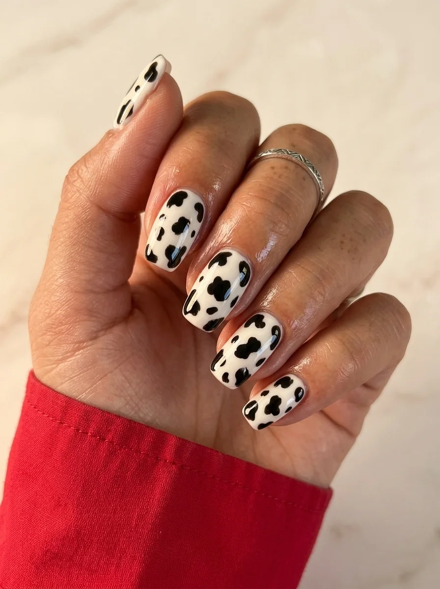
3.Black & White Cow Print
A bold, graphic pattern that makes a statement without trying too hard.
Overview:
Cow print had its viral moment and then most people moved on. But the pattern itself never stopped working. It is one of those designs that reads as intentional without requiring precision, because the irregular shapes are the whole point. Every "mistake" in the spot placement just makes it look more like actual cowhide.
The white base needs to be fully opaque. Any streakiness in the white will show through the negative space between the black spots and make the design look unfinished rather than deliberate. Two thin coats of a self-leveling white formula, fully dried, gives you the cleanest canvas.
What makes this a back-to-school design rather than just a cow print is the context. The black and white palette is neutral enough to go with everything in your closet, and the pattern has enough personality to feel like you put thought into it. It is the kind of manicure that works with a blazer and with a hoodie, which covers most dress codes.
Design Breakdown:
High-contrast graphic pattern. The irregularity of the spots is the design.
Base Color: Bright, fully opaque white. Needs to be streak-free for the spots to read cleanly.
Nail Shape: Medium almond. The rounded shape softens the graphic boldness of the black and white.
Design Element: Irregular black spots painted over the white base. Vary the size and shape of each spot.
Finish: High-gloss top coat to make the contrast look sharp.
Get The Look at Home:
The spots should look random, but "random" still benefits from planning. Map out your placement before painting.
- White base: Two to three thin coats of opaque white. Let each dry fully.
- Spot mapping: Using a large dotting tool or the end of a brush handle, place four to six black spots per nail. Vary the sizes.
- Shape the spots: While the black is still wet, use a toothpick to slightly distort the edges of each spot. Perfect circles read as polka dots; irregular blobs read as cow print.
- Fill gaps: If a nail looks too empty, add a partial spot coming in from the edge. This makes the pattern feel continuous rather than contained.
- Dry check: Black on white smears easily. Wait at least five minutes before top coating.
- Seal: One thick coat of top coat, applied in a single pass to avoid dragging.

34 Stunning Summer Butterfly Nails for Women in 2026 🦋
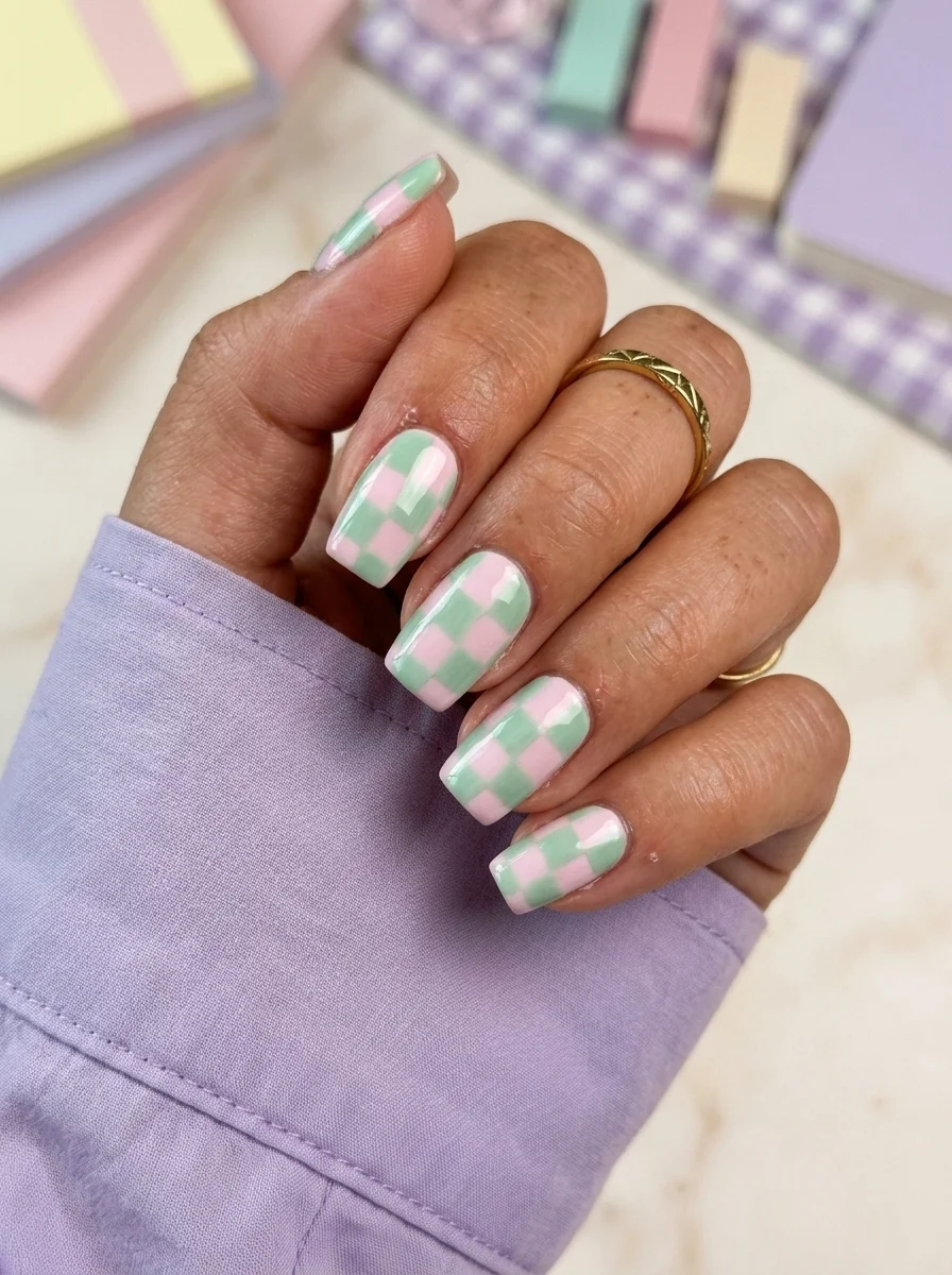
4.Pastel Pink & Mint Checkerboard
A preppy, classroom-ready pattern that feels fresh and polished.
Overview:
Checkerboard patterns on nails live and die on the grid alignment. If the squares are slightly off, the whole design tilts. This version survives the risk because the pastel palette is forgiving. Mint and pink are close enough in value that misalignment reads as "soft" rather than "crooked."
The short squoval shape is the right call. Checkerboard needs a relatively flat surface to keep the grid proportional. Long almond or coffin would force the squares into uncomfortable angles at the tip, and the pattern would lose its clean, graphic quality. Short nails mean fewer squares per nail, which means fewer opportunities for the grid to drift.
This is a design that photographs well in any lighting. The pastels are saturated enough to read clearly on camera but soft enough to avoid looking neon or washed out. For a back-to-school context, it hits the sweet spot between "I care about my appearance" and "I am not trying too hard."
Design Breakdown:
Geometric grid using two pastel tones. Precision matters, but the soft colors are forgiving.
Base Color: Alternating mint green and pastel pink squares in a checkerboard grid.
Nail Shape: Short squoval. The flat surface keeps the grid proportional and clean.
Design Element: Checkerboard pattern across all nails. Each nail carries a section of the grid.
Finish: High-gloss top coat to smooth the grid texture and unify the two colors.
Get The Look at Home:
Striping tape is your best friend here. Freehand checkerboard is possible but requires a very steady hand.
- Pink base: Two coats of pastel pink on all nails. Let dry fully.
- Tape grid: Apply thin striping tape horizontally, then vertically, creating a grid of squares. Press the edges firmly.
- Mint coat: Paint mint green over the entire nail, covering both the tape and the exposed pink squares.
- Peel while wet: Remove the tape immediately before the mint sets. Pull at a low angle to keep the square edges crisp.
- Touch up: If any squares have uneven edges, use a small brush dipped in the appropriate color to clean them up.
- Seal: Two coats of top coat to smooth the ridges left by the tape.
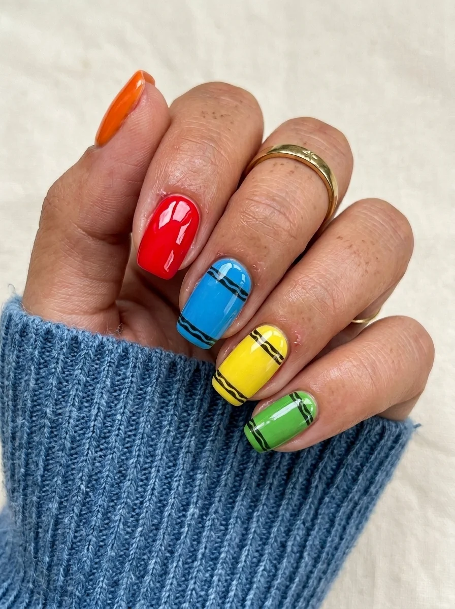
5.Crayon Box Skittle
A playful, colorful set that looks like you raided the crayon box.
Overview:
A different color on every nail is not a new idea. What makes this version work is the black line detail running through each color. Those wavy, imperfect stripes transform the design from "I could not decide on one color" into something that looks deliberately drawn, like crayon strokes on construction paper. The lines give each nail a reason to exist beyond just being a different shade.
The color selection matters. These are not random brights. They are the specific saturated tones you find in a box of crayons: true orange, primary red, cerulean blue, sunshine yellow, grass green. Each color sits at full saturation without leaning pastel or neon. That specificity is what makes the "crayon" reference land.
Short squoval is the ideal shape here. Long nails would make the colors feel costume-like. Short nails keep the playfulness grounded in something wearable. The black lines also need a steady hand, and shorter nails mean shorter lines, which are easier to control. Budget an extra ten minutes for the line work. It is the detail that makes or breaks the design.
Design Breakdown:
Multi-color skittle with illustrative black line detail. The lines unify the separate colors into one design.
Base Color: Five different saturated colors: orange, red, blue, yellow, and green. One color per nail.
Nail Shape: Short squoval. Practical length that keeps the colors from feeling like costume jewelry.
Design Element: Black wavy lines painted over each color, running horizontally or diagonally across the nail.
Finish: High-gloss top coat to saturate the colors and seal the line work.
Get The Look at Home:
Paint all the colors first across all nails, then add the black lines as a second round.
- Color blocking: Paint each nail a different color. Two thin coats per nail. Let dry fully.
- Line prep: Use a thin liner brush and black polish. Practice the wavy line on paper first to get the pressure right.
- Black lines: Paint one to two wavy lines across each nail. Keep the lines imperfect, slightly uneven. Straight lines would kill the crayon effect.
- Line weight: Vary the thickness slightly as you go. Press harder in some spots, lighter in others. This mimics the way a crayon naturally draws.
- Dry time: Black on color smears easily. Wait at least five minutes before top coating.
- Seal: One thick coat of top coat applied in a single stroke per nail.

30+ Chic Pool Party Hairstyles for Summer 2026 🌊👙
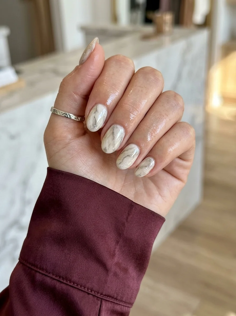
6.White Marble Notebook
A sophisticated, minimalist design that pairs with everything in your wardrobe.
Overview:
Marble nails are one of those designs that sounds harder than it actually is. The technique is simple: wet-on-wet, drag, done. But the result looks like you spent an hour at a salon. That ratio of effort to impact is what keeps marble in rotation year after year.
The white and grey palette is doing something specific here. It reads as "marble notebook cover" or "polished stone," both of which tie directly into a back-to-school context without being on-the-nose about it. You do not need apple decals or pencil art when the texture itself evokes the feeling of new stationery and clean surfaces.
The veining pattern matters more than the colors. Thin, wispy grey lines that branch and fork look like real marble. Thick, deliberate strokes look like someone drew on your nails with a grey marker. The key is restraint: three to four drags per nail, then stop. Overworking the swirls turns the design muddy.
Design Breakdown:
Wet-on-wet technique that creates organic veining. Imperfection is the point.
Base Color: Bright, opaque white. The grey veining sits on top, so the base needs to be clean and streak-free.
Nail Shape: Medium almond. The tapered shape gives the marble room to breathe without looking cramped.
Design Element: Thin grey and silver veins dragged through wet white polish. Each nail looks slightly different.
Finish: Ultra-glossy top coat to create the "polished stone" illusion.
Get The Look at Home:
Work into wet polish. If the base dries before you drag the veins, the colors will not blend.
- White base: One coat of opaque white. Let it dry.
- Wet layer: Apply a second coat of white. Do NOT let it dry.
- Drop grey: Place tiny dots or thin lines of grey polish onto the wet white. Two to three per nail.
- Drag: Use a toothpick or fine brush to pull through the grey dots in one direction. Three to four drags, then stop.
- Clean skin: Use a flat brush dipped in acetone to wipe any polish off your cuticles before it sets.
- Dry and seal: Wait ten minutes for the marble to settle. Apply two coats of glossy top coat to smooth the surface.
7.Multicolor Skittle with Gold Accent
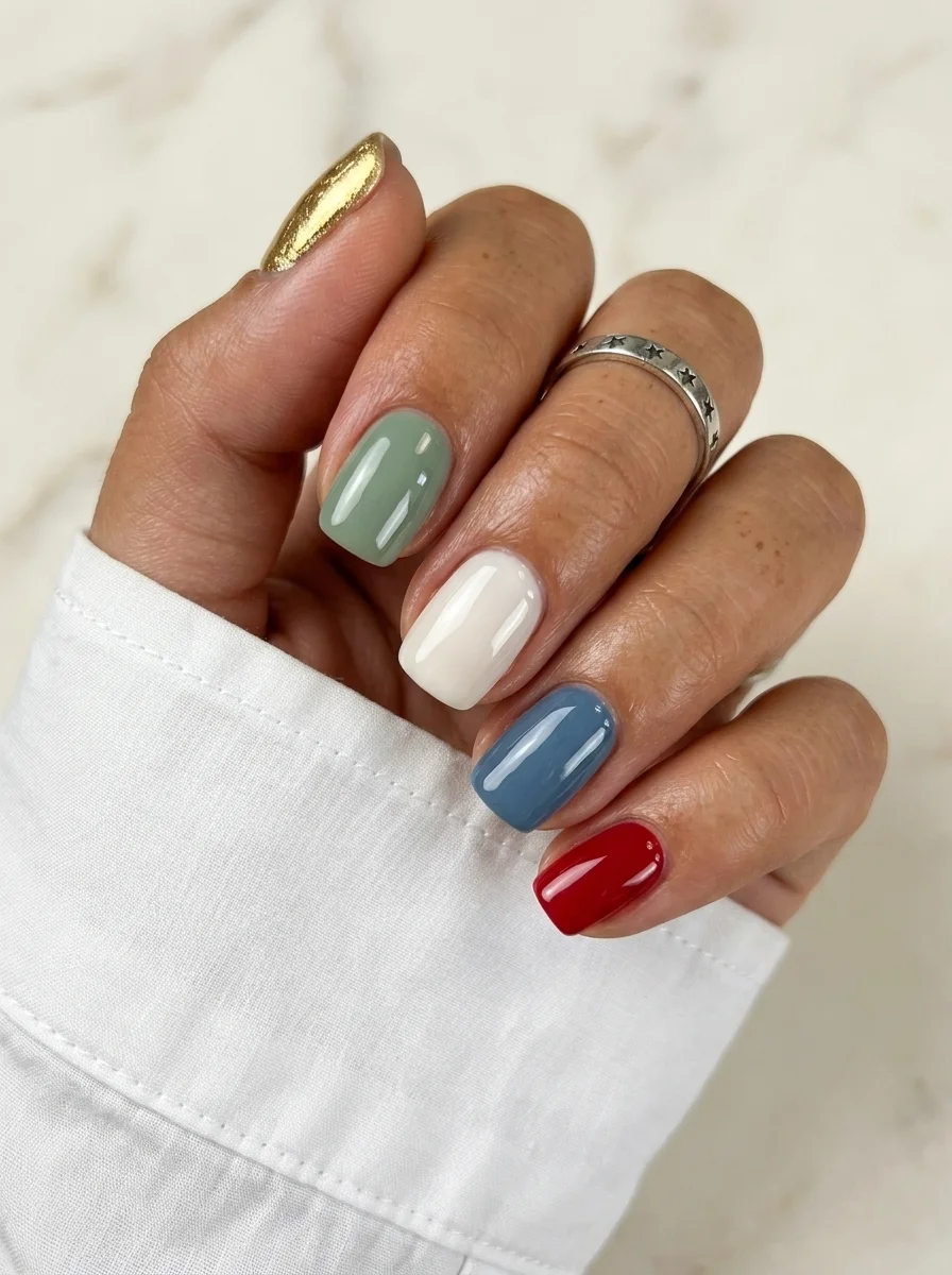
A curated palette of fall-inspired tones tied together with a gold glitter accent.
Overview:
The skittle manicure (a different color on each nail) can look chaotic if the colors are not carefully chosen. This set works because every shade shares the same muted, earthy quality. None of them are neon. None of them are pastel. They all sit in that sophisticated, slightly dusty middle ground that reads as "curated" rather than "random."
The gold glitter thumb is the anchor. Without it, you have five separate solid colors that might or might not belong together. With it, the gold acts as a unifying metallic that ties the sage, cream, blue, and red into a cohesive palette. It is the same principle behind why jewelry works with any outfit: one metallic element makes everything else look intentional.
Short squoval keeps the colors grounded. Long nails with five different colors would feel like too much visual information. Short nails keep each color as a small, contained pop. This is one of those designs that looks better in person than in photos, because the interplay between the matte cream finishes and the glitter texture is something you notice when your hand moves.
Design Breakdown:
Five muted tones unified by a shared earthy quality and one gold metallic accent.
Base Color: Five different shades: gold glitter on thumb, sage green, cream, dusty blue, and deep red. One per nail.
Nail Shape: Short squoval. Clean, practical, and modern.
Design Element: Solid color on each nail. The variation IS the design.
Finish: High-gloss on the solid colors; glitter finish on the gold thumb.
Get The Look at Home:
The hardest part is choosing colors that feel related. Lay them out on a surface before painting.
- Color selection: Choose five shades that share a similar saturation level. All should be slightly muted or earthy.
- Map the order: Decide which color goes on which finger before you start. Place the gold on the thumb and the boldest color (red) on the pinky for balance.
- Paint each nail: Two coats per color. Let each dry fully before moving to the next.
- Gold glitter: The thumb gets two to three coats of gold glitter polish for full coverage.
- Compare both hands: If you are doing both hands, match the color order so they mirror each other.
- Seal: One coat of top coat over everything. The glitter nail may need a second coat to smooth the texture.
29 Bright Lemon Nail Art Designs for Summer & Spring (2026)
8.Pink Plaid Prep
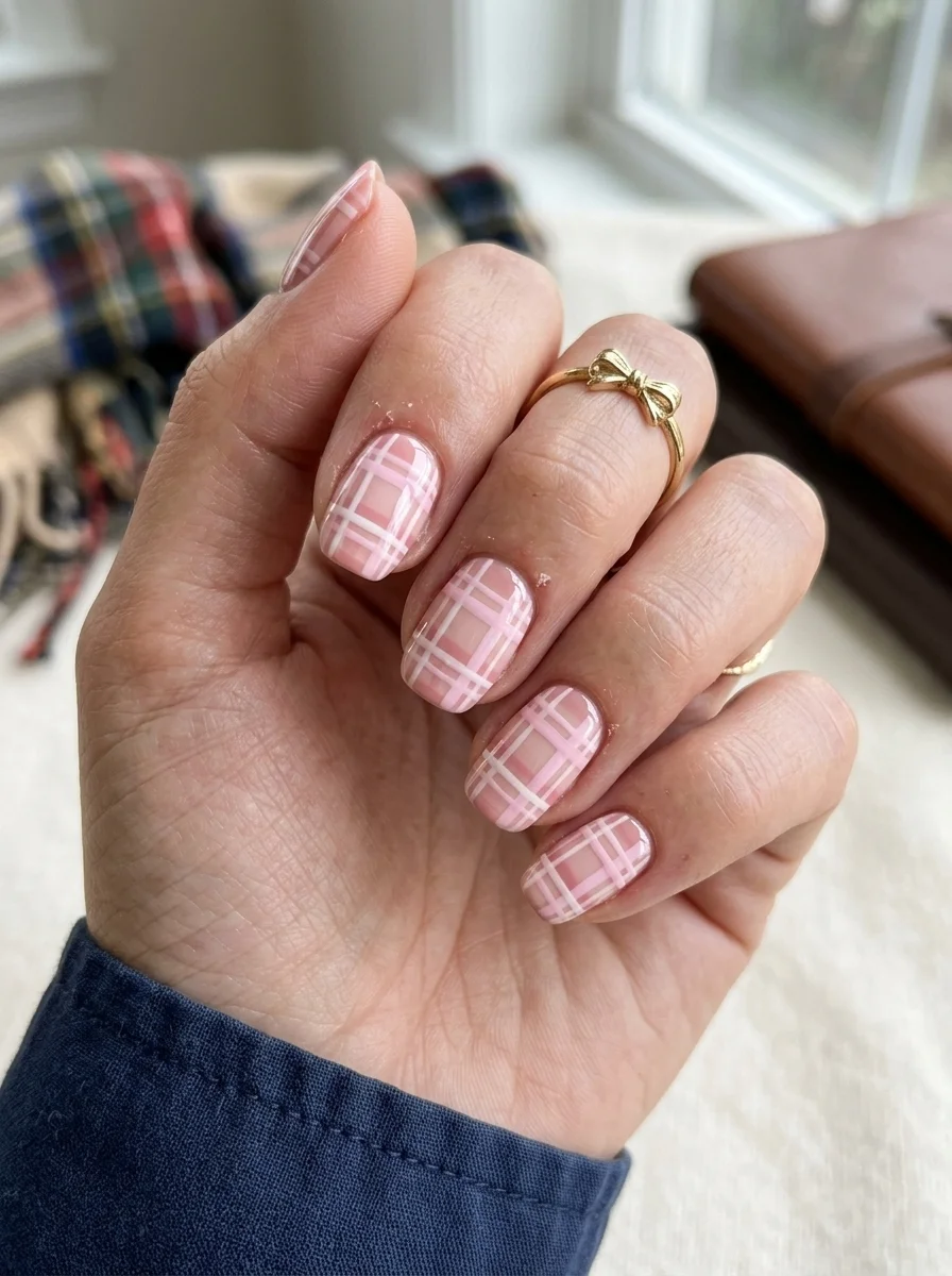
A preppy, polished pattern that channels the best of back-to-school style.
Overview:
Plaid on nails is a direct reference to uniform skirts, flannel shirts, and everything else associated with the start of school. But the pattern works beyond that context because pink and white plaid is genuinely flattering. The soft tones keep the grid from feeling harsh, and the pattern itself has enough visual interest to hold attention without needing accent nails or additional art.
The technique is straightforward but demands patience. You are painting thin lines in one direction, letting them dry, then painting lines in the perpendicular direction. Where the lines overlap, the doubled-up pink creates the darker "intersection" squares that give plaid its characteristic depth. Skipping this step makes the pattern look like a flat grid rather than woven fabric.
Short squoval is the ideal shape for plaid. The flat surface gives the grid room to establish itself, and the short length keeps the pattern from looking busy. On long nails, the grid needs more lines to fill the space, and at that point, you are better off choosing a simpler design.
Design Breakdown:
Precision grid work that mimics woven fabric. The overlapping intersections create depth.
Base Color: Soft, opaque pink. The white lines are painted on top.
Nail Shape: Short squoval. Flat surface, clean edges, minimal lines needed.
Design Element: White grid lines creating a plaid pattern. Where lines cross, the doubled-up color creates darker intersection squares.
Finish: High-gloss top coat to smooth the line ridges and saturate the pink.
Get The Look at Home:
Use a striper brush that holds enough polish to draw a full line without re-dipping. Inconsistent line weight is the most common mistake.
- Pink base: Two coats of soft pink. Let dry fully.
- Horizontal lines: Using a striper brush and white polish, draw thin horizontal lines spaced roughly 3mm apart. Let dry.
- Vertical lines: Draw vertical lines at the same spacing. Where they cross, the doubled-up pink creates the darker plaid intersections.
- Optional depth: Use a slightly darker pink to paint small squares at the intersections. This makes the plaid look more like woven fabric.
- Dry check: The layered lines take longer to set. Wait at least five minutes before top coating.
- Seal: One thick coat of top coat to smooth the grid texture.
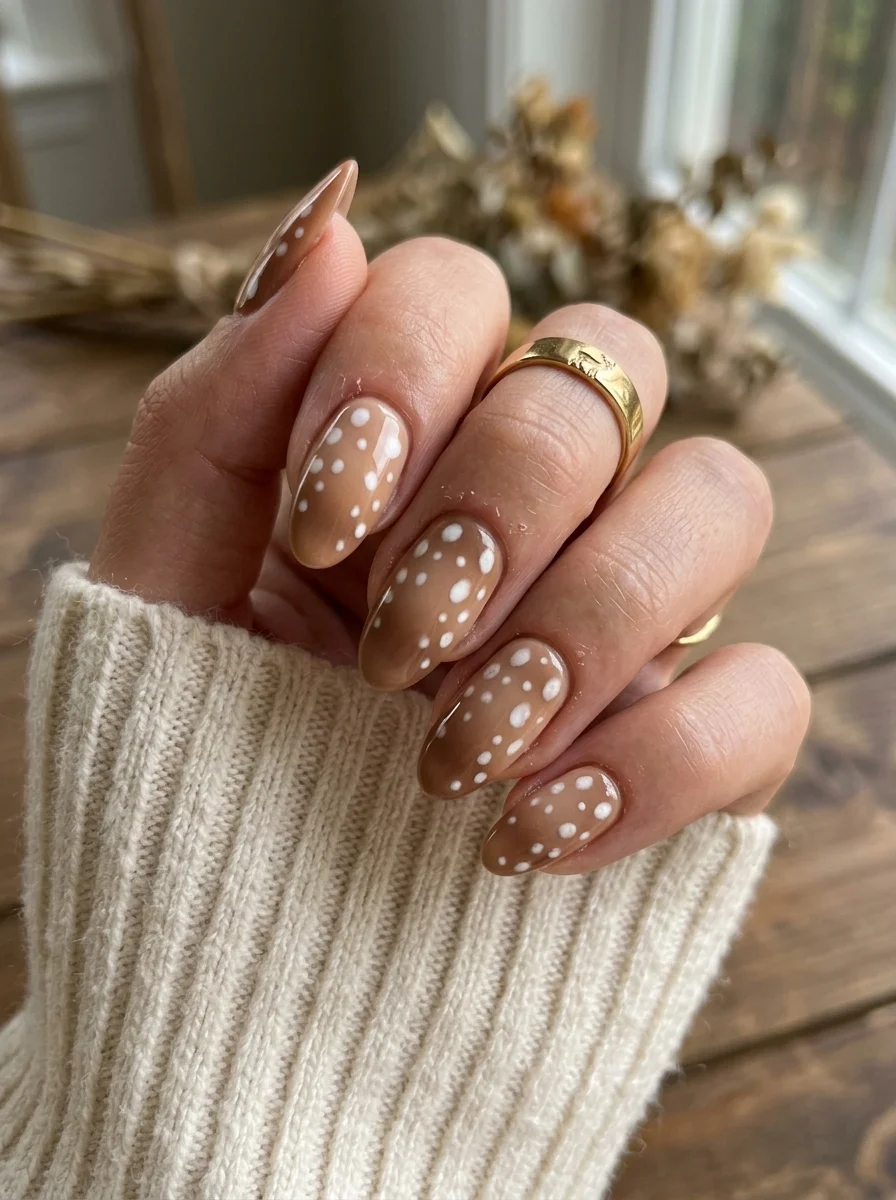
9.Minimalist Speckled Cream
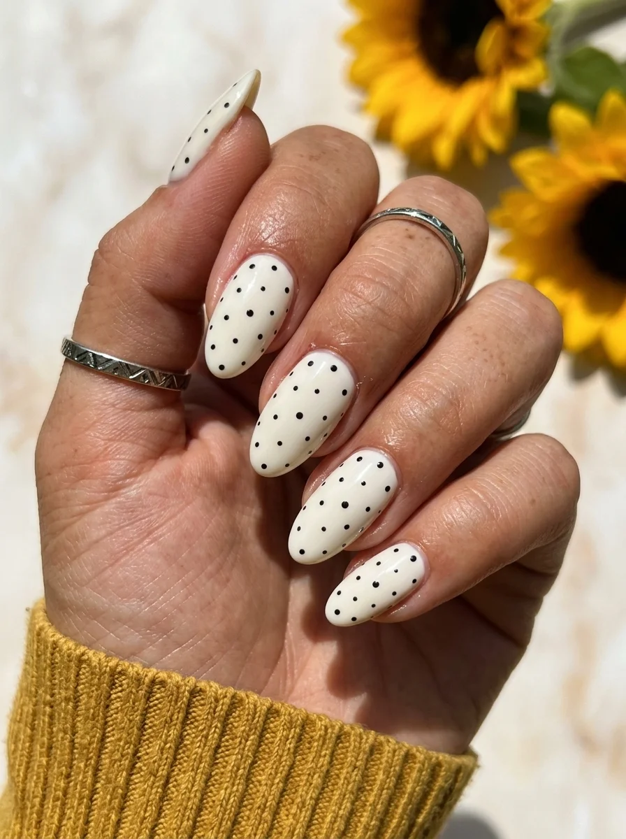
A clean, classic design that pairs with literally everything.
Overview:
Black dots on a white base is one of those combinations that never goes out of style because it never tries to be trendy. The contrast is high, the pattern is simple, and the execution is forgiving. Even slightly irregular dot spacing reads as "hand-done charm" rather than "sloppy technique."
The creamy off-white base is a better choice than stark white here. Stark white with black dots reads as Dalmatian print, which is a specific reference. Creamy white reads as "speckled," which is more versatile and less likely to be mistaken for a costume. The warm undertone in the cream also makes the design feel softer against most skin tones.
The small dot size is important. Large black dots on white would dominate the nail and make the design feel heavy. Small dots create texture that your eye registers as a pattern from a distance but as individual speckles up close. That dual reading is what gives the design its lasting appeal.
Design Breakdown:
Minimal contrast pattern. The simplicity is the strength.
Base Color: Creamy off-white with warm undertones. Not stark white.
Nail Shape: Medium almond. The tapered tip adds elegance to the simple pattern.
Design Element: Small black polka dots scattered across all nails. Keep the dots uniformly small.
Finish: High-gloss top coat for a polished, finished look.
Get The Look at Home:
This is one of the simplest designs on this list. The key is dot consistency.
- Cream base: Two coats of creamy off-white. Let dry fully.
- Dot tool: Use a small dotting tool or the tip of a toothpick. Dip it in black polish.
- Dot placement: Press straight down, lift straight up. Do not twist. Space the dots roughly 3mm apart in a staggered pattern.
- Dot density: Five to eight dots per nail, depending on nail size. Not every nail needs the same number.
- Dry check: Black on white smears instantly if the surface is tacky. Wait at least five minutes.
- Seal: One coat of top coat, applied in a single stroke per nail to avoid dragging.
24 Stunning Festival Hairstyle Ideas for Music Concert Nights 2026 🎶✨
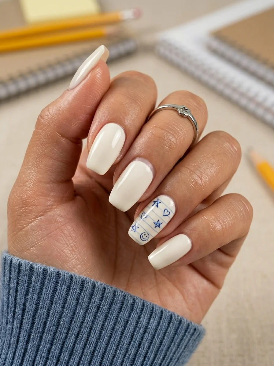
10.Notebook Paper Doodle Accent
A literal back-to-school reference that stays chic through smart restraint.
Overview:
Most themed nail art fails because it tries too hard. Every nail gets a different school-related illustration, and by the time you reach the pinky, it looks like a sticker book exploded. This design avoids that trap by limiting the theme to a single accent nail. Four nails stay clean and cream-colored. One nail tells the story.
The ring finger accent is where the design lives. The notebook paper lines in blue, topped with hand-drawn hearts, stars, and a smiley face, look like someone doodled on your nail during a boring lecture. That casual, illustrated quality is what makes it work. If the lines were perfectly straight and the hearts were symmetrical, it would feel too polished for the "doodle" reference.
The cream base is doing important work. A stark white would make the blue lines look like a printed pattern. Cream gives the design warmth and makes the blue doodles feel hand-drawn on aged paper rather than stamped onto a factory surface. Long coffin gives the accent nail enough room for the full notebook paper illusion to work.
Design Breakdown:
Clean solid base with one themed accent nail. The restraint is the design.
Base Color: Creamy off-white on all nails.
Nail Shape: Long coffin. The flat surface gives the accent nail enough room for the doodle art.
Design Element: Ring finger accent with blue notebook paper lines, hearts, stars, and a smiley face. All other nails are solid cream.
Finish: High-gloss top coat to smooth the raised art and unify the finish.
Get The Look at Home:
The accent nail is the only challenging part. The cream nails are straightforward.
- Cream base: Two coats on all nails. Let dry fully.
- Notebook lines: On the ring finger, use a thin liner brush and light blue polish to draw horizontal lines across the nail. Space them about 2mm apart.
- Doodles: Using the same blue, draw small hearts, stars, and a smiley face between the lines. Keep them imperfect and casual.
- Line weight: The notebook lines should be thinner than the doodle elements. This creates visual hierarchy.
- Dry time: The detailed art needs at least five minutes to set before top coating.
- Seal: Two coats of top coat to smooth the raised texture of the painted art.
11.Baby Blue Micro French
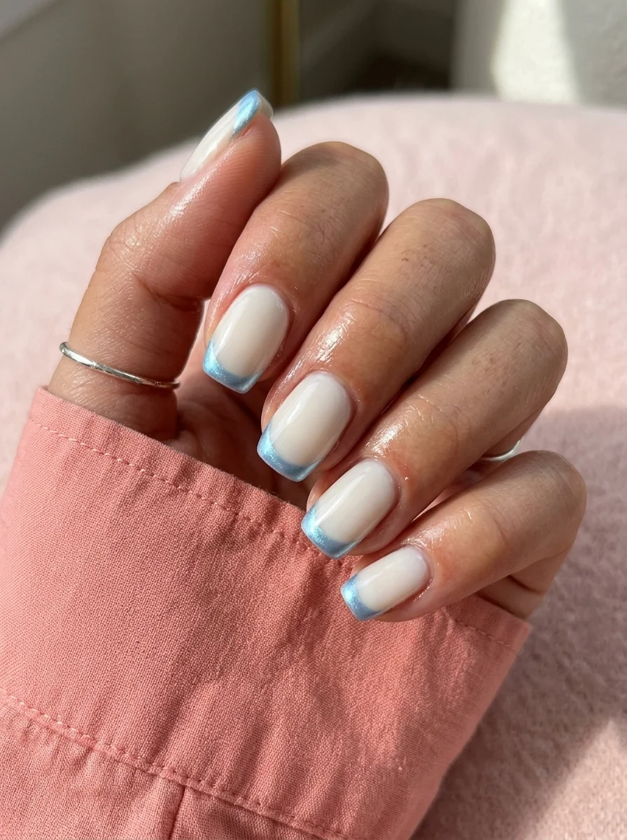
A clean, modern twist on the classic French that feels fresh without being loud.
Overview:
Colored French tips are having their moment, and light blue might be the most wearable entry point. It is less predictable than pink, less aggressive than red, and pairs naturally with a milky white base in a way that feels effortless rather than designed.
The thinness of the tip is what separates this from a standard colored French. These are micro-tips, barely 1-2mm of blue at the very edge. From a distance, the nails read as "clean and white." Up close, the blue reveals itself. That dual reading makes the design interesting at multiple distances and keeps it from feeling like it is trying too hard.
Short squoval is the right shape. The flat tip gives the French line a clean, geometric edge that a rounded shape would soften. The short length also means the blue tips take up a smaller proportion of the nail, which keeps the design subtle. If you are someone who finds classic white French tips too safe, this is the direct upgrade.
Design Breakdown:
Classic French structure with a minimal color swap. Less is more.
Base Color: Milky, semi-sheer white. The natural nail should show through slightly.
Nail Shape: Short squoval. Clean edges, modern proportions.
Design Element: Thin light blue French tips, barely 1-2mm wide, on all nails.
Finish: High-gloss top coat for a glassy, polished look.
Get The Look at Home:
The thinness of the tip means you need a steady hand. Practice the curve on paper first.
- Milky base: Two coats on all nails. Let dry fully.
- Blue tips: Using a French liner brush and light blue polish, paint the smile line from sidewall to center. The two-stroke method is more forgiving than one continuous pass.
- Keep it thin: The tip should be barely visible. If you can see the blue from across the room, it is too thick.
- Cleanup: An angled brush dipped in acetone sharpens the smile line. This step is non-negotiable on a sheer base.
- Compare all nails: Hold your hand up and check that the tip thickness is consistent across all fingers.
- Seal: One coat of top coat. Cap the free edge on every nail.

27 Coral Nail Art Designs for a Warm, Tropical Manicure (2026)
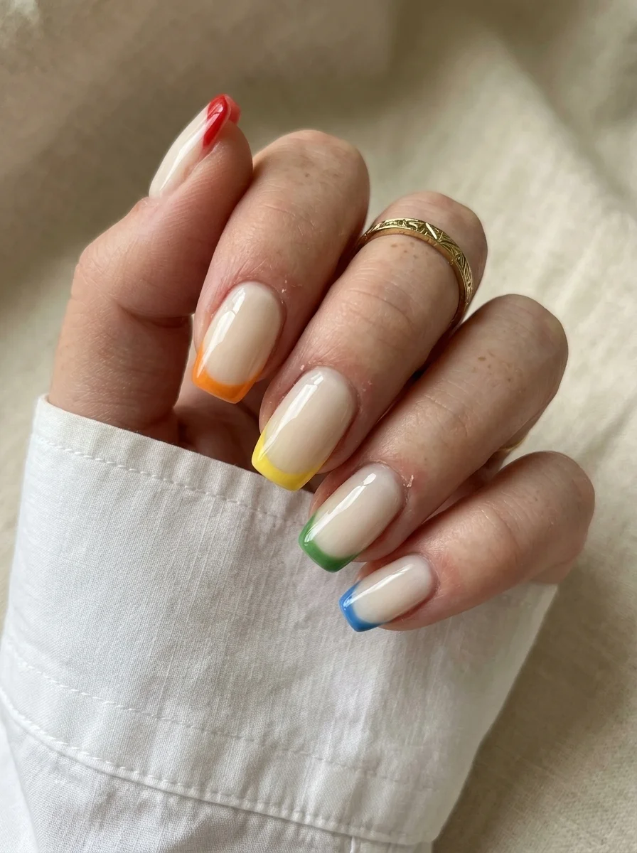
12.Nude Rainbow French Tips
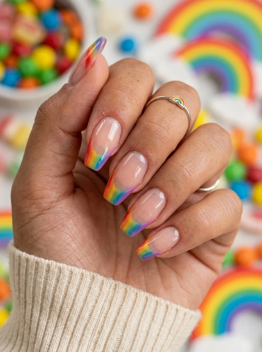
A playful, colorful French that brings a different hue to every finger.
Overview:
A different color on every tip sounds chaotic, but the sheer nude base keeps everything grounded. The base acts as a neutral canvas that lets each color exist independently without competing. Red on one nail, orange on the next, yellow, green, blue: the progression reads as a deliberate gradient rather than a random assortment.
The French tip technique is the same as a classic white French. The only difference is the color palette. That means if you can paint a standard French, you can paint this. The challenge is consistency: each tip needs to be the same thickness and curve across all five fingers. Uneven tips would break the rainbow illusion.
Almond nails work best here because the curved tip creates a more natural smile line for the French. The tapered shape also gives each color enough room to register as a distinct hue. On very short nails, the tips become too small to read as separate colors, and the rainbow effect collapses.
Design Breakdown:
Classic French structure with a multi-color palette. The nude base unifies everything.
Base Color: Sheer, warm-toned nude. The natural nail should be visible.
Nail Shape: Medium almond. The curved tip complements the French smile line.
Design Element: Five different colored French tips, one per nail, arranged in rainbow order: red, orange, yellow, green, blue.
Finish: High-gloss top coat to saturate the colors and unify the design.
Get The Look at Home:
Paint all the tips in order across the hand. Starting with red on the thumb and ending with blue on the pinky creates a natural rainbow flow.
- Nude base: Two coats on all nails. Let dry fully.
- Map the colors: Decide which color goes on which finger before you start. Rainbow order (thumb to pinky) is the standard.
- Paint the tips: Using a French liner brush, paint each tip in its designated color. Two thin coats per tip for full opacity.
- Consistency check: All tips should be the same thickness. Hold your hand up and compare.
- Cleanup: An angled brush dipped in acetone sharpens every smile line.
- Seal: One coat of top coat across all nails. Cap the free edge.
13.Sage Green Cat Eye
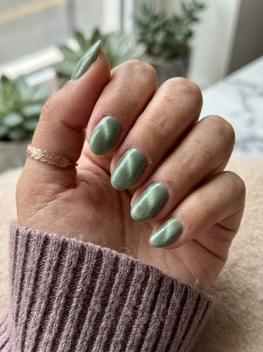
A sophisticated magnetic finish that catches light from every angle.
Overview:
Cat-eye polish is one of those products that looks like it requires professional skill but actually just requires a magnet. The magnetic particles in the polish shift when you hold a magnet near the wet surface, creating that signature velvet-like streak of light. The effect is dramatic enough to look expensive but subtle enough to wear every day.
Sage green is the right color for this technique. Cat-eye works best with mid-tone colors that have enough depth for the magnetic shimmer to show but enough lightness for the base color to remain visible. A dark green would swallow the shimmer. A pastel green would not have enough depth. Sage sits in the sweet spot.
The practical note here is magnet placement. The magnet needs to be held close to the wet polish for fifteen to thirty seconds per nail. If you pull it away too quickly, the particles settle back and the effect disappears. If you hold it too close, the magnet touches the surface and ruins the finish. Finding the right distance (usually about 5mm) takes practice.
Design Breakdown:
Magnetic polish creates a dynamic finish that changes with the light. The technique is simpler than it looks.
Base Color: Sage or olive green with magnetic cat-eye particles.
Nail Shape: Medium almond. The curved surface catches the magnetic shimmer from multiple angles.
Design Element: The cat-eye effect itself. No additional art needed.
Finish: High-gloss top coat to intensify the magnetic shimmer.
Get The Look at Home:
You need a cat-eye magnet. Regular magnets do not work because the particles are specifically formulated for nail polish magnets.
- Base coat: Apply a standard base coat and let it dry.
- First coat: Apply one thin coat of cat-eye polish. Let it dry. The effect will not show yet.
- Second coat: Apply the second coat. Do NOT let it dry.
- Magnet time: Hold the cat-eye magnet about 5mm above the wet polish. Keep it steady for fifteen to thirty seconds. You will see the shimmer line form.
- Repeat per nail: Each nail needs its own magnet session. Work one at a time.
- Seal: One coat of top coat after the polish is fully dry. The top coat intensifies the magnetic effect.
20 Stunning Mother of the Bride Hairstyle Ideas for 2026 💍
14.Chocolate Brown with Tortoiseshell Accent
A rich, autumnal pairing that channels vintage eyewear and leather-bound books.
Overview:
Brown nails in fall are as predictable as pumpkin spice lattes. What separates this version from the standard solid brown is the tortoiseshell accent. The amber, honey, and black swirls on the accent nails add visual complexity that transforms the set from "plain brown" into something with actual design intent.
Tortoiseshell is one of those patterns that looks intimidating but relies on a simple technique: drop colors into wet polish and let them blend. The organic, unpredictable nature of the pattern is the point. Every tortoiseshell nail looks slightly different, which makes the accent nails feel hand-crafted rather than stamped.
The chocolate brown base is warm enough to avoid looking flat. Cool-toned browns can read as muddy or dull. This shade has enough red in its undertone to feel rich and alive, which pairs beautifully with the warm amber tones in the tortoiseshell. Medium almond gives both the solid brown and the patterned accent enough room to breathe.
Design Breakdown:
Solid warm brown with organic patterned accents. The contrast between solid and pattern is the design.
Base Color: Rich chocolate brown with warm undertones on most nails. Tortoiseshell pattern (amber, honey, black) on accent nails.
Nail Shape: Medium almond. The tapered shape complements both the solid color and the organic pattern.
Design Element: Solid brown on thumb, index, and pinky. Tortoiseshell swirl pattern on middle and ring fingers.
Finish: High-gloss top coat to intensify the brown depth and smooth the tortoiseshell texture.
Get The Look at Home:
The tortoiseshell accent uses a wet-on-wet technique. Work quickly before the polish sets.
- Brown base: Two coats on the solid nails. Let dry fully.
- Tortoiseshell base: On the accent nails, apply one coat of amber or honey-colored polish. Let it dry.
- Wet layer: Apply a second coat of amber. Do NOT let it dry.
- Drop colors: Place small dots of dark brown and black onto the wet amber. Two to three dots per nail.
- Swirl: Use a toothpick to gently drag through the dots. Two to three drags maximum. Over-blending creates mud.
- Seal: Wait five minutes for the tortoiseshell to set. Apply two coats of glossy top coat.
15.Dusty Periwinkle Solid
A muted blue that works as a neutral without being boring.
Overview:
Sometimes the best nail design is no design at all. A solid dusty blue hits a specific intersection of "I put thought into this" and "I did not try too hard" that more complicated designs cannot replicate. The muted tone is what makes it work. Bright blue reads as a statement. Dusty blue reads as a color choice.
This particular shade sits somewhere between periwinkle and steel blue. It has enough grey in it to avoid looking childish, and enough purple in its undertone to avoid looking cold. That balance makes it one of the more versatile blues you can wear on your nails. It goes with denim, with black, with white, and with most fall and winter palettes.
The formula matters more with solid colors than with patterned designs. Streaks, brush marks, and uneven thickness that art work hides are fully visible on a solid nail. Three thin coats rather than two normal ones prevents the patchiness that plagues blue polishes. A self-leveling formula like Essie "Saltwater Joy" or OPI "I Saw U Saw We Saw Warsaw" saves you from having to work for smooth coverage.
Design Breakdown:
Single-color coverage. The shade IS the design.
Base Color: Dusty, muted blue with grey undertones. Not bright, not pastel.
Nail Shape: Short squoval. Clean, practical, and modern.
Design Element: None. Solid coverage on all nails.
Finish: High-gloss top coat for a smooth, reflective surface.
Get The Look at Home:
Solid colors are the most unforgiving. Surface prep matters more here than with any patterned design.
- Buff and base: Lightly buff any ridges. Apply a ridge-filling base coat and let it dry completely.
- Three thin coats: Apply the blue in three thin coats rather than two normal ones. Each coat should look slightly translucent on its own.
- Dry time: Wait at least three minutes between coats. Rushing causes bubbling.
- Brush technique: Wipe the brush on the bottle neck before each stroke. This removes excess polish and prevents thick, uneven application.
- Cuticle cleanup: Clean the edges with a small angled brush and acetone. Solid color against skin is more visible than patterned designs.
- Seal: One coat of glossy top coat to smooth the surface and add depth.

31 Stunning Prom Nails for Women in 2026 💃
16.Burgundy Wine Ombre
A rich, moody gradient that transitions from deep wine to bare nail.
Overview:
Burgundy ombre is a different animal from standard burgundy nails. The gradient creates a sense of depth that solid color cannot achieve. The darkest point sits at the tip, which means the color deepens as your nails grow out, making the design look better on day ten than it did on day one. That kind of built-in longevity is rare in nail art.
The fade from burgundy to nude is flattering on most skin tones because the nude base matches your natural nail bed. The transition zone is where the design lives or dies. A smooth, seamless blend reads as sophisticated. A visible line where the two colors meet reads as unfinished. The sponge technique creates the blend, but each layer needs to dry before the next one goes on, or the colors mix into a muddy brown instead of a clean gradient.
Long coffin is the right shape for this design. The flat tip provides the maximum surface area for the darkest burgundy, and the long sides give the gradient room to fade gradually. On short nails, the transition from dark to light happens too quickly, and the ombre effect collapses into a two-tone block.
Design Breakdown:
A gradient that uses your natural nail as part of the design. The nude base does double duty.
Base Color: Sheer nude or bare nail at the cuticle, transitioning to deep burgundy at the tip.
Nail Shape: Long coffin. The flat tip and long sides provide the canvas for a gradual fade.
Design Element: Sponge-applied ombre using burgundy concentrated at the tips and fading toward the cuticle.
Finish: High-gloss top coat to saturate the burgundy and blend the gradient.
Get The Look at Home:
The gradient needs to be built in layers. One heavy pass will not create a smooth blend.
- Base prep: File into a long coffin shape. Apply a clear base coat.
- Nude foundation: Apply one coat of sheer nude on the lower half of the nail. Let it dry.
- Sponge setup: Paint a stripe of burgundy and a stripe of nude side by side on a makeup sponge. Dab on paper first.
- Build the fade: Press the sponge onto the nail with the burgundy at the tip and nude toward the cuticle. Three to four passes builds better opacity than one heavy press.
- Dry completely: Wait at least ten minutes. The sponge leaves a textured surface that needs time to level.
- Seal: Two coats of top coat to smooth the sponge texture and intensify the gradient.
17.Cream & Gold Glitter Accent
A clean, elegant base elevated by a single metallic statement nail.
Overview:
Cream nails with a glitter accent is one of those designs that looks like it took zero effort but actually shows good taste. The cream base is quiet, polished, and goes with everything. The gold glitter ring finger is the one moment of sparkle that elevates the entire set from "plain" to "designed."
The gold works here because it is the only metallic on the hand. If every nail had glitter, the effect would be overwhelming. If no nails had glitter, the set would be forgettable. One accent nail creates a focal point that draws the eye without demanding attention. It is the nail equivalent of wearing a simple outfit with one statement piece of jewelry.
The cream base needs to be opaque in two coats. Sheer or streaky cream looks unfinished, especially next to the precise sparkle of the glitter. A self-leveling formula is worth the investment. The glitter accent also needs full coverage, which means two to three coats of glitter polish rather than one. Dense glitter formulas like OPI "I Cannoli Wear OPI" or Essie "A Cut Above" give the best coverage.
Design Breakdown:
Neutral base with one metallic accent. The contrast between matte cream and glitter texture is the design.
Base Color: Creamy off-white on four nails. Dense gold glitter on the ring finger.
Nail Shape: Short squoval. Clean and practical.
Design Element: Solid cream on thumb, index, middle, and pinky. Full-coverage gold glitter on ring finger.
Finish: High-gloss top coat on the cream nails. Glitter finish on the accent nail.
Get The Look at Home:
The cream nails are the easy part. The glitter accent needs multiple coats for full coverage.
- Cream base: Two coats on four nails. Let dry fully.
- Glitter accent: On the ring finger, apply two to three coats of gold glitter polish. Let each coat dry before the next.
- Coverage check: Hold the glitter nail under light. If you can see bare nail between the glitter particles, add another coat.
- Cream consistency: Compare the cream nails. If any look thinner than the others, add a third coat for even coverage.
- Seal: One coat of top coat on the cream nails. The glitter nail may need a thicker coat to smooth the textured surface.
21 Hot Summer Buns Hairstyle Ideas for 2026 ☀️🔥
18.French Tips with Black Bows
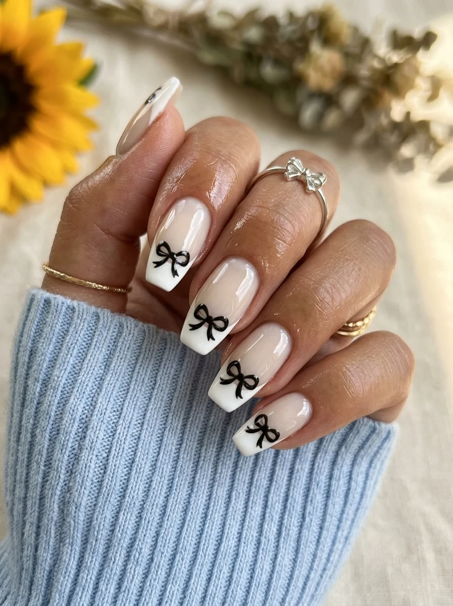
A feminine, structured French with a delicate bow detail at the smile line.
Overview:
White French tips are the most universally recognized nail design in the world. Adding a black bow at the smile line does not change that foundation. It just adds a single detail that transforms the set from "default manicure" to "designed set." The restraint is the point.
The bow sits exactly at the junction between the white tip and the nude base, which means it occupies the most visually active part of the nail. Your eye naturally goes to the smile line, and the bow gives it something to land on. Without the bow, the smile line is just a line. With it, the line becomes a decorative element.
The black against white is a high-contrast choice that keeps the bows visible from a distance. Grey or navy would work, but black creates the sharpest graphic impact. The bows themselves are small enough to read as "detail" rather than "illustration," which is important for maintaining the design's elegance. Long coffin provides the flat surface that makes both the French line and the bow art look clean.
Design Breakdown:
Classic French with one decorative element at the smile line. The bow is the focal point.
Base Color: Sheer nude or milky pink for the base. Opaque white for the French tips.
Nail Shape: Long coffin. The flat tip gives the French line and bow art a clean, modern edge.
Design Element: White French tips on all nails. Small hand-painted black bows at the smile line.
Finish: High-gloss top coat to protect the bow art and unify the design.
Get The Look at Home:
The French tips are the foundation. Get them clean before adding the bow detail.
- Nude base: Two coats on all nails. Let dry fully.
- White tips: Using a French liner brush, paint the smile line from sidewall to center. Two-stroke method is more forgiving.
- Bow outline: Using a thin liner brush and black polish, draw two small triangles meeting at a point at the center of the smile line. Add a small circle at the center for the knot.
- Bow tails: From the center knot, draw two short, slightly curved lines downward. These are the ribbon tails.
- Cleanup: An angled brush dipped in acetone sharpens the French smile line and any bow edges.
- Seal: Two coats of top coat. The first locks the bow art; the second smooths the surface.
19.Red Micro French Tips
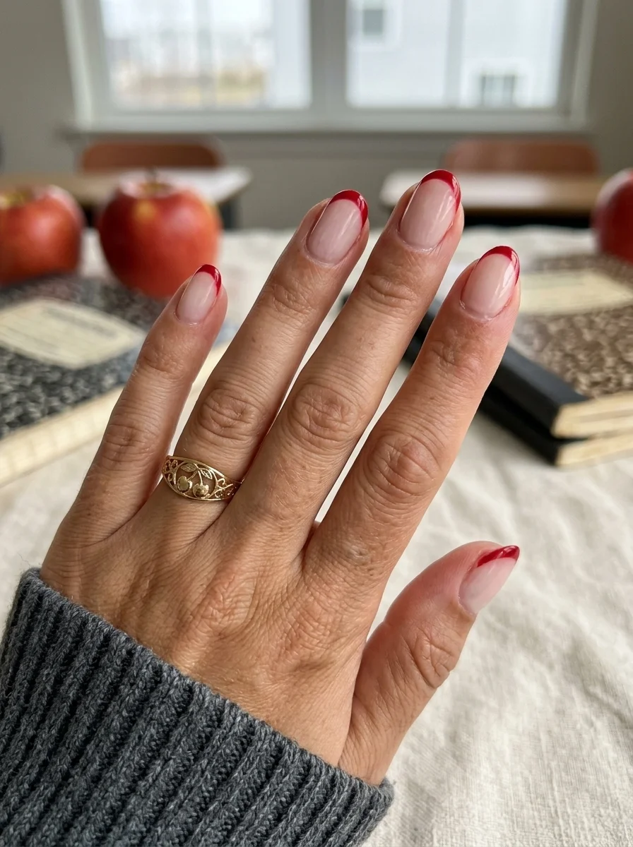
A classic French with a bold color swap that reads as confident without being loud.
Overview:
Red French tips are a step beyond the classic white, and that extra step is worth taking. The deep red here sits somewhere between burgundy and cherry, which gives it enough sophistication to work in a classroom without reading as "trying to get noticed." It is the kind of color choice that people register as "nice nails" from a distance and "great color" up close.
The sheer pink base is doing critical work. It keeps the overall look from feeling heavy and lets the red tips dominate visually. On a colored or opaque base, the French line would lose its crispness and the red would compete with the background for attention. The natural nail showing through the sheer base also means growth-out is less visible, which extends the life of the manicure.
Short squoval is the right shape. The flat tip gives the red French line a clean, geometric edge. The short length keeps the design grounded in something wearable rather than dramatic. Red polish formulas vary in opacity, so choose one that covers in a single coat for the tips. Going back for a second pass on a French tip is where wobbly lines happen.
Design Breakdown:
Classic French structure with a color swap. The red is the statement.
Base Color: Sheer milky pink. The natural nail should be visible.
Nail Shape: Short squoval. Clean edges, modern proportions.
Design Element: Deep red or burgundy French tips on all nails.
Finish: High-gloss top coat for a glassy, polished look.
Get The Look at Home:
Red tips on a sheer base are unforgiving. Clean application matters more than speed.
- Sheer base: Two coats on all nails. Let dry fully.
- Red tips: Using a French liner brush and deep red polish, paint the smile line from sidewall to center. Two-stroke method.
- Tip thickness: Keep the tips about 2mm thick. Consistent across all nails.
- Cleanup: An angled brush dipped in acetone is non-negotiable. Run it along every smile line to sharpen the curve.
- Compare: Hold your hand up and check that the tip thickness is consistent.
- Seal: One coat of top coat. Cap the free edge on every nail.
30 Trendy Summer French Tip Nail Designs for 2026 💅
20.Deep Olive Cat Eye
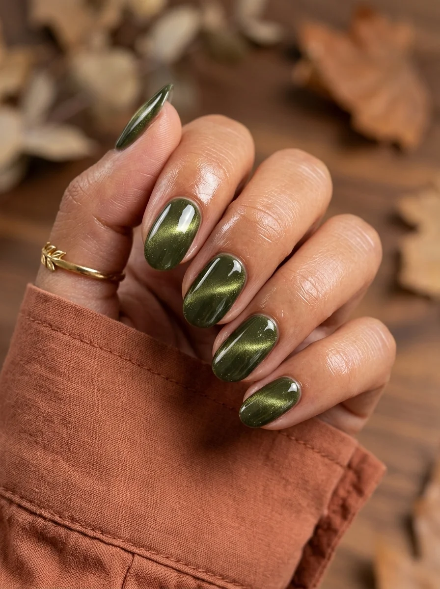
A darker, moodier take on the cat-eye trend with serious autumn energy.
Overview:
If the sage cat eye (design 13) is the "first day of school" version, this deep olive is the "final exams" version. The darker tone reads as more serious and grounded, which makes it a better match for the later months of the school year when the novelty has worn off and you just need your nails to look good.
The magnetic shimmer in this deeper green is more visible than in lighter shades because there is more contrast between the base color and the light-reflecting particles. The result is a finish that looks almost like polished gemstone. Malachite, maybe, or jade with a metallic vein running through it.
Short squoval keeps the dark color from feeling too dramatic. On long nails, deep olive cat eye would read as evening wear. On short nails, it reads as a sophisticated color choice that happens to have an interesting finish. The magnet technique is the same as the sage version: fifteen to thirty seconds per nail, held about 5mm above the wet surface.
Design Breakdown:
Dark magnetic polish with a gemstone-like finish. The depth of the color amplifies the shimmer.
Base Color: Deep olive green with magnetic cat-eye particles.
Nail Shape: Short squoval. Practical length that grounds the dark color.
Design Element: The cat-eye magnetic effect. No additional art needed.
Finish: High-gloss top coat to intensify the magnetic shimmer.
Get The Look at Home:
The technique is identical to the sage cat eye. The darker color actually makes the shimmer easier to see during application.
- Base coat: Standard base coat, fully dry.
- First coat: One thin coat of deep olive cat-eye polish. Let it dry.
- Second coat: Apply the second coat. Do NOT let it dry.
- Magnet: Hold the cat-eye magnet 5mm above the wet polish for fifteen to thirty seconds. The shimmer line will form.
- Repeat: Each nail gets its own magnet session. Work one at a time.
- Seal: One coat of top coat after the polish is fully dry.
21.Sunflower Harvest Mix
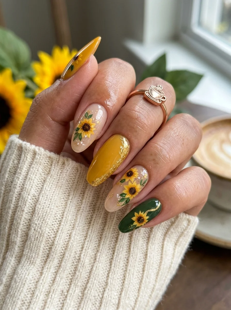
A fall-ready floral set that mixes painted art with solid earth tones.
Overview:
Sunflower nails usually live on white or nude bases, which creates a bright, spring-like feeling. Moving the same flower onto a fall palette of mustard, olive, and nude shifts the mood entirely. The sunflowers look warmer, more saturated, and more grounded. It is the difference between a sunflower field in July and one in October.
The mixed approach, with some nails featuring art and others being solid, is what keeps the design from feeling busy. Not every nail needs a flower. The solid mustard and green nails provide visual breathing room that makes the sunflower art on the other nails stand out more. Your eye moves between the art and the solids, which keeps the set interesting without being overwhelming.
The gold glitter stripe on the mustard nail is a small detail that adds significant impact. It creates a metallic accent that ties the warm palette together and adds a touch of something special without committing to a full glitter nail. Almond shape complements the organic flower forms and gives each sunflower enough room to be recognizable.
Design Breakdown:
Mixed solid and art nails unified by a warm, earthy palette. The variety keeps each nail interesting.
Base Color: Nude on art nails, solid mustard yellow and deep green on accent nails.
Nail Shape: Medium almond. The curved shape complements the organic sunflower forms.
Design Element: Hand-painted sunflowers with brown centers, yellow petals, and green leaves on nude nails. Solid mustard with gold glitter accent. Solid deep green.
Finish: High-gloss top coat to protect the painted art and saturate the solid colors.
Get The Look at Home:
Paint all the solid nails first, then tackle the sunflower art as a second round.
- Solid nails: Two coats of mustard on one or two nails. Two coats of deep green on one nail. Let dry fully.
- Nude nails: Two coats of sheer nude on the remaining nails.
- Sunflower centers: Using a dotting tool and brown polish, place one brown circle per nail on the nude nails.
- Petals: Using a thin striper brush and bright yellow, flick outward strokes from each brown center. Six to eight petals per flower.
- Leaves: Add one or two small green leaves near each flower using a darker green than the base.
- Gold accent: On the mustard nail, paint a thin diagonal stripe of gold glitter polish.
- Seal: Two coats of top coat to smooth the raised art texture.
28 Stunning Softball Hairstyle Ideas with Braids for 2026 🥎✨
22.Silver Glitter Ombre Fade
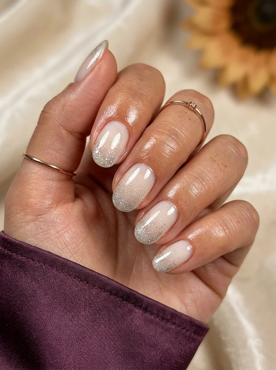
A sparkling gradient that adds glamour without overwhelming the hand.
Overview:
Glitter ombre is one of those designs where the transition zone is more important than the glitter itself. The particles need to fade from dense at the tip to sparse toward the center, creating a gradient of sparkle rather than a hard line. When done well, the glitter looks like it is dissolving into the nude base.
The sheer nude base is essential. It acts as the "negative space" that the glitter fades into. A colored or opaque base would create a hard boundary between the glitter and the background, which defeats the ombre effect. The translucency of the nude also means your natural nail shows through slightly, which keeps the design feeling light and airy despite the sparkle.
Silver glitter is more versatile than gold for this technique because it reads as cooler and more neutral. Gold glitter ombre can lean warm or yellow depending on the lighting. Silver stays consistent. The practical note: glitter toppers with larger particles create a chunkier look. Fine glitter creates a smoother, more sophisticated fade. Choose accordingly.
Design Breakdown:
A sparkle gradient that uses negative space as a design element. The nude base is load-bearing.
Base Color: Sheer nude or milky pink. The natural nail should be visible.
Nail Shape: Medium almond. The curved tip gives the glitter gradient a natural frame.
Design Element: Silver glitter concentrated at the tips, fading toward the center of the nail. Dense at the edge, sparse in the middle.
Finish: High-gloss top coat to smooth the glitter texture and intensify the sparkle.
Get The Look at Home:
The glitter needs to be applied in a gradient, not painted on like a solid color. The technique is different.
- Nude base: Two coats on all nails. Let dry fully.
- Glitter prep: Use a makeup sponge or cosmetic wedge. Paint silver glitter polish onto the sponge.
- Dab the tip: Press the glitter-loaded sponge onto the tip of each nail. Concentrate the glitter at the very edge.
- Fade upward: With less glitter on the sponge, dab lightly toward the center of the nail. The particles should thin out naturally.
- Build opacity: Repeat two to three times until the tip is densely glittered and the center is sparsely scattered.
- Seal: Two coats of top coat to smooth the glitter texture. Run your finger over the nail after each coat; if you feel grit, add another layer.
23.Micro Dot Minimalist
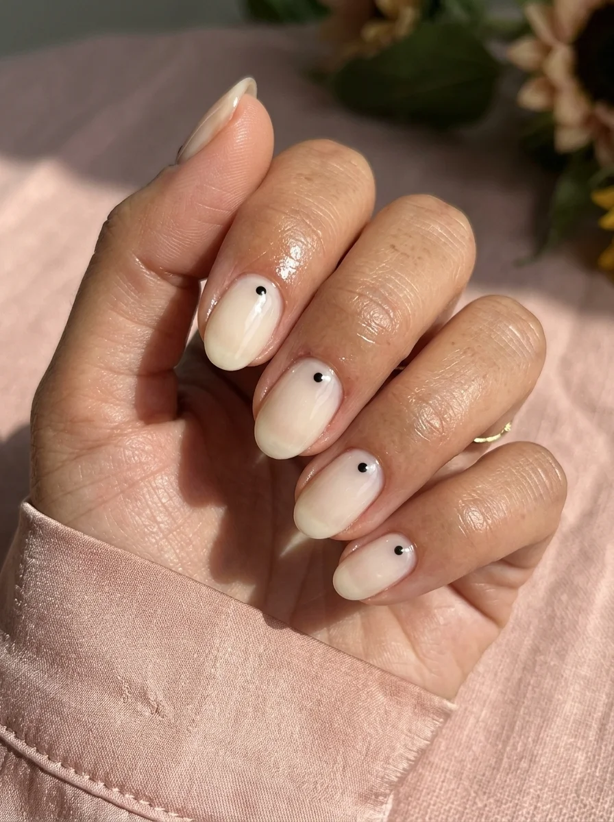
The quietest design on this list, and possibly the most sophisticated.
Overview:
There is a version of minimalism that is actually just laziness, and then there is this. A single black dot near the cuticle of each nail is a deliberate design choice that requires more intentionality than it appears. The placement, size, and consistency of the dot across all five nails is what separates "minimalist" from "I gave up."
The milky cream base is doing most of the work. It needs to be smooth, opaque, and slightly translucent to create that "your nails but better" effect. The dot sits near the cuticle, which is an unusual placement that catches people off guard. Most dot-based designs scatter them across the nail. Placing one dot at the base of the nail creates a focal point that draws the eye downward and makes your fingers look longer.
This is the design you choose when you want your nails to look polished without anyone being able to pinpoint why. It photographs beautifully in natural light and works in any setting, from a lecture hall to a dinner reservation. The only requirement is patience with the base coat, because any flaw in the cream is fully visible.
Design Breakdown:
Maximum restraint. One dot, one base color, zero clutter.
Base Color: Milky, semi-sheer cream. Smooth and streak-free.
Nail Shape: Short oval. Clean, natural, and understated.
Design Element: One tiny black dot near the cuticle on each nail. Same size, same placement, every time.
Finish: High-gloss top coat for a glassy, polished surface.
Get The Look at Home:
The dot needs to be the same size and in the same position on every nail. Consistency is the entire design.
- Cream base: Two to three coats until fully opaque and smooth. Let dry completely.
- Dot tool: Use the smallest dotting tool you have, or the tip of a toothpick. Dip it in black polish.
- Dot placement: Press one dot at the center of each nail, about 2mm above the cuticle. Press straight down, lift straight up.
- Size check: Look at all five dots. They should be identical. If one is larger, carefully remove it with a brush dipped in acetone and redo it.
- Dry check: Black on cream smears easily. Wait at least five minutes before top coating.
- Seal: One coat of top coat, applied in a single stroke to avoid dragging the dot.

34 Cutest Butter Yellow Nail Designs for 2026 🧈
24.Pencil & Apple School Spirit
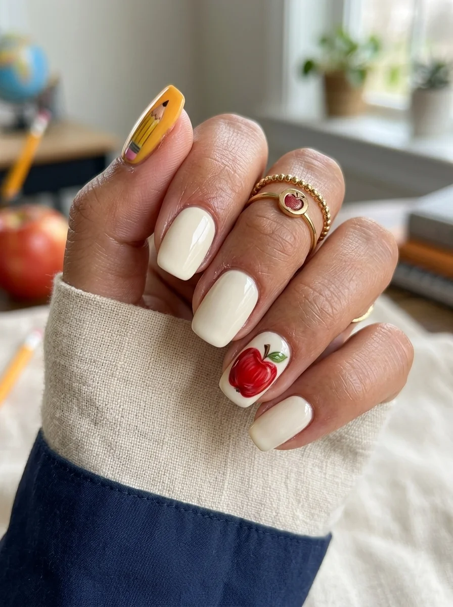
The most literal back-to-school design on this list, executed with enough restraint to stay chic.
Overview:
This is the design for someone who wants their nails to say "back to school" without beating around the bush. The pencil and apple are unmistakable references, but the cream base and the limited placement keep them from feeling costume-like. Two accent nails carry the art. The other three stay clean.
The pencil on the thumb works because the nail is wide enough to accommodate the full illustration: yellow body, pink eraser, silver ferrule, and sharpened tip. On a smaller nail, the pencil would need to shrink, and at that scale, the details become illegible. The thumb is the right canvas for this level of detail.
The apple on the ring finger is simpler but equally effective. A red circle with a green leaf and brown stem reads as "apple" from across the room. The red also creates a color connection to the pencil's eraser, which ties the two accent nails together visually. The cream base on the remaining nails keeps the set from feeling busy.
Design Breakdown:
Two themed accent nails on a clean base. The art is the statement; the rest is supporting cast.
Base Color: Creamy off-white on all nails.
Nail Shape: Short squoval. The flat surface provides enough room for the pencil and apple illustrations.
Design Element: Hand-painted pencil on the thumb (yellow body, pink eraser, silver ferrule). Hand-painted red apple on the ring finger (red circle, green leaf, brown stem).
Finish: High-gloss top coat to protect the art and unify the design.
Get The Look at Home:
The pencil and apple are separate illustrations. Paint them in separate rounds to keep your colors clean.
- Cream base: Two coats on all nails. Let dry fully.
- Pencil body: On the thumb, use a thin brush and yellow polish to paint a long, thin rectangle. Add a pink triangle at one end for the eraser and a silver band between them.
- Pencil tip: Use a beige or tan polish to paint the sharpened wood tip. Add a tiny black dot at the very end for the graphite.
- Apple shape: On the ring finger, paint a red circle. It does not need to be perfect.
- Apple details: Add a small brown stem at the top and a green leaf angled to one side.
- Seal: Two coats of top coat to smooth the raised art texture.
25.Pastel Smile & Heart Doodles
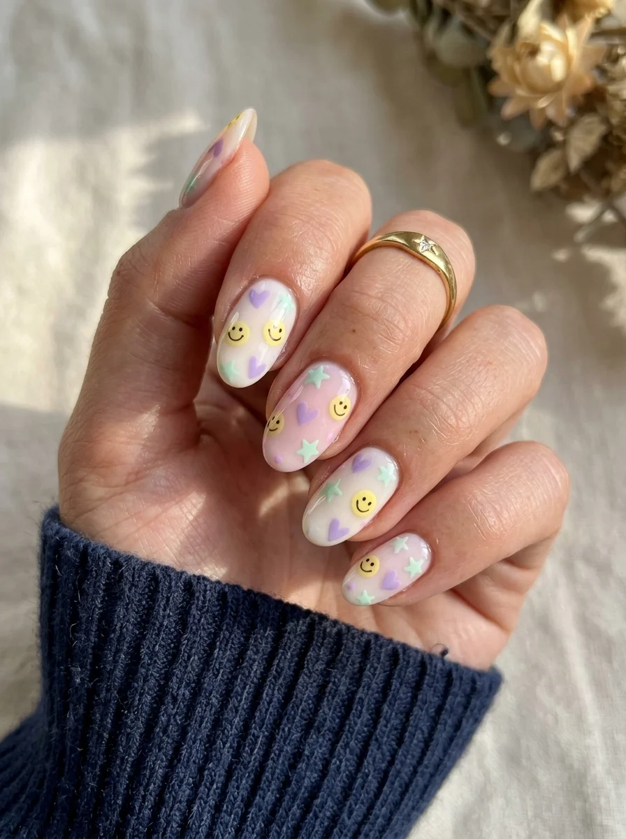
A playful, doodle-inspired set that feels like decorating your notebook margins.
Overview:
Scattered doodle art on a sheer base is one of those designs that looks effortless but requires careful composition. The hearts, stars, and smiley faces need to be distributed evenly enough that no single nail feels crowded while others feel empty. The sheer base helps because it provides visual breathing room between the doodles.
The pastel palette is doing important work here. Lavender, mint, and yellow are all low-saturation colors that sit in the same value range. This prevents any single color from dominating and keeps the overall effect soft and unified. If you added a bright red or deep purple into the mix, the "notebook margin" quality would collapse into something louder.
The smiley faces are the detail that elevates this from "pastel pattern" to "themed design." They are small enough to function as texture from a distance, but up close, the tiny faces reward closer inspection. That layered discovery is what makes a design memorable. Not every element needs to be immediately visible.
Design Breakdown:
Scattered doodle motifs on a transparent canvas. The negative space between elements is part of the design.
Base Color: Sheer pink or milky nude. The natural nail should be visible.
Nail Shape: Medium almond. The curved shape complements the organic doodle forms.
Design Element: Scattered pastel hearts, stars, and smiley faces in lavender, mint, and yellow across all nails.
Finish: High-gloss top coat to protect the fine detail work.
Get The Look at Home:
Work in color layers: all lavender elements first, then all mint, then all yellow. This is faster than finishing one motif at a time.
- Sheer base: One or two coats of milky nude. Let dry fully.
- Lavender layer: Using a small brush and lavender polish, paint hearts and stars scattered across the nails. Two to three per nail.
- Mint layer: Using mint polish, add star shapes in the gaps between the lavender elements.
- Yellow layer: Using yellow polish, paint small smiley faces (circle with two dots and a curved line) on two or three nails.
- Dry time: The layered art needs at least five minutes to set.
- Seal: One coat of top coat, applied carefully to avoid smearing the fine details.

21 Stunning Concert Hairstyles for Women 2026 🎶✨
26.Multicolor Micro French
A colorful French that assigns a different hue to every finger.
Overview:
This design answers the question: what if French tips were a rainbow? The answer is surprisingly wearable. The nude base keeps every tip grounded, and the thinness of the colored lines means the overall effect is more "colorful accent" than "painted nails."
The difference between this and design 12 (the almond rainbow French) is the nail shape and tip thickness. These tips are thinner and on a shorter, squarer nail, which makes the colors register as even more minimal. From across a room, the nails look like they have a subtle colored edge. Up close, the rainbow reveals itself.
Short squoval is the right canvas for this version. The flat tip creates a clean, geometric smile line for each color, and the short length keeps the design feeling practical. This is the kind of manicure that works in any setting because the colors are so contained. Nobody is going to tell you your nails are inappropriate when the color is limited to a 1mm strip at the tip.
Design Breakdown:
Classic French structure with a multi-color palette on short nails. Minimal and playful.
Base Color: Sheer nude or milky pink. The natural nail should be visible.
Nail Shape: Short squoval. Clean edges, minimal color.
Design Element: Five different colored French tips, one per nail, in rainbow order: red, orange, yellow, green, blue.
Finish: High-gloss top coat to saturate the colors and unify the design.
Get The Look at Home:
The tips are thin, which means the color needs to be opaque in one coat. Choose formulas that cover well.
- Nude base: Two coats on all nails. Let dry fully.
- Map the colors: Decide which color goes on which finger. Rainbow order from thumb to pinky.
- Paint the tips: Using a French liner brush, paint each tip in its designated color. Keep the tips thin, about 1-2mm.
- Consistency: All tips should be the same thickness. Compare across all nails.
- Cleanup: An angled brush dipped in acetone sharpens every smile line.
- Seal: One coat of top coat. Cap the free edge on every nail.
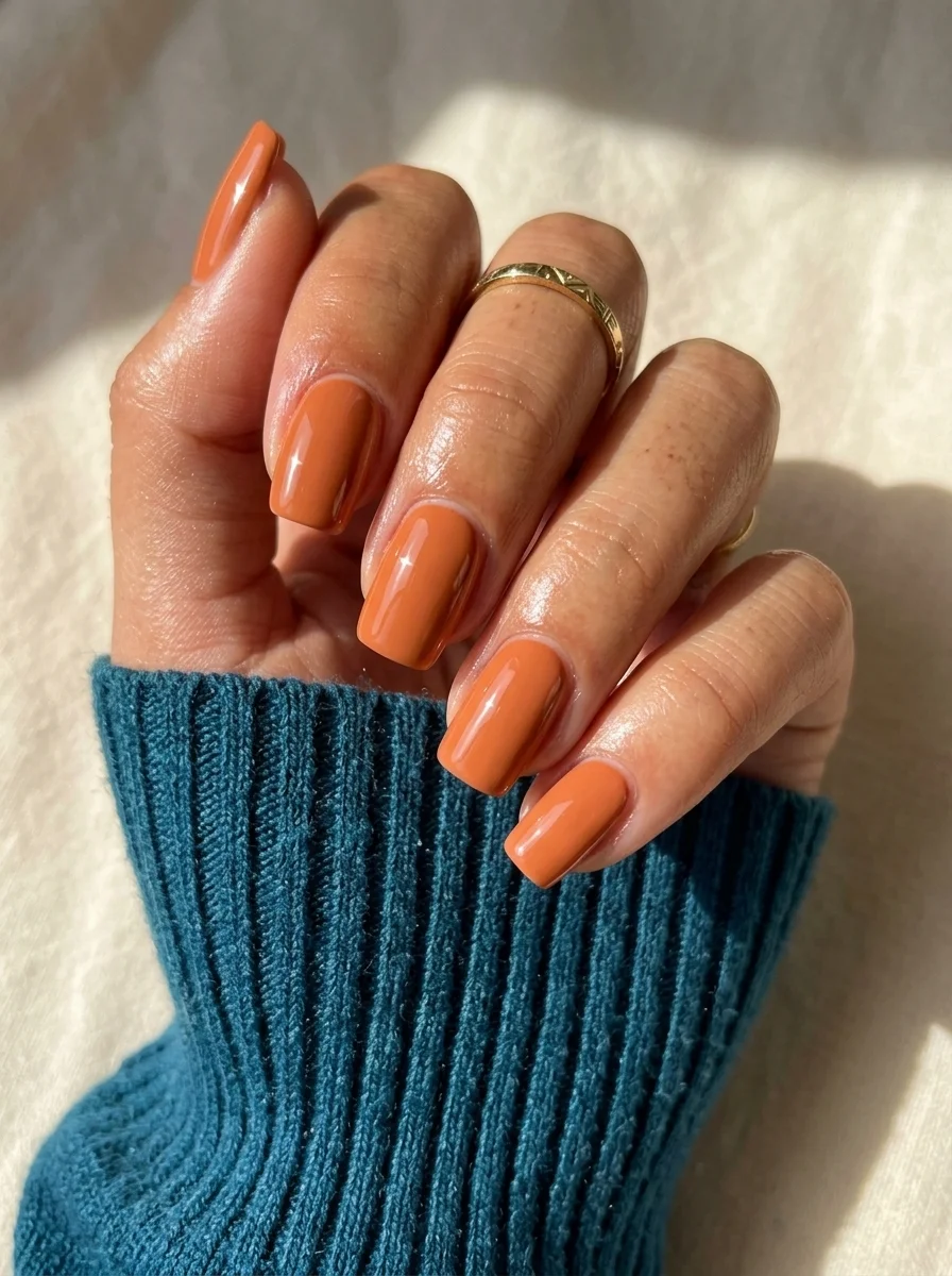
27.Solid Terracotta Warmth
A warm, earthy solid that channels falling leaves and pumpkin spice.
Overview:
Terracotta is one of those colors that exists in a perfect middle ground between orange and brown. It is warm enough to read as a color choice rather than a neutral, but muted enough to go with everything. On short nails, it reads as polished and intentional. On long nails, it can lean dramatic. Short squoval keeps it in the "everyday" zone.
The formula is what makes or breaks a solid terracotta. Some terracotta polishes are chalky and streaky, requiring four coats for full coverage. Others are creamy and self-leveling, covering in two. The difference is usually the brand and the price point. A slightly more expensive formula that covers in two thin coats will look better than a cheap one that needs four thick ones.
This is a design where the color IS the design. There is no art, no accent, no pattern. Just a warm, saturated orange-brown that makes your hands look like they belong in a fall magazine spread. Sometimes that is enough.
Design Breakdown:
Single-color coverage. The shade IS the design.
Base Color: Warm terracotta or burnt orange. Opaque and creamy.
Nail Shape: Short squoval. Practical, comfortable, and modern.
Design Element: None. Solid coverage on all nails.
Finish: High-gloss top coat for a smooth, reflective surface.
Get The Look at Home:
Terracotta formulas vary widely. Test the coverage on one nail before committing to all ten.
- Base coat: Apply a standard base coat and let it dry.
- First coat: Apply one thin coat of terracotta. Evaluate the coverage. If it is streaky, you will need three coats.
- Build opacity: Apply two to three thin coats, letting each dry fully before the next.
- Brush technique: Wipe the brush on the bottle neck before each stroke. This prevents thick, uneven application.
- Cuticle cleanup: Clean the edges with a small angled brush and acetone. Warm colors against skin are visible.
- Seal: One coat of glossy top coat to smooth the surface and add depth.

30 Stunning Beach Nail Ideas for the Best Vacation in 2026 🌊
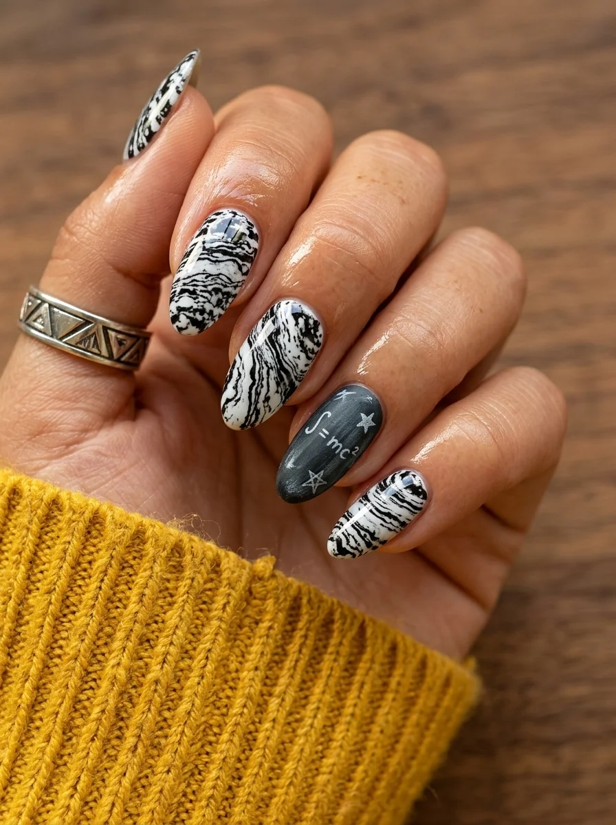
28.Black & White Marble
A science-themed accent nail surrounded by abstract marble art for the studious soul.
Overview:
This design takes the marble concept from design 6 and pushes it darker and bolder. The black and white swirls are more dramatic than the grey veining, creating a look that feels closer to abstract art than polished stone. The higher contrast also makes each nail look more dynamic in photos.
The ring finger accent is where the back-to-school reference lives. A dark grey base with "E=mc2" written in white, surrounded by small hand-painted stars, is a direct nod to science class without being cheesy about it. The equation is small enough to read as "detail" from a distance, and the stars add visual interest without cluttering the design.
The marble technique here is the same wet-on-wet method as design 6, but with black instead of grey. Black is less forgiving because it dominates the white faster. Three to four drags maximum per nail, then stop. The organic, unpredictable nature of marble is what makes it interesting. Trying to control it too much kills the effect.
Design Breakdown:
Bold marble art with one themed accent. The contrast between abstract and literal is the design.
Base Color: Bright, opaque white on marble nails. Dark grey or charcoal on the accent nail.
Nail Shape: Medium almond. The tapered shape gives the marble room to breathe.
Design Element: Black and white marble swirls on most nails. Dark grey accent nail with "E=mc2" equation and white stars.
Finish: High-gloss top coat to smooth the marble texture and protect the accent art.
Get The Look at Home:
The marble and the accent art use completely different techniques. Do them in separate rounds.
- White base: One coat of opaque white on the marble nails. Let dry.
- Wet layer: Apply a second coat of white. Do NOT let it dry.
- Drop black: Place tiny dots or thin lines of black polish onto the wet white. Two to three per nail.
- Drag: Use a toothpick to pull through the black dots. Three to four drags, then stop. Overworking creates mud.
- Accent nail: On the ring finger, apply two coats of dark grey. Let dry. Using a thin liner brush and white polish, write "E=mc2" in the center. Add small white stars around it.
- Seal: Wait ten minutes for everything to set. Apply two coats of glossy top coat.
There you have it, 28 designs that prove back-to-school nails do not have to be boring or predictable. Whether you went with the minimalist micro dot, the bold cow print, or the full pencil-and-apple accent set, the best manicure is the one that makes you feel ready to take on the semester.
Pin your favorites to a Pinterest board now so you have them ready for your next salon visit. Showing your nail tech a reference photo is the fastest way to get exactly what you want without the stress of explaining it from memory.
Have an amazing semester, and may your nails stay chip-free through every exam.