Nail Trends
27 August Nail Designs That Capture the Last Days of Summer
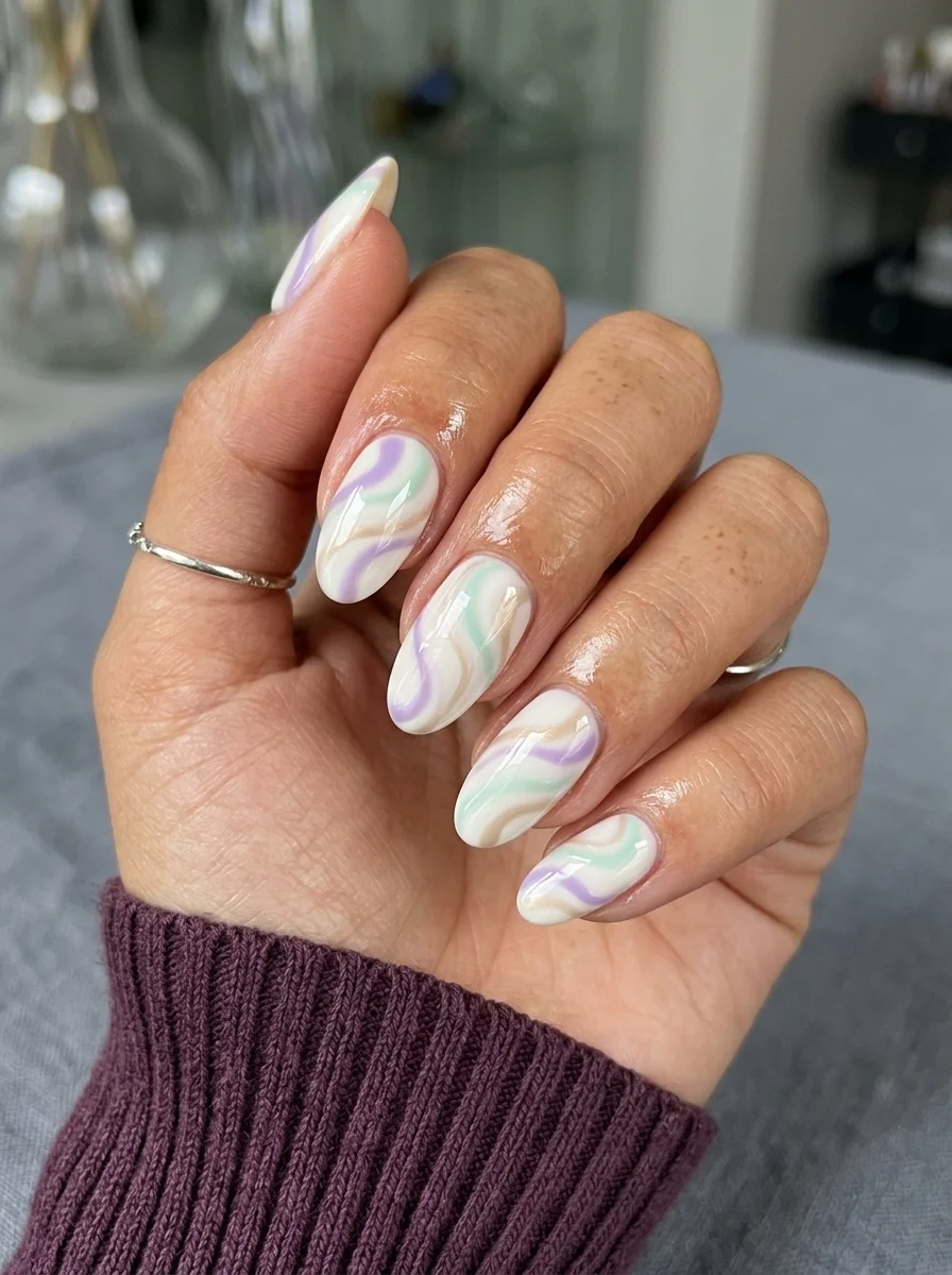
August sits at a strange crossroads in the nail calendar. Summer is still technically in session, but there is a quiet pull toward deeper tones and more structured designs. These 27 designs occupy that exact space. Some lean into the last warmth of the season with bright neons and playful patterns. Others reach forward into early fall with burgundy, forest green, and gold. The result is a collection that works for the entire month, whether you are chasing sunsets or mentally planning your autumn wardrobe.
The August Transition: What Changes and Why It Matters
August nails are different from June nails. The early summer novelty of bright colors and wild patterns has faded, and what remains is a more refined approach. People who spent June experimenting with neon tips and fruit decals tend to settle into something more intentional by August. The designs in this guide reflect that maturity. Even the playful options, like the polka dots or the gingham check, have a restraint that keeps them from feeling juvenile.
The color palette shifts noticeably. Pastels give way to saturated tones. Sheer bases remain popular, but the accent colors deepen. Gold replaces silver as the metal of choice. Green, which barely appears in early summer nail art, suddenly shows up everywhere. These aren't random trends. They're a natural response to the changing light and the approaching transition into fall fashion.
1.Mystical Eye and Star Nail Art
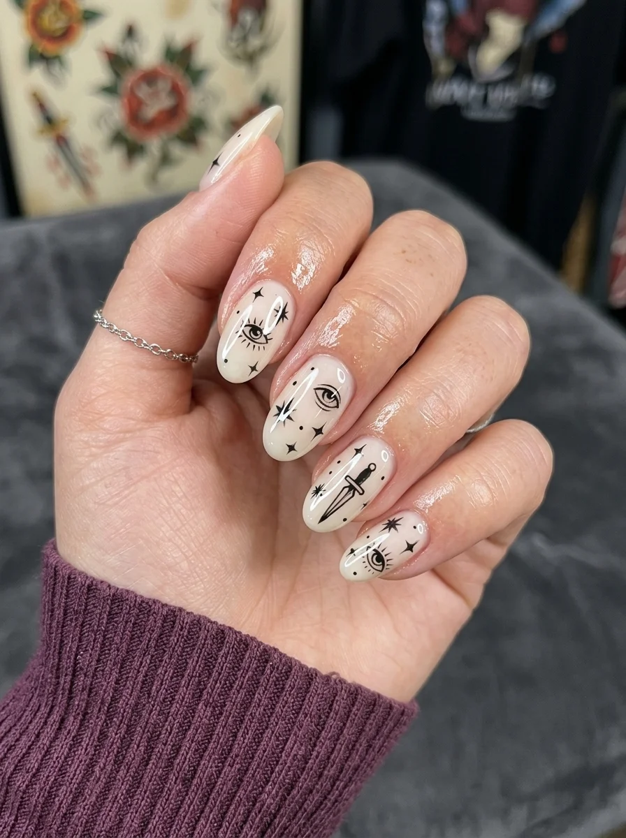
Celestial mysticism meets minimalism on a clean canvas.
Overview:
Black nail art on a white base has been done a thousand ways, but most of them feel like doodles in a high school notebook. This set takes a different approach. The imagery is specific: eyes with radiating lash lines, four-pointed stars, a dagger, scattered dots. Each nail tells a small part of a larger mystical narrative without being so literal that it becomes costume jewelry for your hands.
The milky, semi-sheer white base is doing more work than you might realize. A stark, opaque white would make the black graphics feel harsh and flat. The slight translucency here gives the illustrations depth, as if they're floating just below the surface rather than sitting on top of the nail. It reads more like aged parchment than printer paper.
The almond shape is essential to this design's success. The tapered points echo the dagger and star motifs, creating visual cohesion between the nail shape and the art itself. On a square or coffin shape, these same graphics would feel disconnected from the nail's geometry.
Design Breakdown:
Fine-line nail art that borrows from tarot card illustration and celestial sketching.
Base Color: A milky, semi-sheer white. Think of the finish you get from two thin coats of a jelly white, not a chalky opaque.
Nail Shape: Medium-length almond. The point should be soft, not razor-sharp.
Design Element: Hand-painted black illustrations: eyes with radiating lines, four-pointed stars, a dagger, and scattered dots. Each nail has a different arrangement.
Finish: High-gloss top coat. The shine adds dimension to the semi-sheer base.
Get The Look at Home:
This design lives or dies by line quality. A steady hand and a good detail brush are non-negotiable.
- Shape and base: File into a soft almond. Apply two thin coats of milky white. Let each dry completely.
- Sketch first: Use a white eyeliner pencil to lightly mark where each graphic element will go. This prevents spacing issues.
- Detail work: Using a long, thin liner brush and black polish or acrylic paint, draw each element one at a time. Start with the largest shapes (eyes, dagger) and add the smaller stars and dots last.
- Let it set: Wait five full minutes before applying top coat. Wet detail work smears instantly under a brush.
- Seal carefully: Float the top coat brush over the surface rather than dragging it. Pressure moves the art.
28 Stunning Softball Hairstyle Ideas with Braids for 2026 🥎✨
2.Cherry Blossom Branch Manicure
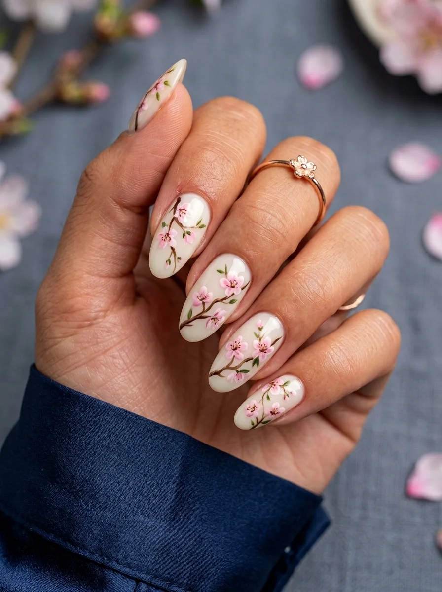
Hand-painted sakura branches that wrap naturally across the nail surface.
Overview:
Cherry blossom nail art has a reputation for looking like wallpaper. The usual approach is to stamp identical flowers across every nail in a tight, repeating grid. This design avoids that trap entirely. The branches grow organically across the nails, starting from different angles, with blossoms at various stages of bloom. Some are fully open, others are still buds. That variation is what makes it feel like a painting rather than a pattern.
The color work deserves attention. The pink isn't a single flat shade. Each petal has a darker center that fades to pale edges, giving the blossoms a three-dimensional quality. The brown branches are equally considered, varying in thickness and following natural curves rather than straight lines. This is the kind of detail that separates a $50 manicure from a $150 one.
The sheer white base keeps everything light and airy, but it also means the natural nail line will show through. If that bothers you, build opacity with three coats instead of two. The trade-off is that the design loses some of its delicate, watercolor quality.
Design Breakdown:
Botanical illustration translated to nail art. The organic placement is key.
Base Color: Semi-sheer milky white. Two coats for a soft translucency, three if you want more coverage.
Nail Shape: Medium-length almond. The tapered shape gives the branches room to curve naturally.
Design Element: Brown branches with pink cherry blossoms in various stages of bloom. Each nail has a unique branch arrangement.
Finish: High-gloss top coat. The shine mimics the look of lacquered ceramic.
Get The Look at Home:
The key is making each nail slightly different while keeping the color palette consistent across all five.
- Base coats: Two thin coats of milky white on all nails. Let dry fully.
- Branches first: Using a thin liner brush and brown polish, paint the main branch line on each nail. Vary the starting point and angle. Let dry two minutes.
- Add smaller branches: Paint thinner offshoot lines from the main branch. These should be noticeably thinner than the parent line.
- Build the blossoms: Using a small brush and two shades of pink (one medium, one pale), dot the darker pink first as the blossom center, then surround it with lighter petals. Three to five petals per flower.
- Buds and details: Add tiny unopened buds as small pink dots along the branches. A single coat of top coat seals everything.
3.Galaxy Glitter Night Sky Nails
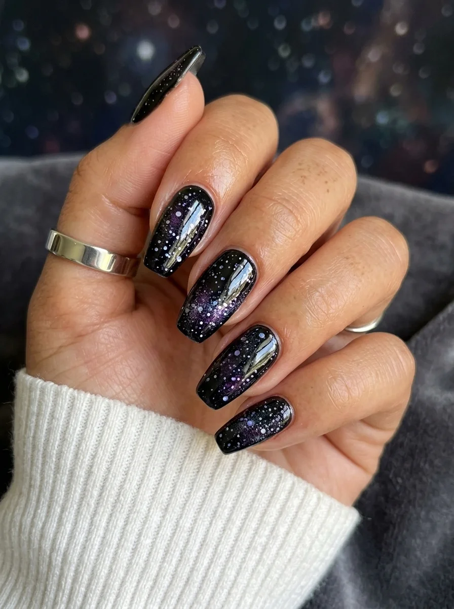
A dense field of glitter that actually looks like depth rather than decoration.
Overview:
"Galaxy nails" usually means someone went wild with a glitter topcoat and called it a day. This version earns the name. The black base is genuinely dark, not a translucent black that reads grey after three coats. The glitter isn't uniform either. There are fine white specks (distant stars), larger purple flecks (nebula clouds), and occasional silver bits that catch light differently than everything else.
What makes this work is the density gradient. The glitter is heaviest near the cuticle and thins out toward the tips, which creates a sense of depth. Your eye reads it as looking into space rather than looking at a flat surface. Most glitter nails fail because the distribution is too even, which flattens the effect immediately.
The coffin shape is doing important structural work here. The flat tip provides a wide canvas where the sparse glitter near the edge looks intentional rather than like you ran out of product. On a pointed shape, that same sparsity would look like a mistake.
Design Breakdown:
Layered glitter over a true black base. The gradient density creates the illusion of depth.
Base Color: A true, opaque black. Two coats should get you there. Anything with a blue or grey undertone weakens the contrast.
Nail Shape: Long coffin. The flat tip and straight sidewalls give the galaxy room to spread out.
Design Element: Multi-size glitter in purple, silver, and white, concentrated at the cuticle and fading toward the tip. Different glitter sizes create the starfield effect.
Finish: High-gloss top coat. The shine creates the "looking through glass into space" illusion.
Get The Look at Home:
The secret is layering the glitter at different densities rather than applying it all at once.
- Black foundation: Apply two thin coats of opaque black. Let each dry completely. Black polish shows every imperfection in the base layer.
- Dense glitter layer: Using a makeup sponge, dab chunky purple and silver glitter onto the cuticle area of each nail. The sponge absorbs the excess clear base, leaving more glitter behind.
- Gradient pull: With a nearly dry sponge, drag the remaining glitter from cuticle toward the midpoint. Don't reload the sponge.
- Fine star details: Using a dotting tool and white polish or white acrylic paint, place tiny individual dots scattered across the entire nail. These are your "distant stars."
- Seal: Two coats of top coat. The first locks the glitter in place; the second smooths the texture so nothing catches on fabric.
32 Bright & Fun Summer Toe Nail Designs (2026)
4.Green Gingham Check Nails
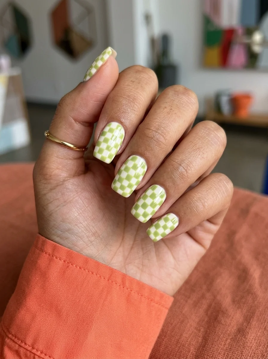
Retro gingham in a fresh green that reads picnic blanket, not tablecloth.
Overview:
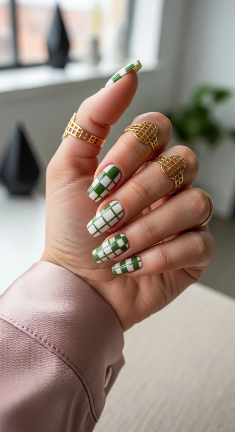
Gingham nails have a tendency to look either too precious or too complicated. This version sidesteps both problems by keeping the color palette to just two tones: white and a muted, slightly yellowish green. No third accent color, no decorative flourishes. Just the check pattern doing its thing across a short, practical nail length.
The green choice is specific and it matters. A cool-toned mint would read as baby shower. A neon would read as costume. This particular shade sits in a warm, slightly olive-tinged territory that feels intentional and mature. It's the color of a well-worn linen shirt, not a plastic cup.
Short square nails are the right call here. Gingham on long nails starts to look like you're trying to make a statement, when the charm of this pattern is its quiet, everyday quality. At this length, it functions almost like a neutral with personality.
Design Breakdown:
Two-tone gingham that works because the green is warm enough to avoid looking juvenile.
Base Color: Clean, opaque white. Two coats for full coverage.
Nail Shape: Short square with softly rounded corners. The geometric pattern pairs well with a geometric nail shape.
Design Element: Gingham check in a warm, slightly olive-toned green over white. The intersections of the pattern should be slightly darker where the lines overlap.
Finish: High-gloss or satin. Both work. Matte dulls the pattern's crispness.
Get The Look at Home:
Striping tape makes the grid lines clean, but the overlapping sections need a different approach.
- White base: Two coats of opaque white. Let dry fully.
- Vertical stripes: Place thin striping tape vertically at even intervals across each nail. Paint green between every other pair of tape lines. Remove tape while the polish is still wet.
- Horizontal stripes: Once the verticals are dry, repeat the process horizontally. The squares where horizontal and vertical green lines overlap should be painted a second time to darken them.
- Clean up edges: Use a small brush dipped in acetone to sharpen any lines that bled under the tape.
- Top coat: One generous coat to smooth the texture from the layered polish.
5.Green and White Jade Marble Nails
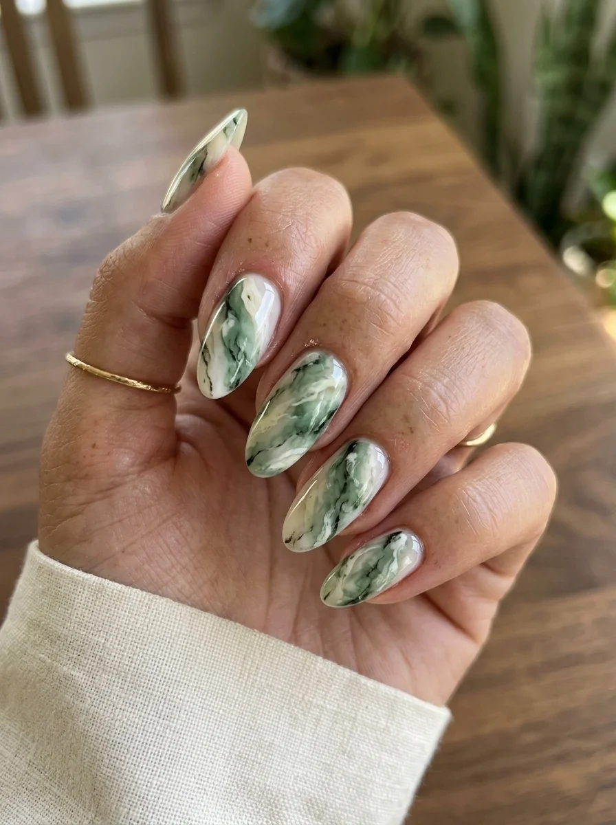
Organic marble veining that looks like polished semi-precious stone.
Overview:
Marble nails are everywhere right now, but most of them lean on the standard black-and-white formula. This green marble goes somewhere different. The base is a milky, semi-sheer white, and the veining is done in multiple shades of green, from deep forest to pale sage. The effect is closer to polished jade or malachite than to Carrara marble.
What makes this version work is the restraint in the veining. Each nail has two or three major veins and a few fainter secondary lines. The designer didn't try to fill every square millimeter with pattern. That white space between the green veins is what lets the eye rest and prevents the design from looking busy.
The almond shape complements the organic nature of marble perfectly. Straight-edged nail shapes impose a geometric structure that fights with the fluid, natural quality of stone veining. The almond's curves let the veins flow naturally from cuticle to tip.
Design Breakdown:
Multi-tonal green marble over a milky white base. The white space between veins is as important as the veins themselves.
Base Color: Semi-sheer milky white. Two coats give enough translucency for the veins to look submerged rather than painted on.
Nail Shape: Almond. The organic curves match the natural flow of stone veining.
Design Element: Dragged veining in two to three shades of green (deep forest, medium sage, pale mint). The veins should vary in thickness and direction across nails.
Finish: High-gloss top coat. The shine creates the polished stone illusion.
Get The Look at Home:
Work on a wet surface so the veins blur at their edges instead of staying crisp.
- Milky base: Two coats of semi-sheer white. Let dry.
- Wet layer: Apply a thin third coat of the same white. Do not let it dry. This is your working surface.
- Drop the greens: Place thin lines of dark green, medium green, and pale green across the wet nail. Work quickly.
- Drag the veins: Use a toothpick to drag through the colors in long, slightly wavy strokes. Three or four drags per nail is plenty. Over-working muddies the colors.
- Let it settle: Wait two minutes for the polish to self-level. The veins will blur slightly at the edges during this time, which is what you want.
- Top coat: Apply after the design is touch-dry to avoid smearing the veins.
30+ Chic Pool Party Hairstyles for Summer 2026 🌊👙
6.Classic Tartan Plaid Nails
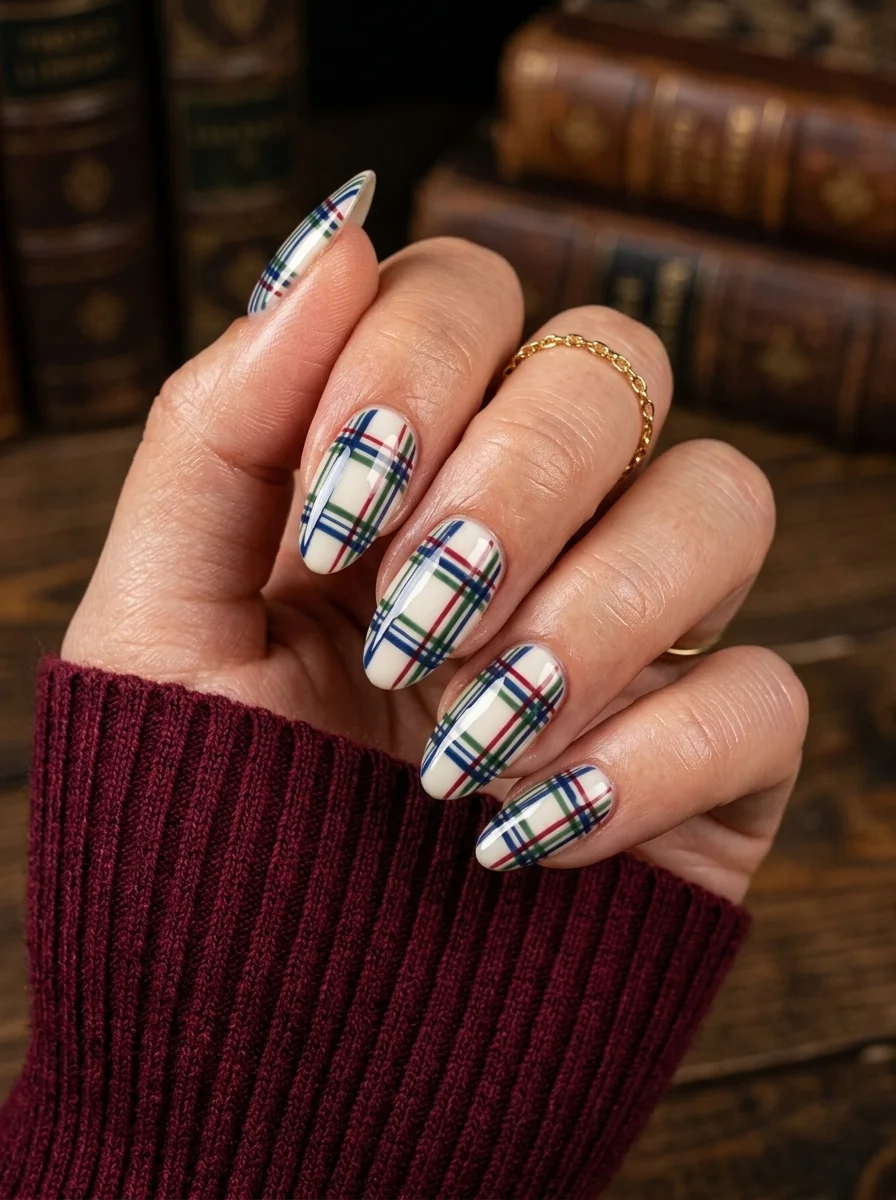
Heritage plaid that looks like it belongs on a wool scarf, not a nail.
Overview:
Plaid nail art is deceptively difficult. The lines need to be straight, evenly spaced, and layered in the right order or the whole thing collapses into a messy grid. This design nails the execution. The base is clean white, the horizontal and vertical lines are crisp, and the overlapping sections create the correct color deepening that real tartan has.
The color palette is classic tartan: navy blue, forest green, and red over white. These are the colors you'd see on a Burberry scarf or a Ralph Lauren flannel, which is exactly why the design reads as sophisticated rather than childish. The white base keeps everything bright and clean, preventing the dark plaid colors from feeling heavy.
The almond shape works better here than you might expect. Plaid traditionally belongs on straight-edged shapes (square, coffin), but the rounded almond gives the pattern a softer, more wearable quality. It feels like a design choice rather than a default.
Design Breakdown:
Traditional tartan built in layers. The order you paint the lines determines whether it looks like real plaid or a color-by-numbers grid.
Base Color: Opaque white. Two coats for full coverage.
Nail Shape: Medium-length almond. The length gives the plaid enough room to read clearly.
Design Element: Layered horizontal and vertical lines in navy blue, forest green, and red. The navy lines should be widest, with thinner green and red lines layered on top.
Finish: High-gloss top coat. The shine adds depth to the layered lines.
Get The Look at Home:
Paint the lines in order from thinnest to thickest. The wider lines go on last because they're the most forgiving.
- White base: Two coats of opaque white. Let dry fully between coats.
- Red lines first: Using a thin liner brush, paint thin red lines in one direction (vertical or horizontal). Space them evenly. Let dry.
- Green lines second: Paint green lines perpendicular to the red. These should be slightly wider. Let dry.
- Navy lines last: Paint the widest navy lines in both directions, covering the intersections of red and green. This creates the depth where colors overlap.
- Check spacing: Before the top coat, check that the grid looks even. Small adjustments can still be made with acetone on a detail brush.
- Seal: Top coat over everything. The multiple layers of polish create slight ridges that the top coat will smooth out.
7.Primary Color Polka Dot Nails
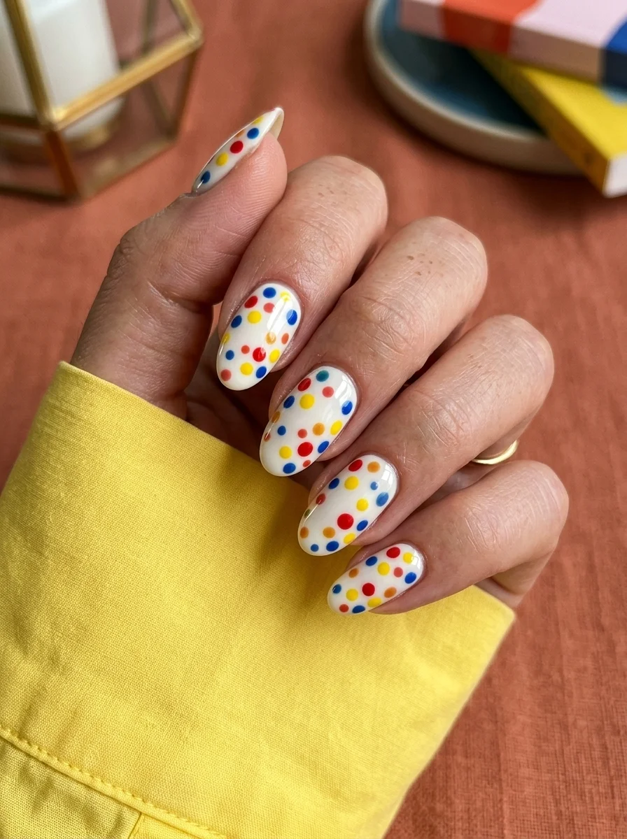
Playful polka dots in primary colors that never takes itself too seriously.
Overview:
Polka dot nails are the gateway drug of nail art. They're easy, forgiving, and almost impossible to get wrong. The challenge isn't technical. It's choosing colors and sizes that look intentional rather than random. This design solves that problem by sticking to a tight palette: red, blue, yellow, and orange. Four colors, no more. That constraint is what keeps it from looking like a box of crayons exploded on your nails.
The dot sizing varies intentionally. Larger dots anchor the design while smaller ones fill the gaps. If every dot were the same size, the pattern would feel static and mechanical. The slight randomness in size and placement gives it a hand-done quality that actually looks better than precision-placed uniformity.
The white base is essential. On a nude or colored base, these dots would fight for attention and create visual noise. White acts as a clean canvas that lets each color pop without competition. The high gloss finish ties everything together and keeps the overall look polished rather than crafty.
Design Breakdown:
Simple dots elevated by a disciplined color palette and varied sizing.
Base Color: Opaque white. Two coats for a clean, even canvas.
Nail Shape: Almond. The rounded shape softens the geometric quality of the dots.
Design Element: Scattered polka dots in red, blue, yellow, and orange. Vary the sizes between medium and small dots. No two nails should have the same layout.
Finish: High-gloss top coat. The shine makes the dots look almost candy-like.
Get The Look at Home:
The tool matters more than the technique here. Use dotting tools in at least two different sizes.
- White base: Two coats of opaque white. Let dry completely.
- Lay out your palette: Put small drops of each color on a piece of foil. You'll be dipping your tools directly into these.
- Large dots first: Using the larger dotting tool, place red and blue dots across each nail. Space them out generously.
- Fill gaps: Switch to the smaller dotting tool and add yellow and orange dots in the spaces between the larger ones. Don't crowd them.
- Let dry and seal: Wait at least three minutes, then apply a thick top coat. Dots dry slower than flat polish because they're raised.
30 Stunning Beach Nail Ideas for the Best Vacation in 2026 🌊
8.Navy and Gold Geometric Art Deco Nails
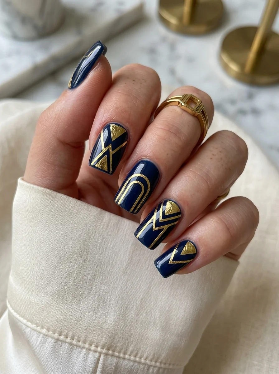
Art Deco geometry that catches light like a gilded skyscraper.
Overview:
Navy and gold is a combination that has been done badly so many times it's practically a cliché. But when the proportions are right and the geometry is intentional, it still works. This design proves that. The navy is deep enough to read as almost black in low light, which gives the gold lines a dramatic, high-contrast backdrop. In direct light, the blue reveals itself and the whole thing warms up considerably.
The geometric patterns vary from nail to nail, which is the smartest choice in the design. Some nails have arches, others have zigzags, others have intersecting triangles. If every nail had the same pattern, it would feel like wallpaper. The variation turns it into a collection of related designs that share a color language.
The gold is doing the heavy lifting here. It's a warm, slightly antiqued gold rather than a bright yellow gold. That distinction matters. Bright gold on navy reads as holiday decor. Antiqued gold on navy reads as architecture.
Design Breakdown:
Art Deco-inspired geometry. Each nail has a unique pattern, but the color palette keeps everything cohesive.
Base Color: Deep navy blue. Two coats for full opacity. The navy should be dark enough to almost disappear in dim lighting.
Nail Shape: Coffin. The flat tip and straight edges complement the geometric designs.
Design Element: Gold metallic lines in various geometric patterns: arches, zigzags, intersecting triangles, chevrons. Each nail features a different arrangement.
Finish: High-gloss top coat. The shine amplifies the gold's reflectivity.
Get The Look at Home:
Metallic paint or polish is harder to work with than regular polish. It drags and streaks. Thin it slightly if needed.
- Navy base: Two coats of deep navy. Let dry completely. Navy polish stains skin aggressively, so clean up as you go.
- Plan your patterns: Decide which geometric design goes on which nail before you start. Spontaneous decisions mid-painting usually don't work.
- Gold lines: Using a thin liner brush and gold metallic polish, paint each geometric shape in slow, deliberate strokes. Metallic polish is less forgiving than creme formulas.
- Let the gold cure: Metallic polishes take longer to dry than regular polish. Wait at least five minutes before top coat.
- Seal: Two coats of top coat. The first locks the gold in place; the second smooths the surface.
9.Silver Abstract Wave Nails
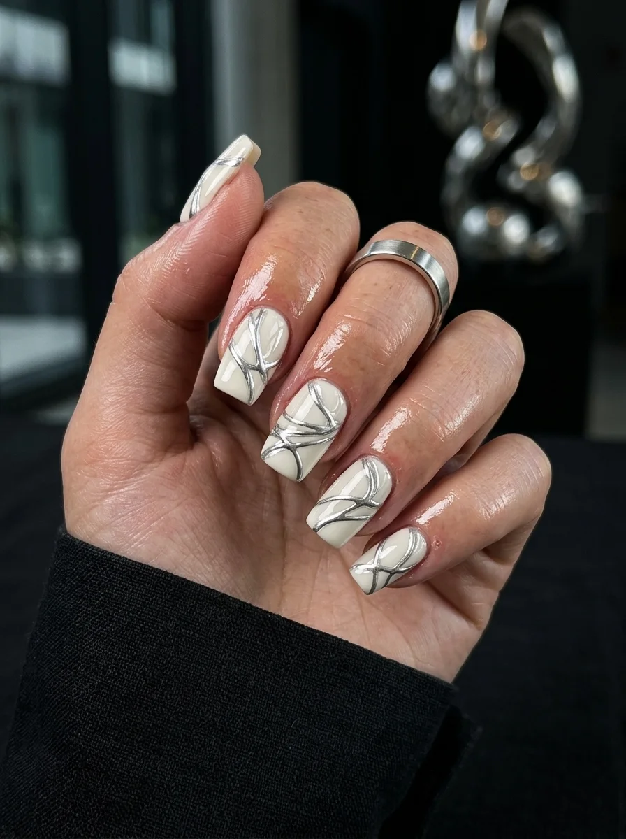
Fluid silver lines that feel like liquid metal poured across a white canvas.
Overview:
Silver on white is a combination that can easily wash out. The silver disappears into the background and the design becomes invisible from arm's length. This set avoids that problem by making the silver lines thick enough to cast actual shadows on the white base. You can see the dimension from across a room.
The wave patterns are abstract, but not random. Each nail has a consistent visual weight with two to three flowing lines that cross and separate like currents in a river. The lines vary in thickness, which creates a sense of movement. Uniform-width lines would feel static. These feel alive.
The white base is a true, bright white rather than a milky or sheer version. That brightness is what creates the contrast needed for the silver to read clearly. On a cream or off-white base, the silver would blend into the warmth and lose its metallic edge.
Design Breakdown:
Fluid abstract lines in metallic silver. The thickness variation is what keeps it from looking like a child's drawing.
Base Color: Bright, opaque white. Two coats for clean, even coverage.
Nail Shape: Coffin. The flat, wide tip gives the waves room to spread.
Design Element: Two to three abstract silver wave lines per nail, varying in thickness. The lines should feel organic, not geometric.
Finish: High-gloss top coat. The shine makes the silver lines look like liquid metal.
Get The Look at Home:
The lines should look confident and fast, not careful and slow. Hesitation shows in the final result.
- White base: Two coats of opaque white. Let dry fully.
- Plan your flow: On each nail, decide where the lines will start and end. The most common pattern is two lines entering from opposite sides and crossing near the center.
- Paint the lines: Using a long liner brush loaded with silver metallic polish, paint each wave in a single, continuous stroke. Don't stop and restart in the middle of a line.
- Vary thickness: Press harder at the widest points of each wave and lighten your pressure at the tails. This creates the natural thickness variation.
- Top coat: Wait five minutes, then seal with two coats of top coat. Metallic polish needs extra dry time.
25 Stunning Summer Vacation Hairstyles for 2026 ☀️🌊
10.Blue Watercolor Marble Nails
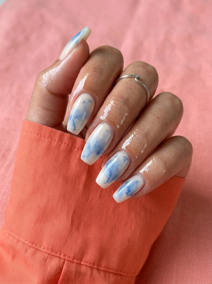
The blue bleeds and softens like watercolor on wet paper.
Overview:
Blue marble nails are common. Blue marble nails that actually look like watercolor rather than someone smearing blue paint around are rare. This design achieves that distinction through the base choice. The milky, semi-sheer white lets the blue swirls sink into the nail rather than sitting on top of it. The effect is closer to ink dropped into a glass of water than to paint applied with a brush.
The blue itself is a soft, slightly dusty shade, not a saturated royal or a deep navy. That restraint is what makes the watercolor illusion work. A darker blue would create hard edges where it meets the white, destroying the soft, bleeding quality that defines the design.
Every nail looks different, and that variety is intentional. The marble technique naturally produces unpredictable results. Trying to match nails defeats the purpose. Embrace the randomness and you'll end up with a set that looks organic and effortless.
Design Breakdown:
Wet-on-wet watercolor marble. The soft, diffused edges are the entire point.
Base Color: Semi-sheer milky white. Two coats for a translucent canvas that lets the blue bleed through.
Nail Shape: Almond. The rounded shape enhances the organic, flowing quality of the marble.
Design Element: Soft, diffused blue swirls that bleed into the white base. No hard edges. Each nail has a unique pattern.
Finish: High-gloss top coat. The shine creates a glass-like surface that enhances the watercolor effect.
Get The Look at Home:
This technique requires working on a wet surface and accepting that control is limited.
- Milky base: Two coats of semi-sheer white. Let dry.
- Wet layer: Apply a thin third coat. Do not let it dry. This is where the magic happens.
- Drop the blue: Using a small brush or toothpick, place two to three drops of soft blue onto the wet surface. Watch them spread.
- Guide, don't force: Use a clean toothpick to gently guide the blue into swirl patterns. Two or three light drags per nail. The less you touch it, the better it looks.
- Let it self-level: Don't touch the nail for at least three minutes. The blue will continue to diffuse during this time.
- Top coat: Apply after the design is fully set. The watercolor effect is fragile when wet.
11.Gold Leaf Flakes on Sheer Nude
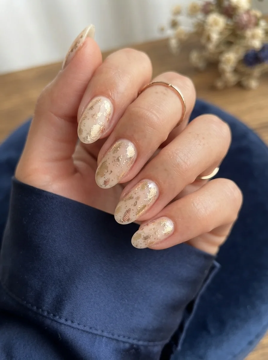
Real gold leaf catches light differently than metallic polish ever could.
Overview:
Gold leaf nails look effortless in photos but require actual technique to execute. The flakes are fragile, they stick to everything including your fingers, and getting them to lay flat against the nail curve takes patience. The result, though, is worth the frustration. Real gold leaf reflects light in a way that metallic polish can't replicate. It shatters and fragments, creating hundreds of tiny reflective surfaces that shift as you move your hand.
The sheer nude base is the right partner for gold leaf. An opaque base would compete with the flakes for attention. The translucency here lets your natural nail show through, which makes the gold feel like it's floating on your skin rather than sitting on a painted surface.
This is the kind of manicure that works for literally any occasion. It's neutral enough for a Monday meeting and special enough for a Saturday night. The gold adds just enough visual interest to elevate bare nails without committing to a specific color or pattern.
Design Breakdown:
Real gold leaf over sheer nude. The key is random, organic placement rather than uniform distribution.
Base Color: Sheer nude or milky pink. One to two coats for a barely-there wash of color.
Nail Shape: Almond. The classic, versatile shape matches the timeless quality of gold leaf.
Design Element: Irregular gold leaf flakes pressed into the tacky polish layer. Vary the density from nail to nail.
Finish: High-gloss top coat. Two coats to fully encapsulate the gold leaf texture.
Get The Look at Home:
Gold leaf is messier than you expect. Work on a protected surface and have tweezers ready.
- Base coat: One coat of sheer nude. Let it dry until tacky but not fully set. You need the surface sticky enough for the leaf to adhere.
- Place the leaf: Using tweezers or a dry brush, pick up small pieces of gold leaf and press them onto the nail. Don't try to place them perfectly. Random looks better.
- Press flat: Use a soft, dry brush to press the leaf flat against the nail surface. Gold leaf that sticks up will catch on things and peel off.
- Dust away excess: The leaf that didn't adhere will flake off. Brush it away gently.
- Encapsulate: Apply two thick coats of top coat, letting the first dry before the second. This seals the leaf edges and prevents lifting.
35 Palm Tree Nail Art Ideas that are the Most Iconic Nail Art Designs 🌴✨
12.Neon French Tip Rainbow Nails
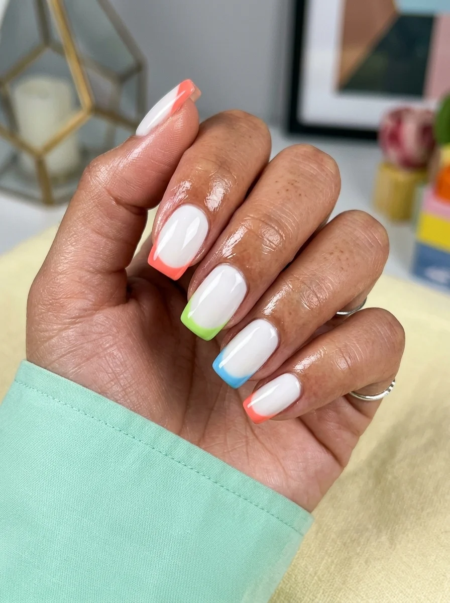
The classic French tip gets a summer upgrade with neon color blocking.
Overview:
The French manicure has been reinvented so many times it's hard to imagine a fresh take. But switching the white tip for neon colors manages to feel both familiar and unexpected. The base is clean white, the tips are neon orange, lime green, and sky blue, and each nail features a different color. It's a French tip that doesn't take itself too seriously.
The neon colors are bright without being obnoxious. They're concentrated on the tips only, which limits the visual impact. If these same colors covered the entire nail, the effect would be overwhelming. At the tip, they read as playful accents rather than a full commitment to neon.
The coffin shape is the right choice for this design. The flat, wide tip gives each neon color enough surface area to register visually. On a pointed shape like stiletto, the tip would be too narrow and the color would barely be visible.
Design Breakdown:
Colorful French tips with a clean white base. The neon works because it's limited to the tip area.
Base Color: Opaque white. Two coats for clean, even coverage.
Nail Shape: Coffin. The wide, flat tip showcases each color clearly.
Design Element: Neon-colored French tips. Each nail features a different neon: orange, lime green, or sky blue. The smile line should be crisp and uniform.
Finish: High-gloss top coat. The shine makes the neons pop against the white.
Get The Look at Home:
Neon polishes are usually sheer, so the tips will need more coats than the white base.
- White base: Two coats of opaque white. Let dry fully.
- Tip guides: Apply French tip sticker guides across each nail. This keeps the smile line clean.
- Neon tips: Paint each tip with its designated neon color. Apply three thin coats for full opacity. Neon pigments are notoriously sheer.
- Remove guides: Peel the guides while the last coat is still wet to get the sharpest line.
- Top coat: Apply two coats over the entire nail to seal the French line and smooth the texture difference between the white base and the built-up neon tips.
13.Deep Green and Gold Foil Nails
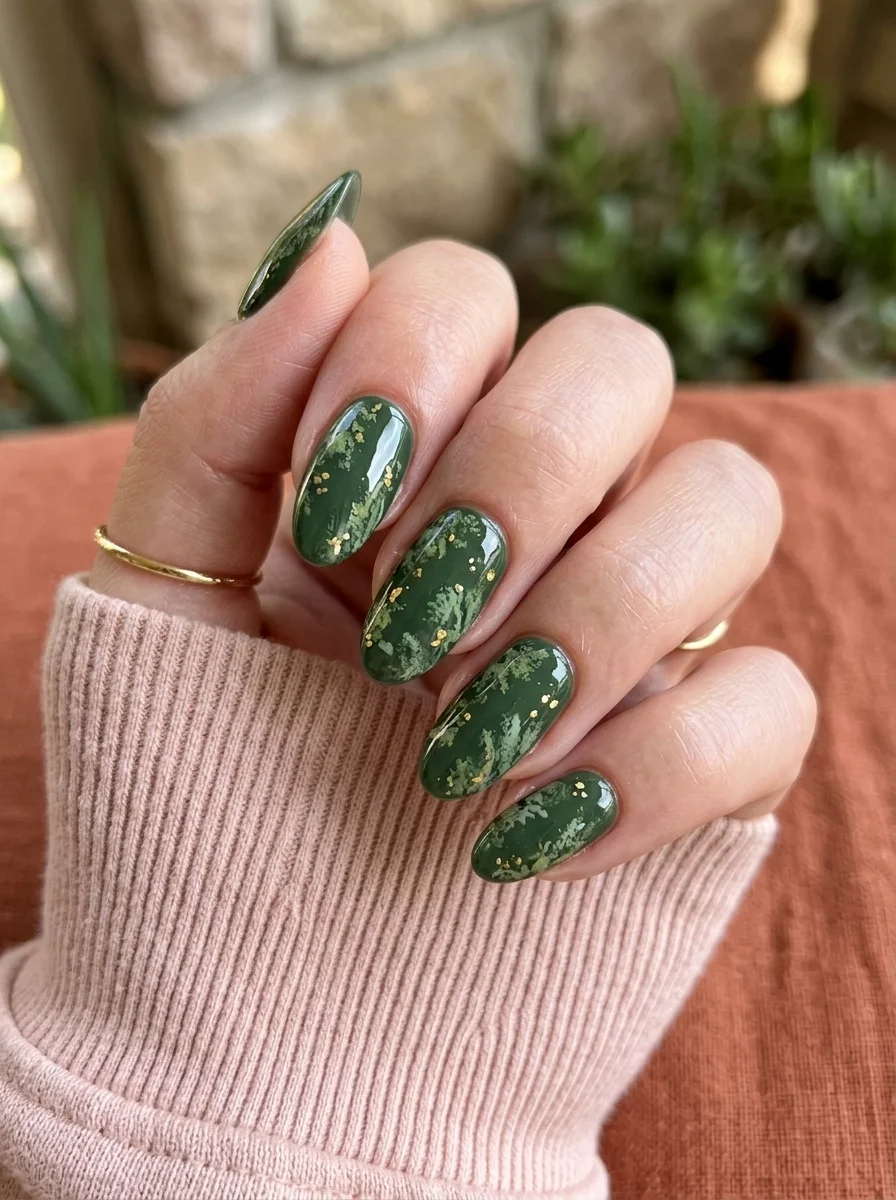
Forest floor richness with scattered gold that catches light unexpectedly.
Overview:
Dark green nail polish has a moment every autumn, and for good reason. It's the color of moss, pine needles, and old money. This particular shade leans toward a warm forest green rather than a cool emerald, which makes it more wearable across different skin tones. The warmth keeps it from looking like holiday nails.
The gold accents aren't uniformly distributed glitter. They're scattered specks and irregular patches that look like flecks of gold leaf caught in the green. Some nails have more gold than others. Some have none at all. That variation keeps the design from feeling like every nail dipped in the same glitter pot.
The almond shape is working hard here. The pointed tips echo the organic, slightly wild quality of the forest green and gold combination. On a square shape, this same color palette would feel more formal and structured. The almond lets it feel natural and unforced.
Design Breakdown:
Dark green with organic gold accents. The uneven gold distribution is what keeps it interesting.
Base Color: Warm, deep forest green. Two coats for full opacity. Avoid anything with a blue undertone.
Nail Shape: Almond. The organic shape matches the nature-inspired color palette.
Design Element: Scattered gold glitter specks and irregular gold foil patches. Not every nail needs gold accents.
Finish: High-gloss top coat. The shine creates a lacquered, rich finish.
Get The Look at Home:
The gold should look randomly scattered, not carefully placed. Let gravity and chance do some of the work.
- Green base: Two coats of deep forest green. Let dry fully.
- Select gold accents: Choose which nails will have gold and which will stay solid green. Two to three nails per hand is plenty.
- Apply gold: Using a dry brush, pick up small amounts of gold glitter or gold leaf flakes and press them onto the green base. Random placement looks best.
- Press flat: Use a soft brush to press any raised gold pieces flat against the nail surface.
- Seal: Two coats of top coat to fully encapsulate the gold texture and prevent anything from catching on fabric.
28 Stunning Baddie Summer Hairstyles for 2026 🔥☀️
14.Orange and White Color Block Nails
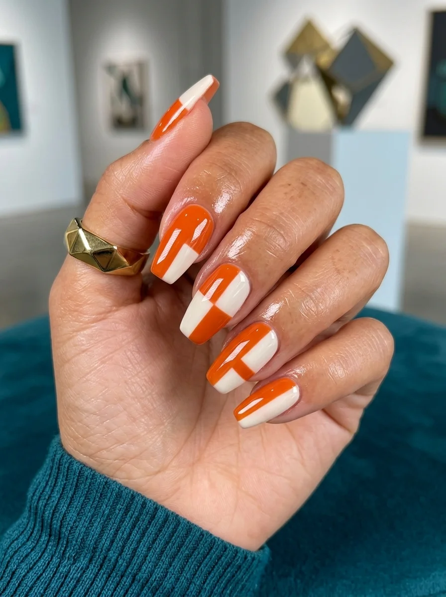
Bold geometric blocks that look like abstract architecture on your nails.
Overview:
Orange and white is a combination that screams summer, but most interpretations lean too hard into the citrus aesthetic. This design takes a different approach. The color blocking is geometric and architectural, with diagonal splits, rectangular blocks, and asymmetric sections. It looks more like Mondrian than like an orange grove.
The orange is a true, saturated orange with no yellow or red bias. It's the color of a traffic cone or a construction sign, which sounds garish in theory but looks surprisingly sophisticated against the crisp white. The high contrast between the two colors creates a clean, graphic quality that photographs beautifully.
The coffin shape serves this design well. The wide, flat surface gives the geometric blocks room to establish themselves. On a narrow or rounded shape, the same blocks would feel cramped and lose their impact.
Design Breakdown:
Geometric color blocking with a high-contrast two-tone palette. The shape of each block varies across nails.
Base Color: Opaque white. Two coats for full, even coverage.
Nail Shape: Long coffin. The wide canvas showcases the geometric patterns clearly.
Design Element: Bold geometric blocks in bright orange. Each nail features a different arrangement: diagonal splits, rectangles, asymmetric sections.
Finish: High-gloss top coat. The shine makes the color blocks look lacquered and precise.
Get The Look at Home:
Tape is your best friend here. Freehand geometric lines rarely look intentional.
- White base: Two coats of opaque white. Let dry completely.
- Map your blocks: Use thin striping tape or painter's tape to mark where the orange sections will go. Plan different layouts for each nail.
- Paint the orange: Fill in the taped-off sections with bright orange polish. Two thin coats for full opacity.
- Remove tape: Peel the tape while the last coat is still wet for the sharpest edges.
- Clean the lines: Use a small brush dipped in acetone to sharpen any edges that bled under the tape.
- Seal: Two coats of top coat to level the surface where the two colors meet.
15.Mixed Metal French Tips
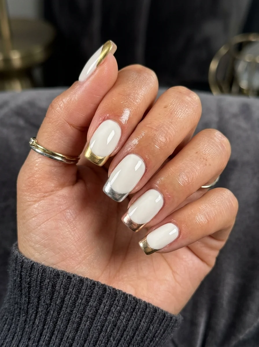
Gold and silver French tips that prove mixing metals is a power move.
Overview:
The old rule about not mixing gold and silver jewelry has been dead for years, but nail art hasn't gotten the memo yet. This design finally addresses it. Some nails have gold French tips, others have silver. The white base keeps everything grounded, and the mixed metals create an interesting visual tension that matched metals don't achieve.
The metallic tips are painted rather than applied with chrome powder, which gives them a slightly softer, more liquid appearance. They catch light like polished metal rather than like a mirror. That distinction matters. Chrome tips can look plasticy. These look like actual metal was melted onto the nail edge.
The milky white base is doing important work. An opaque white would create a harder boundary between base and tip. The semi-sheer quality here softens that transition and makes the metallic tips look like they're emerging from the nail rather than sitting on top of it.
Design Breakdown:
Alternating gold and silver French tips over a milky white base. The mixed metals create visual interest.
Base Color: Semi-sheer milky white. Two coats for a soft, translucent base.
Nail Shape: Coffin. The flat tip gives the metallic French a clean, modern edge.
Design Element: Metallic French tips alternating between gold and silver on different nails. Two to three nails per metal.
Finish: High-gloss top coat. The shine amplifies the metallic quality of both metals.
Get The Look at Home:
Alternating metals means planning your color order before you start. The pattern should feel balanced, not random.
- Milky base: Two coats of semi-sheer white. Let dry.
- Plan your metals: Decide which nails get gold and which get silver. Alternate or group them, but make a choice before you start painting.
- Gold tips first: Using a French liner brush and gold metallic polish, paint the smile line from sidewall to center on each gold nail. Two thin coats for full coverage.
- Silver tips: Repeat the process with silver metallic polish on the remaining nails. Clean the brush between metals.
- Clean the smile line: Use a flat brush dipped in acetone to sharpen the French line on each nail. This step is critical on a sheer base.
- Seal: Two coats of top coat over the entire nail.
28 Trendy May Nail Designs for 2026 💅
16.Dark Purple and Cream Color Block Nails
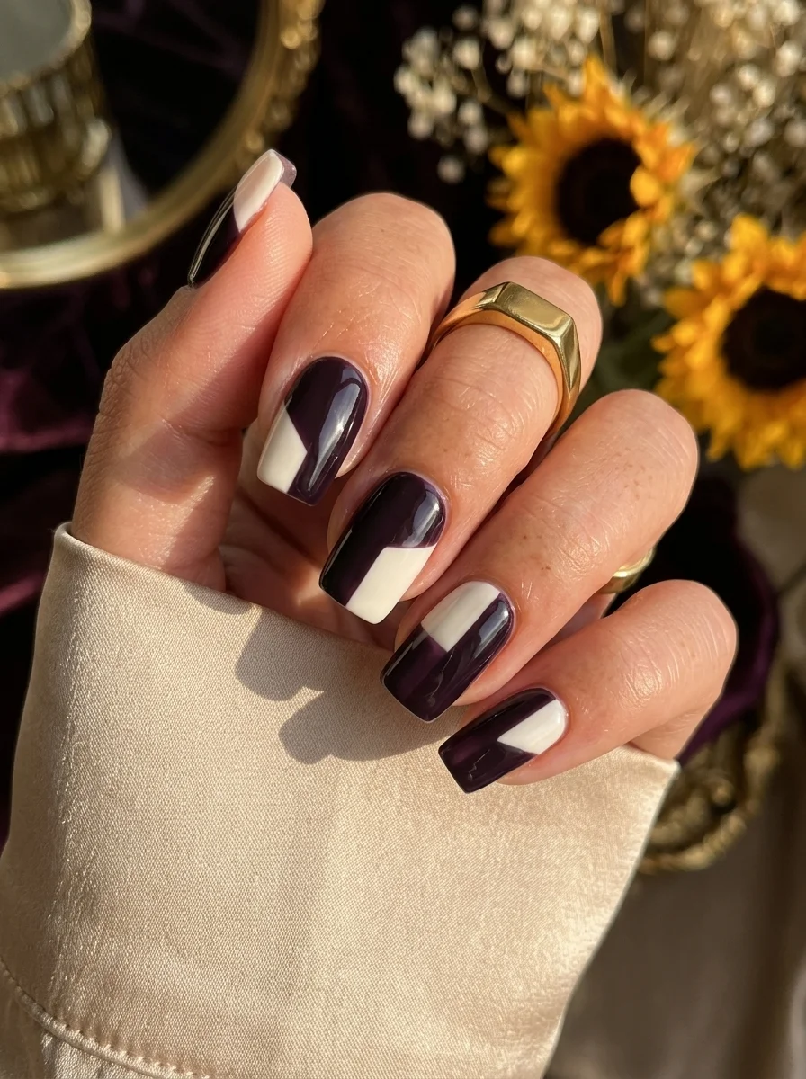
Split-tone color blocking that creates drama through contrast alone.
Overview:
Two-tone nails are simple in concept but hard to execute well. The challenge is getting a clean, sharp line where the two colors meet. This design nails it. The dark plum purple and the warm cream are divided by a crisp diagonal line that splits each nail into two bold sections. No blending, no gradient, just a hard, confident edge.
The color choice is what elevates this beyond a basic two-tone. Dark plum is rich and moody without being full black. The cream is warm enough to complement the purple's undertones rather than clashing with them. Together, they feel autumnal and sophisticated without leaning into seasonal clichés.
The diagonal split is more visually interesting than a horizontal or vertical divide. It creates a sense of movement and direction on each nail, with the eye following the line from one corner to the other. The asymmetry keeps the design dynamic even though it's just two flat colors.
Design Breakdown:
Clean diagonal color block with a hard edge between the two tones. The sharpness of the line determines the quality of the whole design.
Base Color: Warm cream. Two coats for full opacity.
Nail Shape: Square. The geometric nail shape complements the geometric color blocking.
Design Element: Diagonal split in dark plum purple. The angle should be consistent across all nails for a cohesive look.
Finish: High-gloss top coat. The shine makes the colors look richer and the dividing line sharper.
Get The Look at Home:
The diagonal line needs to be consistent from nail to nail. Use a guide to keep the angle uniform.
- Cream base: Two coats of warm cream. Let dry fully.
- Tape the diagonal: Place a strip of thin tape diagonally across each nail, from one corner to the opposite side. The angle should be the same on every nail.
- Purple section: Paint the exposed section with dark plum purple. Two thin coats for full coverage.
- Remove tape: Peel while the purple is still wet. The line should be clean and sharp.
- Touch up: If the line bled under the tape, use a small brush dipped in acetone to clean it up.
- Seal: Top coat over the entire nail to level the surface where the two colors meet.
17.Gold Crescent Moon Reverse French Nails
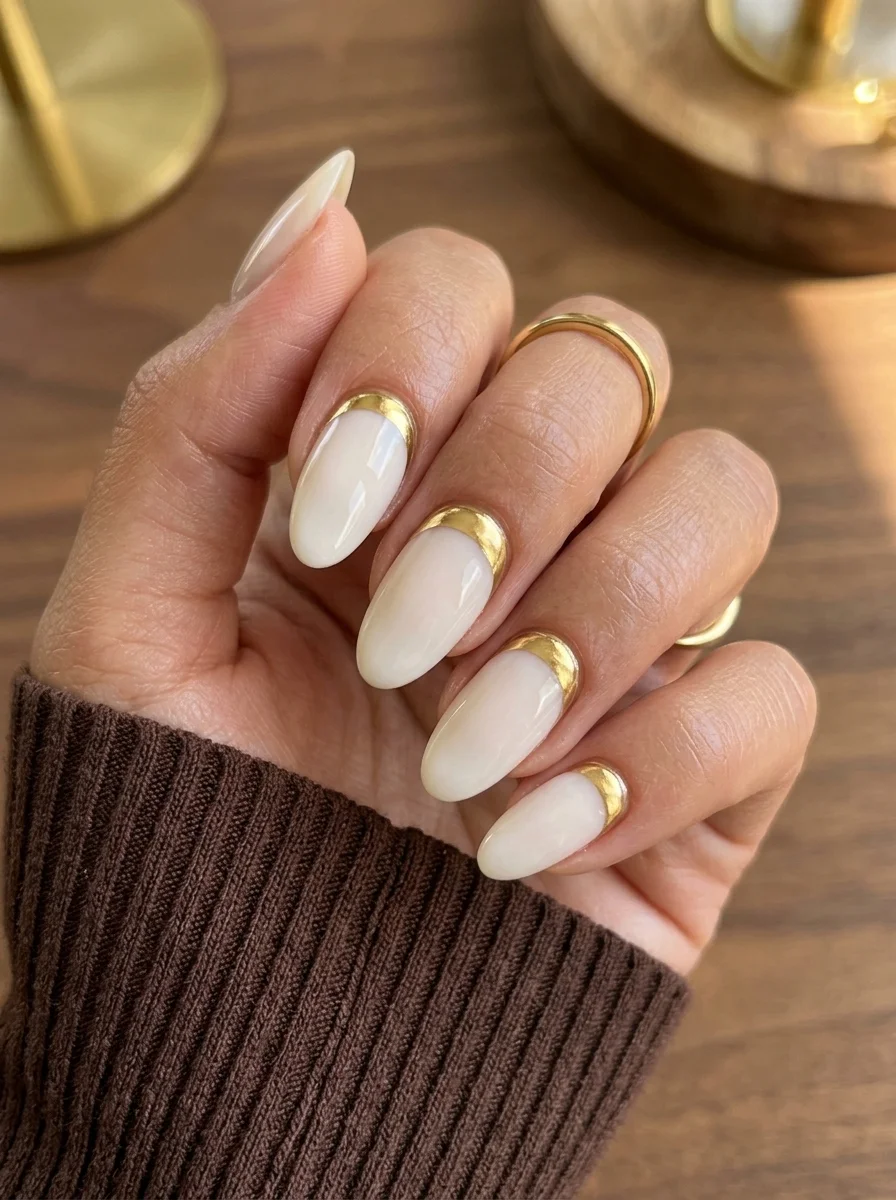
The French tip flips to the cuticle with a gold crescent that catches every light source.
Overview:
The reverse French manicure has been gaining traction for a while now, but most versions use the same white or nude as a traditional French, just moved to the cuticle. This gold crescent version is more interesting. The gold sits at the base of the nail like a half-moon, creating a visual weight at the bottom that traditional French tips place at the top.
The crescent shape follows the natural curve of the cuticle, which makes the gold look like it belongs there rather than being arbitrarily placed. It's a design that works with your nail's anatomy instead of against it. The milky white base above the crescent provides enough contrast for the gold to read clearly without competing for attention.
This is a surprisingly practical design. The gold is concentrated at the cuticle area, which means as your nails grow out, the gap between the gold and your skin actually enhances the crescent shape instead of ruining the design. You get an extra few days of wear compared to a traditional French tip.
Design Breakdown:
Gold crescents at the cuticle on a milky base. The reverse French placement grows out more gracefully than a traditional tip.
Base Color: Semi-sheer milky white. Two coats for a soft, translucent base.
Nail Shape: Almond. The rounded cuticle area complements the crescent shape perfectly.
Design Element: Gold metallic crescent shapes at the cuticle. The crescent should follow the natural cuticle curve with a consistent width.
Finish: High-gloss top coat. The shine makes the gold look like molten metal.
Get The Look at Home:
The crescent shape needs to follow your cuticle line exactly. A mismatched curve looks sloppy.
- Milky base: Two coats of semi-sheer white. Let dry fully.
- Mark the crescent: Using a white eyeliner pencil, lightly trace the curve where the gold crescent will go. This gives you a guide to follow.
- Paint the gold: Using a small brush and gold metallic polish, fill in the crescent area. Two thin coats for full opacity.
- Smooth the edge: Use a clean brush to sharpen the upper edge of the crescent where it meets the white base. The curve should be smooth and continuous.
- Top coat: Two coats to seal the gold and level the surface.
26 Stunning Summer Braided Hairstyles for Women 2026 ☀️💇♀️
18.Memphis Style Color Block Nails
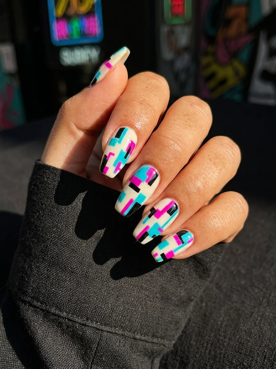
1980s Memphis design energy in a wearable, modern interpretation.
Overview:
Memphis design is having a revival, and it's about time nail art caught up. This set takes the key elements of the style: bold color blocking, geometric shapes, high contrast, and a playful disregard for symmetry. The palette is teal, hot pink, and black over white, which is about as Memphis as it gets without literally being a Sottsass lamp.
What makes this work as nail art (rather than just a design exercise) is the restraint in the individual patterns. Each nail has two to three geometric shapes, not seven. The white base provides breathing room between the colors. If the entire nail were covered in Memphis patterns, it would feel like a costume. The white space keeps it wearable.
The color choices are period-accurate but not dated. Teal and hot pink together could feel very 1990s, but the black accents ground everything and push the palette toward something more architectural and intentional.
Design Breakdown:
Memphis-inspired geometric blocks with white breathing room. The patterns vary from nail to nail.
Base Color: Opaque white. Two coats for a clean, bright canvas.
Nail Shape: Coffin. The flat, angular shape suits the geometric design language.
Design Element: Geometric blocks in teal, hot pink, and black. Each nail features a different arrangement of rectangles, triangles, and L-shapes.
Finish: High-gloss top coat. The shine makes the colors look saturated and the edges sharp.
Get The Look at Home:
This design requires planning. Map out each nail's pattern on paper before you start painting.
- White base: Two coats of opaque white. Let dry fully.
- Tape your shapes: Use thin striping tape to mark the edges of each geometric block. Plan different layouts for each nail.
- Paint one color at a time: Start with black, then teal, then hot pink. Let each color dry before moving to the next to prevent bleeding.
- Remove tape between colors: Peel the tape after each color application to keep lines clean. Re-tape for the next color.
- Check the balance: Before sealing, look at all five nails together. The overall effect should feel balanced, not heavy on one side.
- Seal: Two coats of top coat to level the surface where the colors meet.
19.Green Leafy Vine Nails
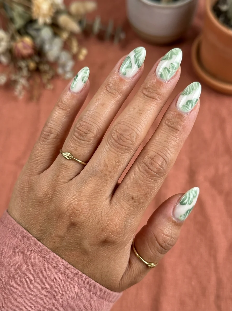
Vine-like greenery that wraps naturally across a clean white canvas.
Overview:
Green leaf nail art can go wrong fast. Too many leaves and it looks like a fern. Too few and it looks like a mistake. This design finds the middle ground by using a single vine structure that wraps across each nail with leaves branching off at irregular intervals. The pattern feels organic, like a climbing plant finding its way across a white wall.
The green is a medium, slightly muted shade that reads as natural foliage rather than neon or pastel. The white base keeps everything fresh and clean, letting the leaf pattern dominate visually without competing colors pulling attention away from the greenery.
Each nail has a slightly different vine arrangement, which is the right choice. Identical patterns on all five nails would feel mechanical and stamped. The variation here makes it feel like the vine is growing across your hand rather than being applied to it.
Design Breakdown:
Organic vine patterns with natural leaf placement. The variation between nails is intentional and important.
Base Color: Opaque white. Two coats for a clean, even canvas.
Nail Shape: Almond. The organic shape suits the botanical design.
Design Element: Green vine patterns with small leaves. Each nail has a unique vine arrangement that wraps across the surface.
Finish: High-gloss top coat. The shine makes the leaves look fresh and vibrant.
Get The Look at Home:
The vine structure should feel like one continuous plant growing across your hand. Start with the main stem and branch from there.
- White base: Two coats of opaque white. Let dry fully.
- Main vine: Using a thin liner brush and green polish, paint a single curved line across each nail. Vary the starting point and direction on each nail.
- Add leaves: Using the same green, paint small leaf shapes branching off the main vine. Each leaf is two small curved strokes meeting at a point. Three to five leaves per nail.
- Vary the leaves: Make some leaves slightly larger, some slightly smaller. Perfectly uniform leaves look artificial.
- Top coat: One generous coat to seal the design and smooth any texture from the hand-painted elements.
30 Stunning July Nail Designs for Summer 2026 💅
20.Pink Bow Accent Nails
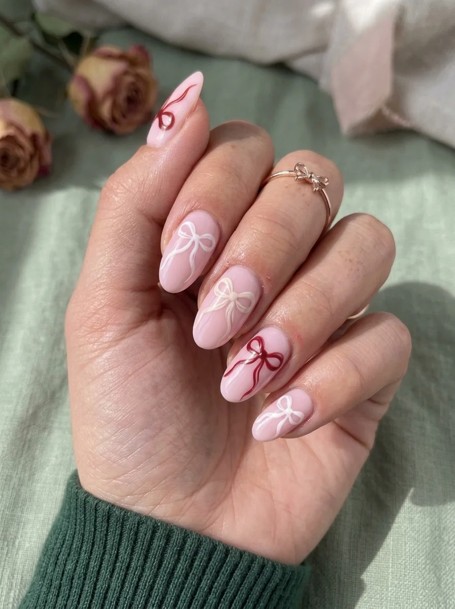
Dainty bows that feel feminine without tipping into costume territory.
Overview:
Bow nail art has a reputation for looking like a five-year-old's birthday party. The trick to avoiding that is keeping the bows small, the placement intentional, and the color palette tight. This design does all three. The bows are modest in size, scattered across the nails rather than centered on every one, and rendered in just two colors: white and a deep, wine red.
The soft pink base is the right call for this design. A nude would make the bows feel too stark. A bright pink would compete with them. This particular pink is barely there, just enough color to feel deliberate without establishing itself as the star of the show.
The ribbon trails on the thumb add movement and keep the bows from feeling like isolated stickers. They connect the design to the nail itself, making it feel like a painted illustration rather than a decal applied after the fact.
Design Breakdown:
Delicate hand-painted bows on a soft pink base. The ribbon trails add movement and prevent the design from feeling static.
Base Color: Soft, milky pink. Two coats for a gentle wash of color.
Nail Shape: Almond. The feminine shape complements the bow motif.
Design Element: Small hand-painted bows in white and deep red. Two to three bows per nail, with ribbon trails on select nails.
Finish: High-gloss top coat. The shine keeps the bows looking fresh.
Get The Look at Home:
The bow shape is simple but requires a steady hand. Practice the motion on paper before touching the nail.
- Pink base: Two coats of soft pink. Let dry fully.
- Map the bows: Using a white eyeliner pencil, lightly mark where each bow will go. Space them out so they don't crowd each other.
- Paint the bows: Using a thin liner brush and white or red polish, paint each bow as two small loops meeting at a center dot. Add tiny ribbon tails trailing from the center.
- Vary the colors: Alternate white and red bows across the nails. Don't put both colors on the same nail unless you want a more complex look.
- Top coat: Seal with two coats to protect the hand-painted details.
21.Pastel Swirl Abstract Nails
Pastel swirls that move across the nail like silk ribbons in water.
Overview:
Pastel nail art often reads as juvenile, mostly because the colors are usually applied in uniform blocks that look like Easter eggs. This design avoids that trap by using the pastels as thin, flowing lines rather than solid fills. Lavender, mint green, and a whisper of gold move across the white base in loose, organic swirls that feel like ribbons caught in a breeze.
The line work is the star here. Each swirl is a single, confident stroke that varies in thickness as it moves across the nail. The effect is closer to calligraphy than to coloring. That quality lifts the pastels out of the "cute" category and into something more artistic and considered.
The white base is essential. It provides the clean, neutral backdrop that lets each pastel color read clearly. On a nude or pink base, the lavender and mint would blend into the background and lose their individuality.
Design Breakdown:
Thin, flowing lines in pastel colors over white. The brush technique creates natural thickness variation.
Base Color: Opaque white. Two coats for a clean, bright canvas.
Nail Shape: Almond. The curved shape complements the flowing lines.
Design Element: Thin swirl lines in lavender, mint green, and gold. Each line varies in thickness and follows a loose, organic path.
Finish: High-gloss top coat. The shine adds depth to the layered lines.
Get The Look at Home:
The key is loading your brush with enough polish for a single, long stroke. Running out mid-swirl creates obvious seams.
- White base: Two coats of opaque white. Let dry fully.
- Plan the flow: Decide which direction each swirl will move on each nail. The most natural pattern is swirls that enter from one side and exit from the other.
- First color: Using a long liner brush loaded with lavender polish, paint a single flowing swirl across the nail. Vary the pressure to change line thickness.
- Second color: Repeat with mint green, following a different path. The lines should cross or run alongside each other without blending.
- Gold accent: Add one or two thin gold lines for metallic contrast. These should be thinner than the pastel lines.
- Seal: Two coats of top coat to smooth the surface and protect the fine lines.

26 Quick Hairstyles for a Waitress Job (2026)
22.Burberry-Style Plaid Nails
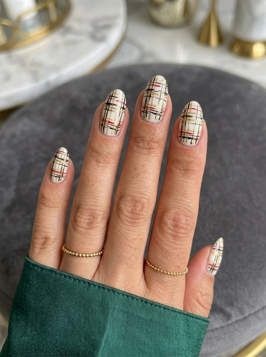
The iconic plaid pattern translated to nails with precise, layered line work.
Overview:
The Burberry check is one of the most recognizable patterns in fashion, and translating it to nails is a bold choice. This design earns the comparison. The base is a warm cream, the black lines are crisp, and the red and white accents are placed with the precision you'd expect from the actual fabric pattern. It doesn't look like a cheap knockoff. It looks like the pattern was designed for nails.
The line layering is the technical challenge here. The black grid goes on first, then the thinner red lines, then the white accent lines. Each layer needs to be fully dry before the next goes on, or the colors bleed into each other and the pattern loses its crispness. The designer clearly took their time.
The cream base (not white) is a critical choice. White would make the pattern feel stark and modern. The cream gives it the warmth and softness that makes the Burberry check feel luxurious rather than graphic.
Design Breakdown:
Layered plaid built in stages. The order of the lines determines the final look.
Base Color: Warm cream. Two coats for a soft, even foundation.
Nail Shape: Almond. The slightly elongated shape gives the plaid room to develop.
Design Element: Layered plaid in black (widest), red (medium), and white (thinnest). The lines cross at right angles to create the classic check pattern.
Finish: High-gloss top coat. The shine adds richness to the warm color palette.
Get The Look at Home:
Patience is the only way to get this right. Each layer must be completely dry before the next.
- Cream base: Two coats of warm cream. Let dry fully.
- Black grid: Using a thin liner brush, paint the widest lines first. Two vertical, two horizontal, evenly spaced. Let dry completely, at least five minutes.
- Red accents: Paint thin red lines parallel to the black lines, slightly offset from center. Let dry fully.
- White details: Using the thinnest brush you have, add white lines that cross through the center of the grid squares. These should be the thinnest lines in the pattern.
- Check your work: Look at all five nails together. The pattern should feel consistent across the set.
- Seal: Two coats of top coat to smooth the ridges created by the multiple layers of polish.
23.Gold Glitter Cuticle Gradient Nails
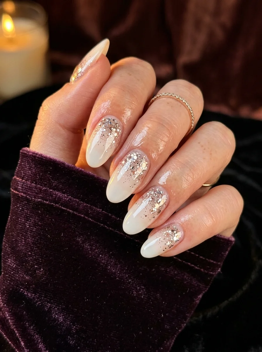
Glitter that cascades from dense to sparse, like champagne bubbles rising.
Overview:
Glitter gradients are a reliable formula, but most of them look like someone dipped their fingers in a glitter jar and called it art. This version is more considered. The gold glitter is densest at the cuticle, creating a solid band of sparkle that gradually thins out toward the tip. The transition is smooth enough that your eye can't pinpoint exactly where the solid glitter ends and the scattered specks begin.
The milky white base is the right partner for this gradient. An opaque white would create a harsh boundary where the glitter starts. The translucency here lets the glitter feel like it's emerging from within the nail rather than being layered on top of it. The effect is more organic, like natural mineral deposits in stone.
The glitter itself is a mix of fine dust and larger hexagonal pieces. The fine glitter creates the smooth gradient while the larger pieces add focal points of extra sparkle. That combination prevents the gradient from looking flat and one-dimensional.
Design Breakdown:
Dense-to-sparse glitter gradient using a sponge for the smoothest transition.
Base Color: Semi-sheer milky white. Two coats for a soft, translucent base.
Nail Shape: Almond. The curved shape enhances the cascading quality of the gradient.
Design Element: Gold glitter gradient, densest at the cuticle and fading to sparse at the tips. Mix of fine and chunky glitter for texture.
Finish: High-gloss top coat. Multiple coats to smooth the glitter texture.
Get The Look at Home:
The sponge technique creates the smoothest gradient. Brush application leaves visible start and stop marks.
- Milky base: Two coats of semi-sheer white. Let dry fully.
- Sponge setup: Paint gold glitter polish onto a makeup sponge. Concentrate it on one edge of the sponge.
- Dab the cuticle: Press the glitter-loaded edge of the sponge onto the cuticle area of each nail. Dab repeatedly to build density.
- Fade toward tips: Without reloading the sponge, continue dabbing toward the tip. The glitter will naturally thin out.
- Build layers: Repeat the process two to three times per nail, focusing the glitter density at the cuticle each time.
- Top coat: Apply three coats of top coat, letting each dry before the next. The glitter texture needs multiple coats to smooth out.
30 Trendy Summer French Tip Nail Designs for 2026 💅
24.Stained Glass French Tip Nails
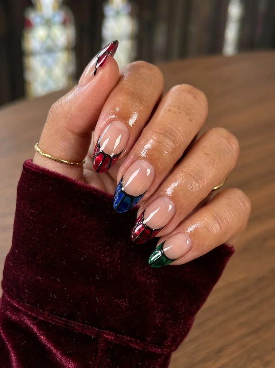
Stained glass window tips that turn each nail into miniature cathedral art.
Overview:
French tips have been reinvented hundreds of times, but this is genuinely one of the more creative interpretations. The tips are designed to look like stained glass windows, with colored sections separated by thin black outlines. Each nail features a different color combination: red, blue, and green. The effect is striking without being overwrought.
The sheer nude base is doing critical work here. It creates the illusion of transparent glass, letting the "stained glass" tips feel like they're floating at the nail edge rather than sitting on an opaque surface. The translucency mimics the way light passes through actual stained glass, which is the whole point of the design.
The black outlines are what sell the stained glass concept. Without them, these would just be colored French tips. The thin black lines between each colored section create the leaded glass framework that makes the reference instantly recognizable.
Design Breakdown:
Stained glass French tips with black leading lines. The sheer base creates the transparent glass illusion.
Base Color: Sheer nude. One to two coats for a barely-there wash that lets the natural nail show through.
Nail Shape: Almond. The curved tip area provides a good canvas for the stained glass pattern.
Design Element: French tips divided into colored sections (red, blue, green) by thin black outlines mimicking leaded glass frames.
Finish: High-gloss top coat. The shine enhances the glass illusion.
Get The Look at Home:
The black outlines must be painted first and dried before the colored sections are filled in.
- Nude base: One to two coats of sheer nude. Let dry.
- Map the tips: Using a thin liner brush and black polish, outline the French tip area and divide it into sections with thin black lines. Let dry completely.
- Fill the colors: Using a small brush, fill each section with its designated color. Work carefully to stay within the black outlines.
- Second coat on colors: The colored sections may need two coats for full opacity, especially the red and green.
- Clean the outlines: If any color bled over the black lines, use a thin brush dipped in acetone to clean them up.
- Seal: Two coats of top coat to level the surface and protect the detailed work.
25.Neon Tip French Manicure
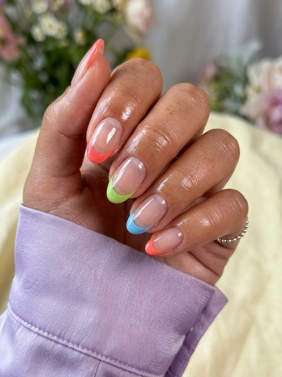
Thin neon tips on a nude base: subtlety meets electricity.
Overview:
Neon French tips on a nude base are the introvert's version of full neon nails. The color is there, but it's contained to a thin strip at the tip. It's enough to catch attention without demanding it. The nude base keeps the overall look neutral and wearable, while the neon tips add a flash of personality that rewards closer inspection.
The tip colors alternate between coral pink, lime green, and sky blue. The variety across nails keeps the design playful and prevents it from feeling too matched. Each nail has its own personality while sharing the same formula: sheer base, thin neon tip.
The almond shape works beautifully here. The pointed tip concentrates the neon color into a smaller area, which paradoxically makes it more visible than it would be on a wider shape. The eye is drawn to the point, and the neon is right there waiting.
Design Breakdown:
Thin neon French tips on a sheer nude base. The minimalism makes the neon more impactful.
Base Color: Sheer nude. One to two coats for a natural, skin-like base.
Nail Shape: Almond. The pointed tip concentrates the neon color for maximum impact.
Design Element: Thin neon French tips alternating between coral pink, lime green, and sky blue. The smile line should be thin and precise.
Finish: High-gloss top coat. The shine makes the neons look wet and vibrant.
Get The Look at Home:
The thinner the tip, the more precise you need to be. Use a liner brush, not the polish brush.
- Nude base: One to two coats of sheer nude. Let dry fully.
- Plan the colors: Decide which nails get which neon. Alternate or group them, but make the choice first.
- Thin tips: Using a liner brush and neon polish, paint a thin line across each tip. Follow the natural smile line of your nail.
- Second coat: Neon pigments are sheer. Apply a second thin line directly over the first for full opacity.
- Clean the line: Use a small brush dipped in acetone to sharpen the smile line. The contrast between nude and neon makes any imperfection visible.
- Seal: One generous coat of top coat to protect the tips.
25 Trendy Beach Day Hairstyles for Vacation 2026 ☀️🌊
26.Red, Blue, and Gold Stripe Nails
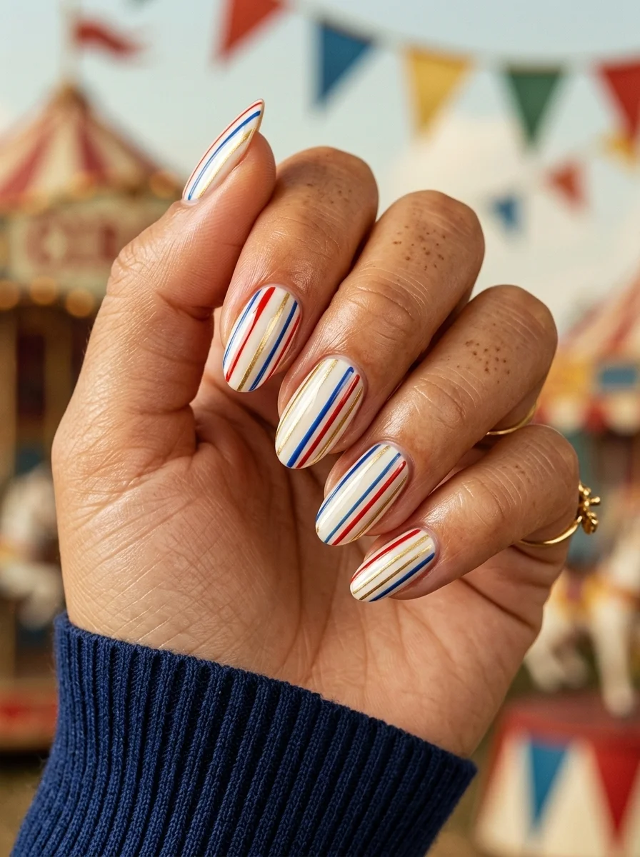
Vertical stripes that elongate the nail and add patriotic flair without the flag reference.
Overview:
Vertical stripes on nails create an elongating effect that makes fingers look longer and more slender. This design uses that principle with a three-color stripe pattern: red, blue, and gold on white. The gold is the clever addition. Without it, these would read as patriotic. With it, the palette shifts toward something more fashion-forward and less literal.
The stripe widths are consistent across all nails, which is what gives the design its clean, polished quality. Uneven stripes would make the whole thing look hand-done in a bad way. These look like they could have been manufactured, which is the compliment you want for geometric nail art.
The white base between the stripes is important. It provides visual separation between the three colors and prevents them from blending into each other. On a nude base, the stripes would lose their individual identities and the pattern would feel muddy.
Design Breakdown:
Three-color vertical stripes on white. Consistent width is what makes this look professional.
Base Color: Opaque white. Two coats for full, even coverage.
Nail Shape: Almond. The vertical stripes enhance the natural length of the shape.
Design Element: Vertical stripes in red, blue, and gold running from cuticle to tip. Consistent spacing and width across all nails.
Finish: High-gloss top coat. The shine makes the stripes look crisp and the colors saturated.
Get The Look at Home:
Use striping tape as a guide to keep the lines straight and evenly spaced.
- White base: Two coats of opaque white. Let dry fully.
- Map the stripes: Using thin striping tape, mark the edges of each stripe. Space them evenly across the nail.
- Red stripes: Paint the red sections first. Two thin coats for full opacity. Let dry.
- Blue stripes: Paint the blue sections. Two thin coats. Let dry.
- Gold stripes: Paint the gold sections. Metallic polish may need three coats for full coverage.
- Remove tape: Peel the tape carefully after the last color is dry.
- Seal: Two coats of top coat to level the surface where the different colors meet.
27.Dark Red Half-Moon Manicure
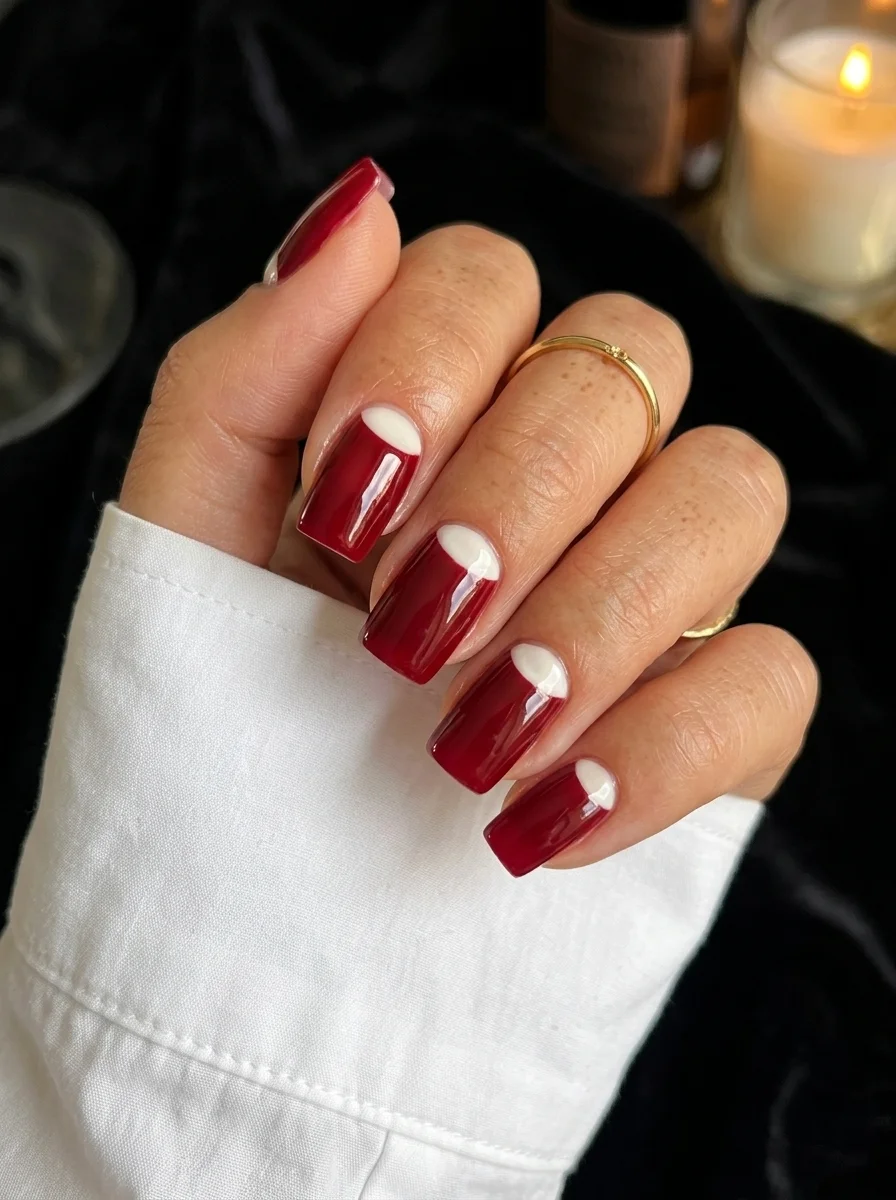
Deep burgundy with a crisp white half-moon that looks like it was cut with a stencil.
Overview:
The half-moon manicure dates back to the 1920s, when leaving the lunula (the white crescent at the base of your nail) unpainted was considered fashionable. This modern interpretation uses a white half-moon instead of bare nail, which creates a sharper, more intentional contrast against the deep red base.
The red is a true dark burgundy, the kind of shade that looks almost black in low light and reveals its wine-red depth in direct sun. This color has weight and presence. The white half-moon at the cuticle creates a clean break that prevents the dark red from overwhelming the nail. It's the visual equivalent of a deep V-neck: it opens up the design and lets it breathe.
The coffin shape gives the half-moon room to establish itself. On a narrow or rounded shape, the white crescent would be compressed and lose its impact. The flat, wide cuticle area of a coffin nail lets the half-moon spread out and read clearly from a distance.
Design Breakdown:
A vintage technique updated with modern color and shape. The white half-moon is the focal point.
Base Color: Deep burgundy red. Two to three coats for full opacity. The color should be rich enough to look almost black in dim light.
Nail Shape: Coffin. The wide cuticle area showcases the half-moon shape.
Design Element: White half-moon crescents at the cuticle. The shape should follow the natural lunula curve with a crisp, clean edge.
Finish: High-gloss top coat. The shine adds depth to the dark red and makes the white pop.
Get The Look at Home:
The half-moon needs to be symmetrical and consistent across all nails. Stickers or stencils help.
- Half-moon first: Apply half-moon sticker guides at the cuticle of each nail. Make sure they're centered and at the same height on every nail.
- Red application: Paint the exposed nail with deep burgundy red. Two to three thin coats for full opacity.
- Remove stickers: Peel the stickers while the last coat is still wet. The half-moon should be clean and white.
- Fill the half-moon: If any red bled into the crescent area, use a small brush dipped in white polish to clean it up. Two thin coats of white for full coverage.
- Sharpen the edge: Use a flat brush dipped in acetone to clean the curve where the red meets the white. This line is the entire design.
- Seal: Two coats of top coat to level the surface and add depth to the dark red.
29 Best Tropical Vacation Nails for Women in 2026 🌴
August is the month where nail art gets interesting. The pressure to match a specific seasonal mood relaxes, and you can choose designs that reflect your actual taste rather than what the calendar dictates. Whether you gravitate toward the mystical eye art, the structured geometric patterns, or the soft watercolor marbles, each of these designs is built on solid technique and honest execution.
Save the designs that catch your eye to your Pinterest boards before your next salon visit. Having a visual reference eliminates the awkward "I forgot what I wanted" moment in the chair. Your nail tech will thank you, and you will leave with exactly what you went for.