Nail Trends
28 Fall Nail Designs for an Autumn-Ready Manicure (2026)
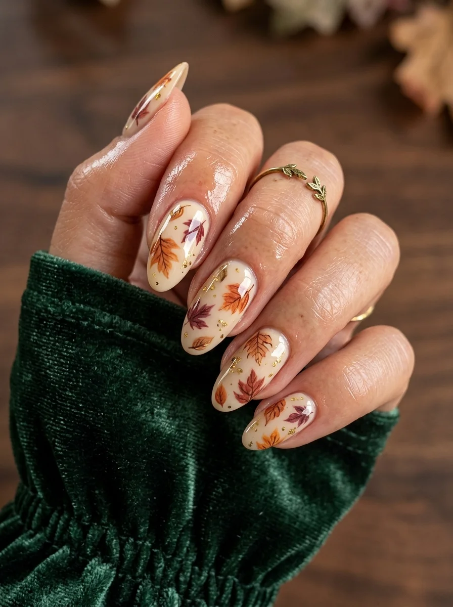
Fall nails are about warmth, depth, and texture. The palette shifts from summer's bright corals and pastels to rich burgundies, warm coppers, earthy greens, and cozy browns. These 28 designs capture everything we love about the season: autumn leaves, coffee-inspired swirls, sunflower botanicals, and just the right amount of metallic shimmer. Whether you prefer a solid color with no fuss or detailed hand-painted art, there's a fall nail design here that fits your style.
1.Mixed Animal Print
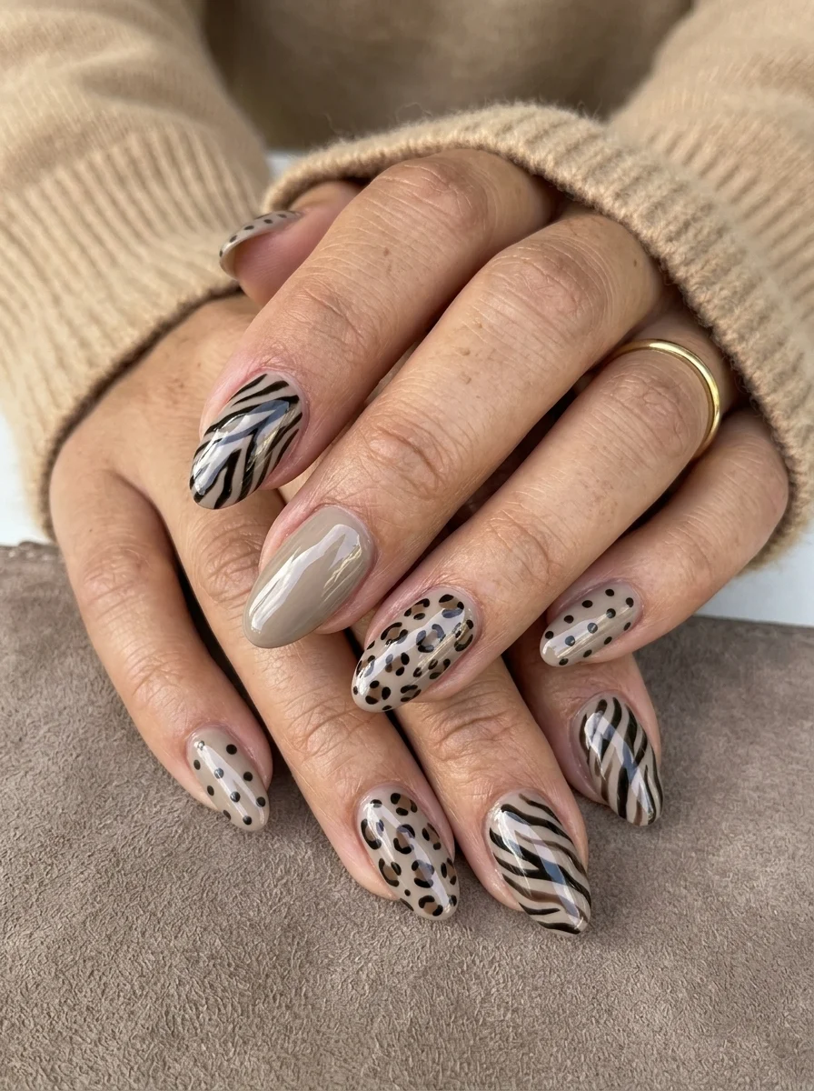
Three animal prints in one set, grounded by a neutral taupe base.
Overview:
Mixing animal prints on one hand sounds like a recipe for visual chaos. Zebra stripes next to leopard spots next to polka dots should clash. But the neutral taupe base acts as a unifying ground that lets each pattern coexist without fighting for attention. The key is that all three prints share the same black-on-neutral palette, which keeps the set feeling curated rather than random.
The design alternates which print appears on which nail, which creates a visual rhythm across the hand. Your eye moves from zebra to leopard to dots and back, picking up each pattern individually rather than processing them as a single busy surface. That alternation is what prevents the "everything at once" effect that kills most multi-print designs.
One practical note: the zebra stripes need a very thin liner brush. Thick stripes lose the organic, tapered quality that makes zebra print recognizable. Each stripe should start thin, widen slightly in the middle, and taper again at the end. Uniform-width lines read as tiger stripes, which is a different energy entirely.
Design Breakdown:
Three distinct patterns sharing a single neutral color story. The taupe base is the anchor.
Base Color: A warm, creamy taupe. Not too grey, not too brown. Something in the mushroom range.
Nail Shape: Medium almond. The tapered shape softens the bold patterns and keeps the overall look wearable.
Design Element: Black zebra stripes on the index and middle fingers. Leopard spots (irregular black circles with brown centers) on the ring finger. Small black polka dots on the thumb and pinky fingers.
Finish: High-gloss top coat to unify the three patterns under a single finish.
Get The Look at Home:
Do all the base coats first across every nail, then add each pattern type in a separate round.
- Taupe base: Two coats of opaque taupe on all nails. Let dry fully.
- Zebra stripes: Using a thin liner brush and black polish, paint tapered, slightly curved lines across the index and middle finger nails. Vary the spacing and angle of each stripe.
- Leopard spots: On the ring finger, place irregular black circles using a dotting tool. Fill the centers with a warm brown. Not every spot needs to be the same size.
- Polka dots: On the thumb and pinky finger nails, press a medium dotting tool straight down to create evenly spaced black dots.
- Consistency check: Compare the black density across all nails. If one pattern looks significantly heavier than the others, add a few more elements to balance it.
- Seal: One thick coat of top coat to smooth the texture differences between the three patterns.
28 Best Camping Hairstyles for Women That Actually Hold Up Outdoors 2026
2.Fall Leaf Watercolor
Botanical autumn leaves with scattered gold foil on a barely-there base.
Overview:
Sheer nude bases are the unsung hero of detailed nail art. They let the design sit on top of something that looks like bare nail, which gives the leaves a floating, pressed-flower quality that an opaque base would destroy. The transparency also means growth-out is nearly invisible for the first two weeks, which is a practical bonus that most people don't think about until they're three weeks in and wondering why their manicure still looks fresh.
The gold foil flakes scattered between the leaves do more than add sparkle. They create a visual bridge between the botanical elements, filling the negative space with something that catches light at different angles. Without the foil, the gaps between leaves would feel empty. With it, every nail looks complete regardless of how many leaves it carries.
The color range across the leaves is what sells the fall theme. Orange, burgundy, rust, and brown all appear within the same set, which mimics the actual color variation you'd see on a single branch in October. Using only one or two leaf colors would read as a symbol of fall. Using four or five reads as an illustration of it.
Design Breakdown:
Botanical illustration on a transparent canvas, with metallic filler between the elements.
Base Color: Sheer nude or milky pink. The natural nail should be visible through the base.
Nail Shape: Medium almond. The tapered tip echoes the pointed lobes of the leaf shapes.
Design Element: Hand-painted fall leaves in multiple autumn colors (orange, rust, burgundy, brown) with small gold foil flakes scattered between them.
Finish: High-gloss top coat to encapsulate the foil and protect the painted detail.
Get The Look at Home:
Paint all the leaves first, then add the gold foil as the final embellishment before sealing.
- Sheer base: One or two coats of milky nude. Let dry fully.
- Leaf shapes: Using a small brush, paint simple leaf outlines in autumn colors across the nails. Vary the sizes and angles. Some leaves can overlap slightly.
- Fill the leaves: Add color inside the outlines. Use two or three different autumn shades across the set for depth.
- Leaf veins: With a very thin liner brush and a darker shade of each leaf color, add a single center vein to each leaf.
- Gold foil: Using tweezers, press small, irregular pieces of gold leaf into the gaps between leaves. Flatten gently with a dry brush.
- Seal: Two coats of thick top coat. The first locks the foil in place; the second smooths the surface.
3.Burgundy Cat Eye
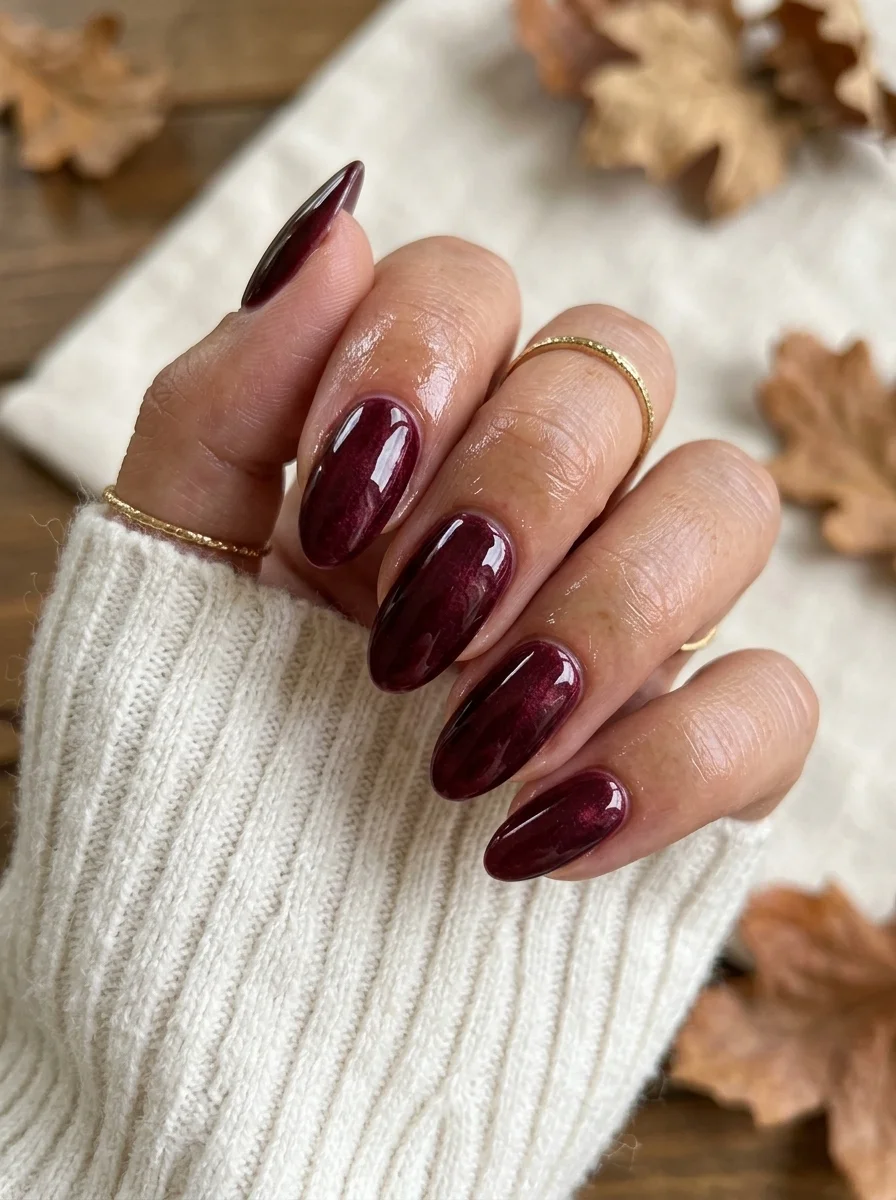
A moody, dimensional burgundy with a magnetic shimmer that shifts as you move.
Overview:
Cat-eye polish uses magnetic particles suspended in the formula to create a concentrated line of light that shifts position as your hand moves. In this deep burgundy, the effect reads as a glowing vein of crimson running through dark wine. It gives the color a depth that flat crome polishes simply cannot achieve, no matter how many coats you apply.
The magnetic shimmer is subtle under indoor lighting but transforms dramatically in direct sunlight. Under fluorescent office lights, these read as a dark, sophisticated burgundy. In sunlight, the cat-eye band ignites and the nail looks almost three-dimensional. That dual personality is what makes cat-eye polish worth the extra step of using a magnet during application.
The practical challenge with cat-eye formulas is magnet placement. Hold the magnet too far away and the particles don't concentrate enough to form a sharp line. Too close and you risk touching the wet polish. Three to five millimeters above the nail surface, held steady for ten to fifteen seconds, is the sweet spot. If the line looks diffuse after the first pass, you can re-magnetize before the polish sets.
Design Breakdown:
Single-color magnetic polish. The cat-eye effect IS the design.
Base Color: Deep burgundy or wine-red cat-eye magnetic polish. Two coats are usually sufficient for full opacity.
Nail Shape: Medium almond. The curved surface gives the magnetic light band room to travel across the nail.
Design Element: None beyond the magnetic shimmer. The cat-eye band provides all the visual interest.
Finish: High-gloss top coat. The shine amplifies the magnetic effect and deepens the burgundy.
Get The Look at Home:
You need a strong magnet specifically designed for nail art. A regular fridge magnet won't concentrate the particles enough.
- Base coat: Apply a standard base coat and let it dry completely.
- First coat: Apply a thin layer of burgundy cat-eye polish. Let it dry for two minutes.
- Second coat and magnet: Apply the second coat. Immediately hold the magnet 3-5mm above the nail surface, angled to create a diagonal light band. Hold steady for 10-15 seconds.
- Repeat on each nail: Work one nail at a time. The polish needs to be wet when you magnetize it.
- Cure or dry: If using gel cat-eye, cure under a UV lamp. Regular polish needs at least five minutes of air drying.
- Top coat: One thick coat of glossy top coat. Don't go back over the same area or you risk shifting the magnetic particles.
22 Office Nail Designs That Are Professional But Never Boring
4.Burgundy Heart Accents
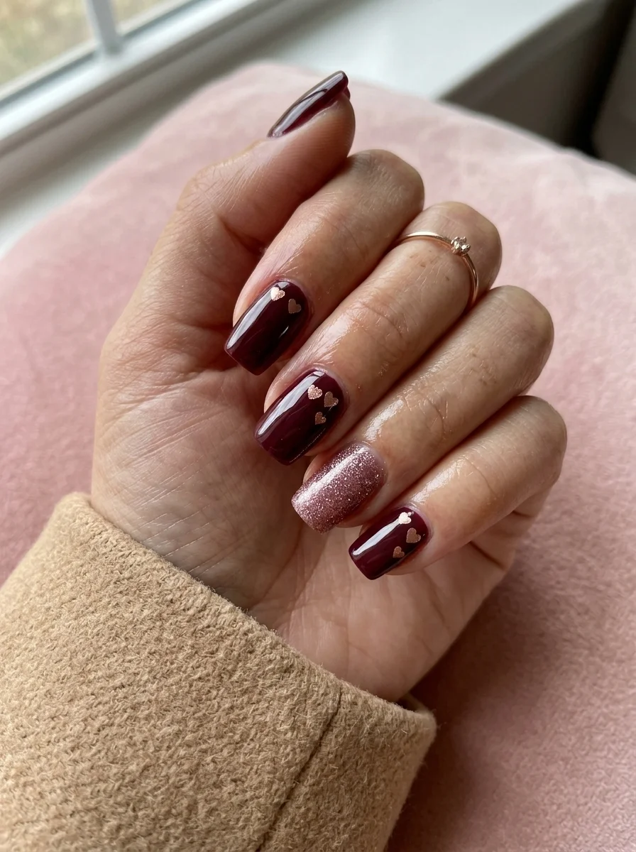
Rich wine tones paired with rose gold hearts for a romantic fall set.
Overview:
Deep burgundy and rose gold is a pairing that works because the two colors share warm undertones. The burgundy leans slightly brown rather than blue, which means the rose gold hearts sit on a color that complements rather than competes with them. On a cool-toned berry or plum, rose gold would look disconnected. On this particular burgundy, the metallic accents feel like they belong.
The ring finger glitter nail is a smart addition. Without it, you have burgundy with heart stickers, which is fine but predictable. The full rose gold glitter nail breaks the pattern and gives the set a third texture: crome, metallic foil, and loose glitter. That textural variety is what keeps the design from reading as one-note.
The hearts themselves are small enough to function as punctuation rather than illustration. Two or three per nail, placed at different angles, creates a scattered effect that feels more organic than symmetrical placement. These are tiny rose gold foil hearts, not hand-painted, which keeps the execution straightforward.
Design Breakdown:
Dark crome base with metallic foil accents and one full glitter nail. Three textures, two colors.
Base Color: Deep burgundy or wine red. Opaque in two coats.
Nail Shape: Medium square. The flat surface provides a clean canvas for the heart placement.
Design Element: Rose gold foil hearts scattered on the index, middle, and pinky fingers. Full rose gold glitter on the ring finger.
Finish: High-gloss top coat over everything. The glitter nail may need two coats of top coat to smooth the texture.
Get The Look at Home:
The foil hearts need a slightly tacky surface to adhere to. Apply them right after the color coat, before it fully sets.
- Burgundy base: Two coats on all nails. Let the first coat dry fully; leave the second coat slightly tacky.
- Heart placement: Using tweezers, press small rose gold foil hearts onto the tacky surface of the index, middle, and pinky nails. Two to three hearts per nail, scattered at random angles.
- Glitter accent: On the ring finger, apply two coats of rose gold glitter polish over the burgundy base.
- Flatten the foil: Press each heart gently with a dry brush to ensure it sits flat against the nail. Raised edges catch on things.
- Seal: Two coats of top coat. The first locks the foil in place; the second creates a smooth surface over the glitter.
5.Copper Chrome
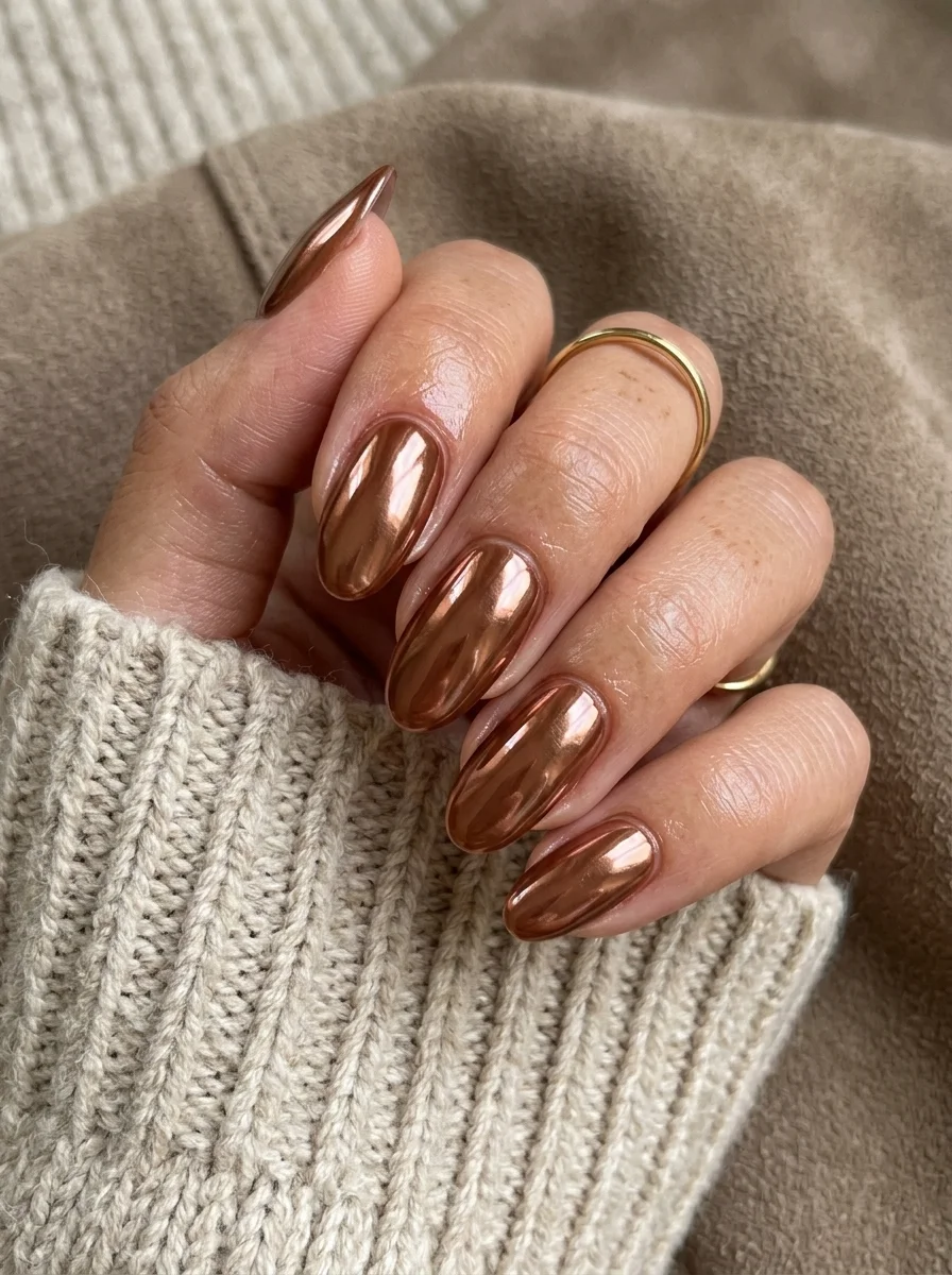
Liquid metal warmth for the days when crome polish feels too safe.
Overview:
Chrome powder over a dark base creates a mirror-like finish that regular metallic polish can't touch. The difference is in how light interacts with the surface: metallic polish scatters light in multiple directions (creating a diffuse glow), while chrome powder reflects it in a focused band (creating a true mirror effect). On these warm copper-toned nails, the result looks like liquid bronze poured over each finger.
The copper shade sits in a specific sweet spot between rose gold and true bronze. It's warm enough to read as autumnal rather than icy, but not so orange that it clashes with warm skin tones. This makes it one of the more versatile chrome options for fall. It pairs equally well with a cream sweater and jeans as it does with a black dress.
The critical application detail is the no-wipe gel top coat underneath the powder. Chrome powder only adheres to a specific surface: cured, no-wipe gel top coat. Regular polish won't give the powder anything to stick to, and you'll spend the day brushing shimmer off your hands. The top coat must be fully cured (under a UV or LED lamp) before rubbing the powder in.
Design Breakdown:
Single-color chrome finish. The mirror effect is the entire design.
Base Color: A dark brown or copper gel polish, fully cured. The base color shows through slightly at the edges and affects the final chrome tone.
Nail Shape: Medium almond. The curved surface maximizes the reflective area for the chrome.
Design Element: None. Solid chrome coverage on every nail.
Finish: Chrome powder rubbed over cured no-wipe gel top coat, then sealed with another layer of top coat.
Get The Look at Home:
This is a gel-only technique. Regular polish won't work with chrome powder because the powder needs a cured, tack-free surface.
- Dark base: Apply two coats of dark brown or copper gel polish. Cure each coat under a UV/LED lamp.
- No-wipe top coat: Apply a thin layer of no-wipe gel top coat. Cure fully (usually 60 seconds under LED).
- Rub the chrome: Using a silicone applicator or eyeshadow sponge, rub copper chrome powder onto the cured top coat. Press firmly and buff in circular motions until the surface is mirror-smooth.
- Brush off excess: Use a fluffy brush to remove loose powder from around the cuticles and sidewalls.
- Seal: Apply one coat of gel top coat over the chrome and cure. This locks the mirror finish and prevents flaking.
20 Stunning Mother of the Bride Hairstyle Ideas for 2026 💍
6.Coffee Swirl
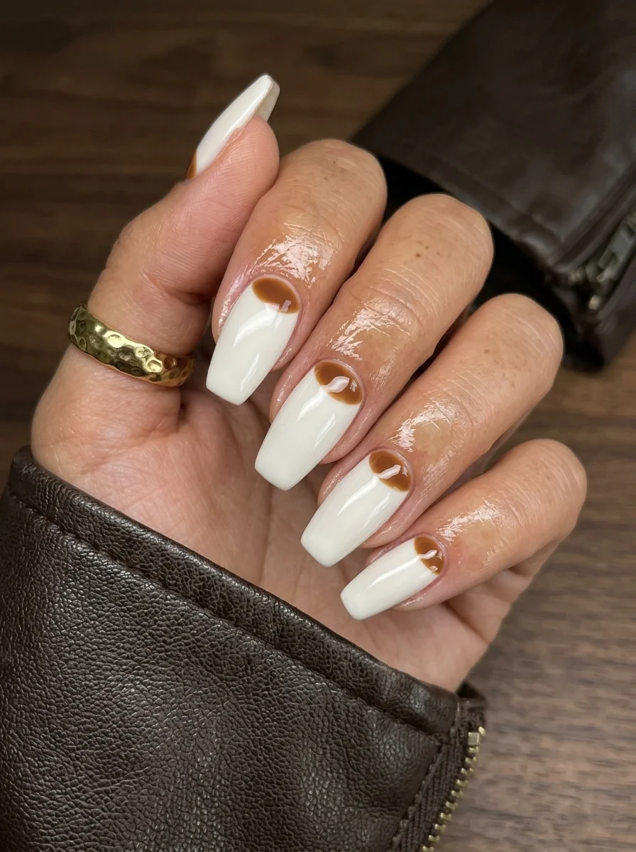
Cream and espresso swirls that look like your morning pour-over.
Overview:
Brown and white together on nails inevitably makes people think of coffee. The association is so strong that the design almost doesn't need to try. But the specific technique here, where the brown swirls concentrate at the cuticle and fade into white toward the tip, creates a gradient effect that's more interesting than a simple marble. It looks like cream being poured into espresso, caught at the exact moment the two liquids meet.
The long coffin shape is essential for this particular design. The extended length gives the brown-to-white transition room to develop naturally. On shorter nails, the swirl would compress into a thin band at the cuticle and lose the flowing, liquid quality that makes it visually appealing. The flat coffin tip also provides a clean white ending that anchors the more chaotic swirl work near the base.
The wet-on-wet technique is the key. You apply a layer of white, then drop brown into it while it's still wet, and use a toothpick or fine brush to drag the colors into each other. The mistake most people make is over-mixing. Three or four drags per nail creates defined swirl lines. More than that and the brown bleeds into the white until you have a uniform tan. Know when to stop.
Design Breakdown:
Two-color swirl using a pour technique. The gradient effect comes from where the brown is concentrated.
Base Color: Bright, opaque white. The white needs to be fully coverage so the brown swirls sit on a clean canvas.
Nail Shape: Long coffin. The extended length and flat tip give the swirl room to develop and a clean endpoint.
Design Element: Brown swirl patterns concentrated at the cuticle, fading into white toward the tips. The brown is a warm espresso tone.
Finish: High-gloss top coat to smooth the surface and intensify the contrast between brown and white.
Get The Look at Home:
Work on one nail at a time. The brown needs to be dropped into wet white polish, so you can't batch this across all nails.
- White base: Two coats of opaque white on all nails. Let dry fully.
- Wet layer: On one nail, apply a third thin coat of white. Do NOT let it dry.
- Drop the brown: Place two or three small drops of espresso brown near the cuticle while the white is still wet.
- Drag: Using a toothpick or fine brush, pull the brown drops toward the tip in curved, S-shaped lines. Three to four drags maximum.
- Clean the edges: Use a flat brush dipped in acetone to remove any polish that flooded the cuticle.
- Repeat: Move to the next nail and repeat the process. Each nail will look slightly different, which is the point.
- Seal: Two coats of top coat to smooth the texture ridges where the two colors meet.
7.Sunflower on Green
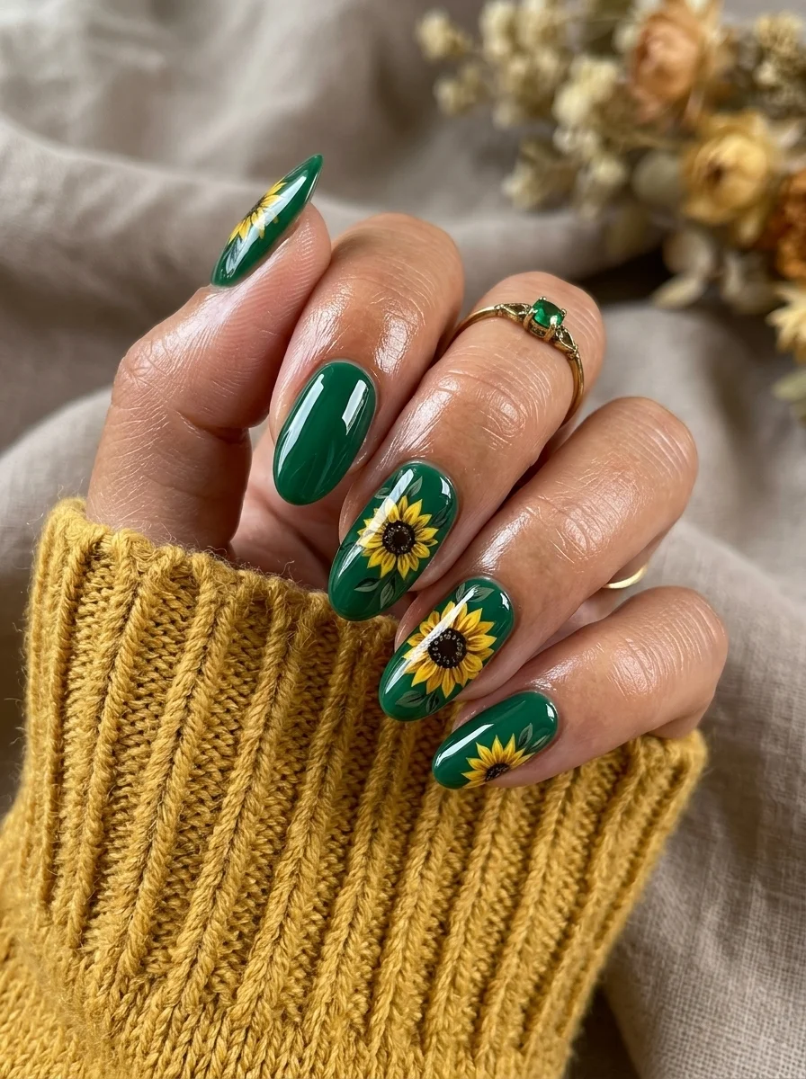
Sunflowers that feel autumnal rather than summery, thanks to the forest green base.
Overview:
Sunflowers on a white or yellow base read as summer. The same flower on deep forest green reads as fall. The dark background shifts the entire color temperature of the design, making the yellow petals glow against the green rather than blending into a warm-toned palette. It's the same principle as hanging a bright painting on a dark wall: the contrast makes both the art and the background more vivid.
The index finger breaks the pattern with no sunflower. That asymmetry is what keeps the design from feeling like a stamp. When every nail carries the same motif in the same configuration, the set reads as manufactured. When the placement varies, it reads as hand-painted. The difference matters.
The green itself needs to be dark enough to create contrast but not so dark that it reads as black under indoor lighting. A true forest green, like Essie "Off Tropic" or OPI "Christmas Gone Plaid," hits the right balance. These colors look green in any lighting condition, which is important because a green that appears black defeats the purpose of the color contrast.
Design Breakdown:
Botanical illustration on a dark solid base. The green does the atmospheric work; the sunflowers provide the focal point.
Base Color: Deep, opaque forest green. Two coats for full coverage.
Nail Shape: Medium almond. The curved shape complements the round form of the sunflower heads.
Design Element: Hand-painted sunflowers with bright yellow petals and dark brown centers on all nails. One flower per nail on most fingers, no sunflower on the index finger.
Finish: High-gloss top coat to saturate the green and make the yellow petals pop.
Get The Look at Home:
Paint all the brown centers first across every nail, then go back and add petals to each. It's faster than finishing one flower at a time.
- Green base: Two coats of forest green. Let dry fully. The yellow petals will smear if the green is even slightly tacky.
- Brown centers: Using a large dotting tool and chocolate brown, place one circle on each nail where you want a sunflower. Vary the positions.
- Yellow petals: Switch to a thin striper brush and bright yellow. Flick short strokes outward from each brown center. Six to eight petals per flower.
- Petal shading: Mix a dot of orange into your yellow. Add a shadow stroke at the base of two or three petals per flower for depth.
- Center texture: Go back to the brown centers and add tiny dots with a darker brown or black to suggest seeds.
- Seal: One thick coat of top coat to smooth the raised texture of the layered art.
30 Stunning July Nail Designs for Summer 2026 💅
8.Champagne Leopard
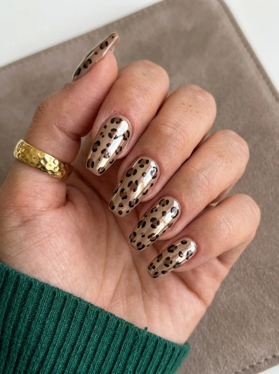
Animal print that catches light from every angle.
Overview:
Leopard print on a matte or crome base is a known quantity. Leopard print on a metallic champagne base is a different animal entirely. The reflective surface underneath changes how the spots read: instead of flat black shapes sitting on a flat background, the spots appear to float above a pool of liquid gold. The metallic sheen shows through between the spots, which creates a depth that a crome base can't replicate.
The all-over pattern works here because the spots are small and irregularly spaced. Larger, more uniform spots would read as a deliberate pattern. These small, varied spots mimic actual leopard fur, which is never perfectly symmetrical. The irregularity is what makes the design feel organic rather than stamped.
Chrome or metallic bases are less forgiving than crome formulas during application. Brush strokes show more easily, and any unevenness in the base coat gets amplified by the reflective surface. Two thin coats, applied in the same direction, reduces visible brush marks. Some people find that floating the brush (barely touching the nail surface) creates a smoother metallic finish than pressing down.
Design Breakdown:
Full-coverage animal print over a metallic base. The shimmer between the spots creates depth.
Base Color: Metallic champagne or pale gold. Something with warm undertones but not so yellow that it reads as costume.
Nail Shape: Short to medium square. The flat surface provides a stable canvas for the all-over pattern.
Design Element: Small, irregular black leopard spots covering every nail. Each spot is an incomplete C-shape or irregular circle.
Finish: High-gloss top coat to amplify the metallic base and seal the black spots.
Get The Look at Home:
The spots should be small and irregular. Perfect circles read as polka dots, not leopard print.
- Metallic base: Two thin coats of champagne gold chrome or metallic polish. Apply in the same direction to minimize brush strokes.
- Spot shapes: Using a small dotting tool and black polish, press irregular C-shapes and broken circles across each nail. Vary the size and orientation.
- Spacing: Keep the spots roughly 2-3mm apart. Crowded spots merge into a solid mass; widely spaced spots look like polka dots with formatting issues.
- Fill select spots: On about a third of the spots, add a tiny dot of dark brown inside the black outline. This creates the two-tone effect that distinguishes leopard from cheetah.
- Consistency check: Compare all nails. The spot density should feel similar across the set.
- Seal: One coat of glossy top coat. Apply in a single stroke per nail to avoid smearing the black.
9.Coffee Marble with Beans
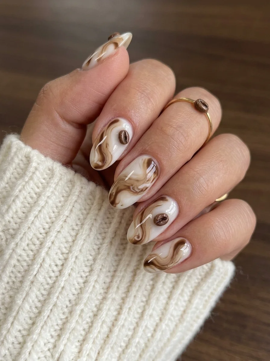
Espresso marble with actual coffee bean details for the caffeine devotee.
Overview:
Coffee-themed nail art walks a fine line between "clever reference" and "novelty costume." These nails stay on the right side because the marble technique is genuinely beautiful independent of the theme. The brown-and-white swirls read as polished stone or cream stirred into dark liquid. The coffee bean accents on two nails are small enough to function as a wink rather than a shout.
The marble technique here is different from the "pour" method used in the earlier coffee swirl design. These swirls have sharper, more defined edges between the brown and white, which suggests a drag technique rather than a wet-on-wet pour. The brown ribbons flow alongside each other with clear borders, creating a layered, geological quality that looks like polished agate.
The 3D coffee bean charms are the design's most distinctive feature and its most practical liability. They snag on hair, knitwear, and everything in between. Sealing the edges with a thick bead of gel or top coat around the base of each charm reduces lifting, but it doesn't eliminate the snagging entirely. Budget about a week of wear before something catches.
Design Breakdown:
Marble technique with 3D embellishment on accent nails. The beans are the conversation starter.
Base Color: Bright, opaque white. The marble swirls need a clean canvas to read as sharp.
Nail Shape: Medium almond. The organic curves complement the fluid marble patterns.
Design Element: Brown and tan marble swirls on most nails. Two accent nails with 3D coffee bean charms placed on top of the marble.
Finish: High-gloss top coat to smooth the marble texture and seal the charm edges.
Get The Look at Home:
The marble swirls are done one nail at a time, working into a wet surface. Have your brown polish and a toothpick ready before you start.
- White base: Two coats of opaque white on all nails. Let dry fully.
- Wet layer: Apply a third thin coat of white on one nail. Do NOT let it dry.
- Drop brown: Place two or three drops of espresso brown and one drop of tan near the center of the wet nail.
- Drag into swirls: Using a toothpick, pull the drops in curved lines alongside each other. Keep the borders between colors distinct.
- Coffee beans: On two accent nails, press small 3D coffee bean charms into the wet marble. Alternatively, paint small brown ovals with a center line for a flat illustration.
- Seal carefully: Apply top coat in one stroke per nail. For 3D charms, add an extra bead of top coat around the base edges.
26 Quick Hairstyles for a Waitress Job (2026)
10.Rose Gold Chrome
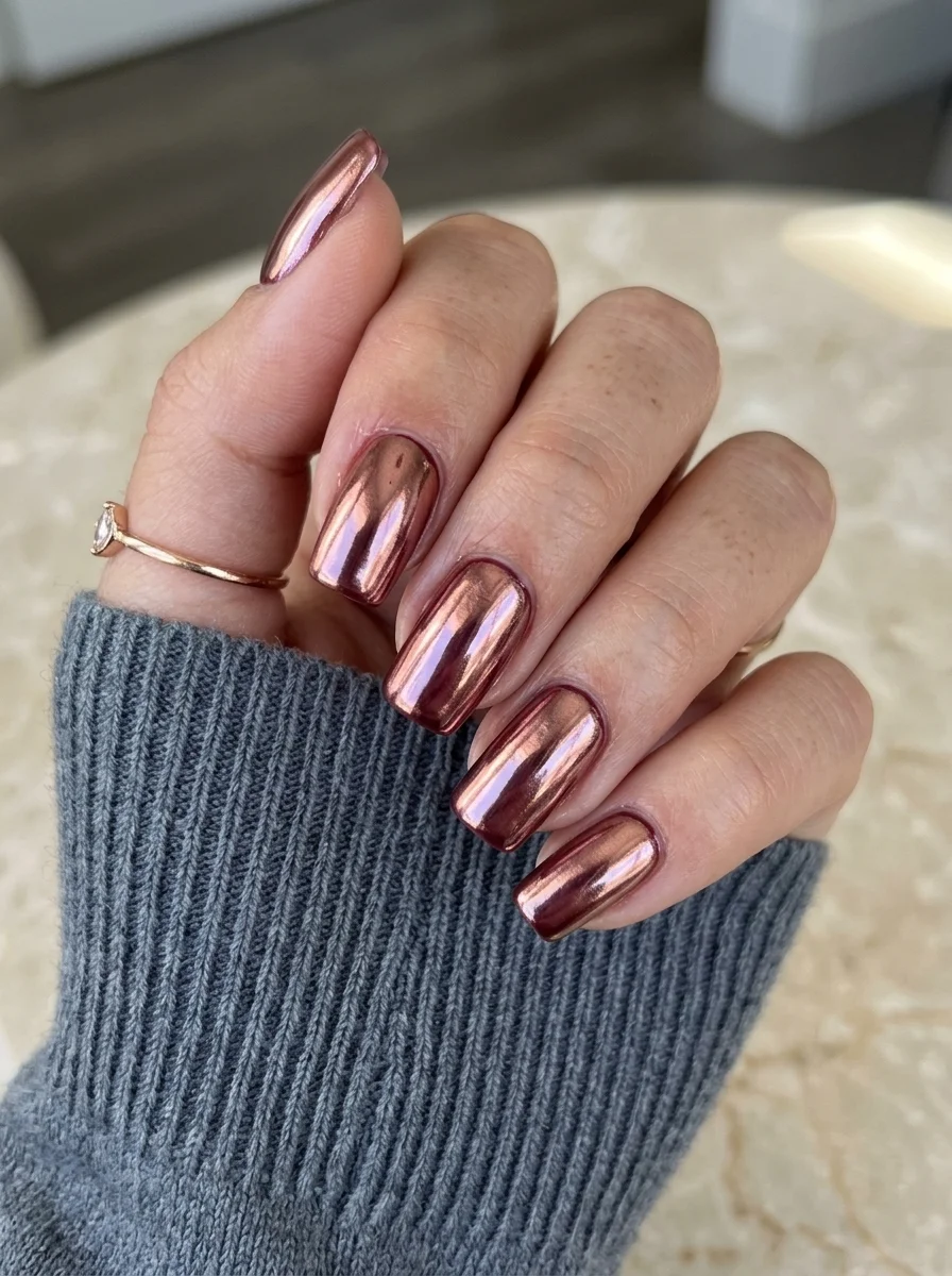
Rose gold that shifts between pink, copper, and mauve depending on the light.
Overview:
Rose gold chrome is one of those finishes that looks different in every photo you take of it. Under warm lighting, it reads as a deep copper. Under cool lighting, the pink undertones emerge and it shifts toward mauve. That color-shifting quality is what separates chrome powder from metallic polish. Metallic polish stays the same color regardless of lighting. Chrome powder changes with the light source, which makes your nails look alive in a way that static color can't.
The short square shape is an interesting choice for chrome. Most chrome nail photos show long almonds or coffins where the large reflective surface area maximizes the mirror effect. On short nails, the chrome reads as more of a glow than a mirror. It's subtler, and for everyday wear, that subtlety might actually be preferable. The nails catch light without looking like you're trying too hard.
The purple-pink shift visible in this particular chrome is a result of the base color showing through. Chrome powder is semi-translucent, so the color underneath affects the final tone. A dark base deepens the chrome; a pink or mauve base amplifies the rose tones. If you want a more copper-heavy result, use a dark brown base. For more pink, use a berry or mauve.
Design Breakdown:
Chrome powder over a tinted base. The base color determines the final chrome tone.
Base Color: A mauve or dusty rose gel polish. This base amplifies the pink-purple shift in the chrome.
Nail Shape: Short square. The compact shape creates a subtle, everyday-appropriate chrome effect.
Design Element: None. Solid chrome coverage on every nail.
Finish: Chrome powder over cured no-wipe gel top coat, sealed with another layer of top coat.
Get The Look at Home:
Chrome powder adheres best to a fully cured, no-wipe top coat. If the surface is tacky, the powder clumps instead of buffing smooth.
- Base color: Apply two coats of mauve or dusty rose gel polish. Cure each coat.
- No-wipe top coat: Apply a thin layer and cure fully (60 seconds LED).
- Rub the chrome: Using a silicone applicator, rub rose gold chrome powder onto the cured surface. Buff in circular motions until mirror-smooth.
- Brush off excess: Use a fluffy brush to remove loose powder from cuticles and sidewalls.
- Seal: One coat of gel top coat, cured. This prevents the chrome from flaking at the edges.
11.Navy Blue Solid
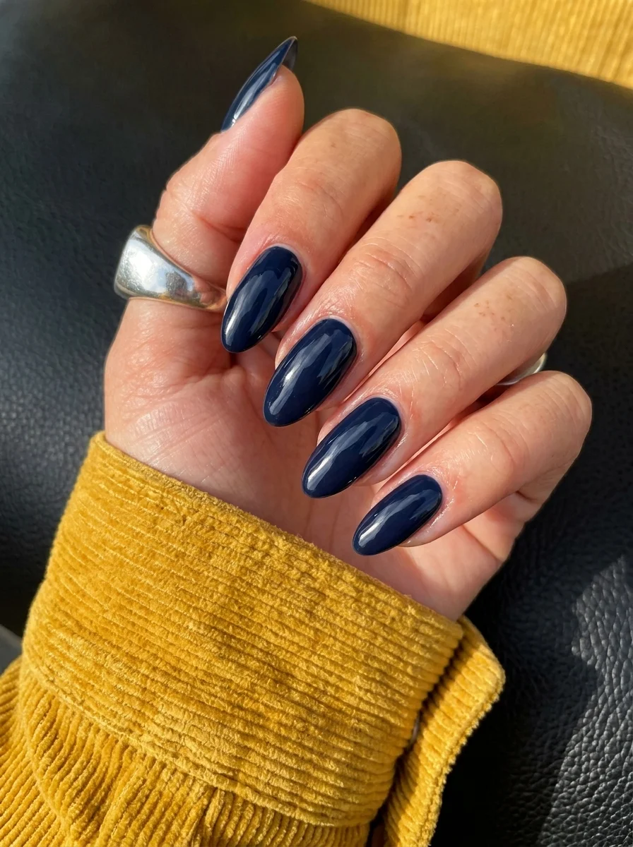
Sometimes the strongest fall statement is a single, perfect color.
Overview:
Navy blue is one of those colors that looks different depending on the formula. Some lean almost black, others show a true blue undertone even in dim lighting. This particular shade sits in the sweet spot: dark enough to feel moody and autumnal, blue enough to read as a deliberate color choice rather than a near-black. Under direct sunlight, you can see the blue clearly. Under indoor lighting, it deepens toward midnight. That range is what makes navy more interesting than black for fall.
A solid color with no art or accents is sometimes the hardest look to execute well. There's nowhere to hide imperfections in the base coat. Every brush stroke, every uneven edge at the cuticle, every streak in the color is fully visible against the dark, glossy surface. The application needs to be precise, which means thin coats, proper dry time between them, and careful cuticle work with a cleanup brush.
The almond shape is a good pairing for solid navy. The curved tip softens the darkness of the color and keeps the overall look elegant rather than heavy. On square nails, solid navy can feel a bit corporate. On almond, it feels intentional and fashion-forward.
Design Breakdown:
Single-color solid. The application precision IS the design.
Base Color: Deep, opaque navy blue. Look for a formula that reads as blue, not black, in bright light.
Nail Shape: Medium almond. The tapered tip balances the visual weight of the dark color.
Design Element: None. Solid, fully opaque coverage.
Finish: Ultra-glossy top coat. The shine is what makes navy feel luxurious rather than flat.
Get The Look at Home:
Dark colors stain skin and cuticles more visibly than light ones. Clean up immediately after each coat, not just at the end.
- Base coat: Apply a ridge-filling base coat. Dark polish magnifies surface imperfections.
- First coat: Apply a thin layer of navy. It will look slightly streaky. That's normal for dark formulas.
- Second coat: Apply a second thin layer, floating the brush to avoid dragging the first coat.
- Third coat (if needed): If any streaks remain, a third thin coat will fully opaque the color.
- Cleanup: Dip a small angled brush in acetone and run it along the cuticle line and sidewalls. This step separates a salon-quality manicure from a rushed one.
- Top coat: One thick coat of high-shine top coat. Cap the free edge to prevent tip chipping, which shows immediately on dark colors.
30 Stunning Beach Nail Ideas for the Best Vacation in 2026 🌊
12.Neutral Brown Gradient
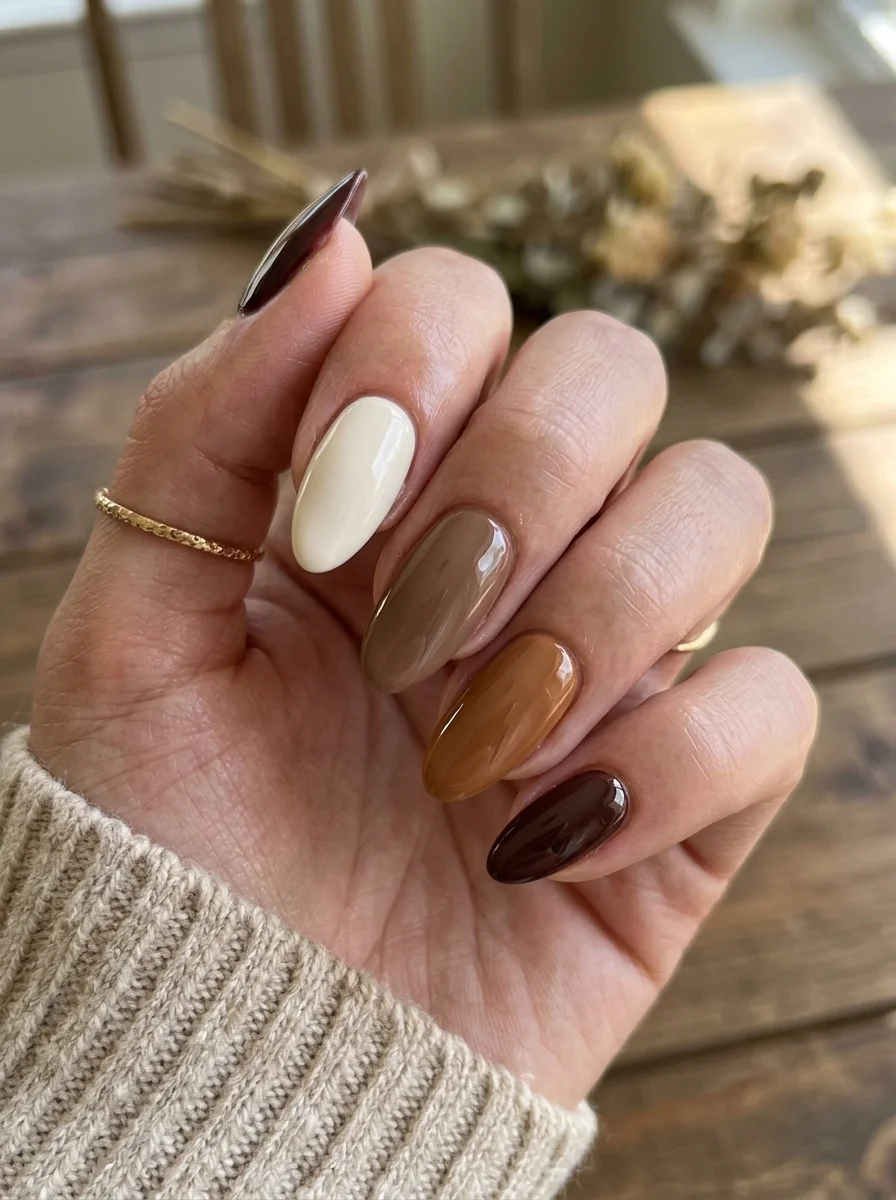
Five shades of brown that look like a paint swatch card for autumn.
Overview:
The gradient-across-the-hand concept is one of those designs that sounds simple but requires a specific eye for color selection. Each nail gets a different shade, and the shades need to transition smoothly from light to dark. Too small a jump between adjacent nails and the gradient reads as muddy. Too large a jump and the set looks like you grabbed five random bottles from the shelf. The spacing here is just right: cream, warm taupe, caramel, toffee, and deep chocolate, each noticeably distinct from its neighbor but clearly part of the same family.
The oval shape works well because the soft edges complement the organic, earthy color palette. These colors on long stilettos would feel aggressive. On short rounds, they'd feel safe. Oval sits in the middle where the design feels polished without trying too hard.
The advantage of this design is its simplicity for anyone who finds nail art intimidating. There are no patterns to paint, no lines to draw, no steady hand required. You're just applying five different solid colors in a specific order. The design work was done in the color selection; the application is as basic as it gets.
Design Breakdown:
Five solid colors arranged in a gradient sequence. The color selection is the entire design.
Base Color: Five distinct brown shades: cream, warm taupe, caramel, toffee, and deep chocolate. All should be crome finish (no shimmer).
Nail Shape: Medium oval. The soft, rounded shape complements the warm, earthy palette.
Design Element: None. Each nail is a solid color. The gradient effect comes from the arrangement across the hand.
Finish: High-gloss top coat to unify the five colors under a single sheen.
Get The Look at Home:
Lay all five bottles out in order before you start painting. The gradient only works if the colors transition in the right sequence.
- Map the order: Arrange the bottles from lightest to darkest. Assign each color to a finger: lightest on the thumb, darkest on the pinky (or vice versa).
- First coat: Apply one thin coat of each color to its assigned nail. Work from light to dark to avoid cross-contamination on the brush.
- Second coat: Apply a second coat to each nail for full opacity. Let each dry before moving to the next.
- Check the gradient: Hold your hand at arm's length. The transition should look smooth and even. If one nail seems out of place, swap the color.
- Cleanup: Clean the cuticle line on each nail with an angled brush and acetone.
- Seal: One coat of glossy top coat across all nails. Cap the free edge.
13.Plaid Tip Accent
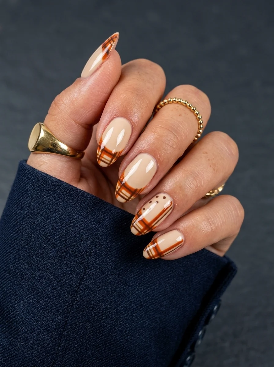
Flannel-inspired plaid tips that keep the busy pattern contained.
Overview:
Full-coverage plaid on every nail is a lot. The grid pattern is visually dense, and when it covers the entire nail surface from cuticle to tip, the effect can feel overwhelming. Limiting the plaid to the tips of the nail solves that problem. The nude base provides breathing room, and the plaid reads as an accent rather than a dominant pattern. It's the difference between wearing a plaid blazer and wearing a full plaid suit.
The warm orange and brown tones used in the plaid are what make this feel like fall rather than holiday. Red and green plaid reads as Christmas. Orange, brown, and cream reads as October. The color story does the seasonal heavy lifting here, not the pattern itself.
The plaid technique requires patience. You lay down horizontal lines, let them dry, then lay vertical lines on top. Where the lines cross, the doubled-up color creates darker squares that give plaid its characteristic depth. The most common mistake is rushing the drying time between horizontal and vertical passes. Wet horizontal lines smear when the vertical brush crosses them.
Design Breakdown:
Modified French with plaid pattern at the tips. The nude base keeps the design grounded.
Base Color: Warm nude or beige. Close to the natural nail tone but with enough coverage to look deliberate.
Nail Shape: Medium almond. The curved tip provides a natural frame for the plaid pattern.
Design Element: Burnt orange and brown plaid grid concentrated on the upper third of each nail. The plaid includes horizontal and vertical lines with cream accent stripes.
Finish: High-gloss top coat to smooth the layered stripe texture.
Get The Look at Home:
Do all horizontal lines first across every nail, let them dry completely, then do all vertical lines.
- Nude base: Two coats of warm nude on all nails. Let dry fully.
- Map the tip area: Decide how far down the nail the plaid extends. Usually the upper third.
- Horizontal lines: Using a striper brush and burnt orange polish, paint thin horizontal lines in the tip area. Space them about 2mm apart. Let dry completely.
- Vertical lines: Paint vertical lines at the same spacing. Where they cross the horizontal lines, the doubled-up color creates the darker overlap squares.
- Cream accents: Add thin cream-colored lines between the orange lines for a more complex plaid pattern.
- Seal: Two coats of top coat to level out the raised stripe texture.
30+ Chic Pool Party Hairstyles for Summer 2026 🌊👙
14.Purple Chrome
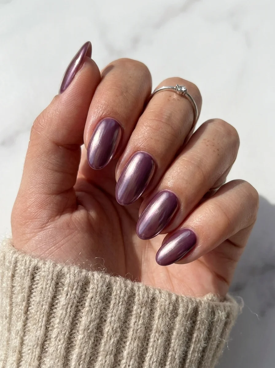
A cool-toned chrome that shifts between violet and dusty rose.
Overview:
Purple chrome is an unusual choice for fall, which is partly why it works. Most fall nail palettes lean warm: burgundy, copper, caramel, forest green. A cool-toned purple chrome breaks that pattern without clashing with the season. It pairs well with grey, cream, and navy fall wardrobes in ways that warmer chrome tones don't.
The finish on this particular chrome is closer to a satin metallic than a true mirror. The light band is softer and more diffused than the sharp reflection you'd see on a silver or gold chrome. That diffused quality makes the purple feel more like a shimmer than a mirror, which actually works in its favor for everyday wear. A high-intensity mirror chrome can feel like too much for a Tuesday morning meeting.
The almond shape complements the reflective surface because the curved sides create a continuous light band that wraps around the nail. On square nails, the chrome reflection breaks at the sharp edges, which interrupts the flow. The curved almond surface lets the light travel uninterrupted from cuticle to tip.
Design Breakdown:
Single-color chrome with a satin metallic finish. The purple tone is the design.
Base Color: A dusty mauve or plum gel polish. The base color affects the final chrome tone significantly.
Nail Shape: Medium almond. The curved surface maximizes the continuous light band.
Design Element: None. Solid chrome coverage on every nail.
Finish: Chrome powder over cured no-wipe gel top coat, sealed with top coat.
Get The Look at Home:
The chrome tone depends heavily on the base color. Test different base shades to find the purple tone you prefer.
- Base color: Two coats of dusty mauve or plum gel polish. Cure each coat.
- No-wipe top coat: Apply and cure fully.
- Rub the chrome: Using a silicone applicator, rub purple or holographic chrome powder over the cured surface. Buff until smooth.
- Brush off excess: Remove loose powder with a fluffy brush.
- Seal: One coat of gel top coat, cured. This locks the chrome and prevents edge flaking.
15.Tortoiseshell
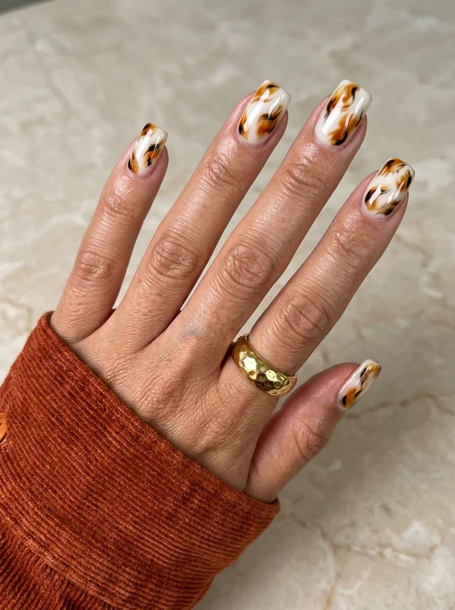
Warm amber swirls that look like polished vintage tortoiseshell.
Overview:
Tortoiseshell is one of those patterns that looks impossibly complex but is actually built from just three colors: white, amber, and dark brown. The magic is in how they interact. When the three colors are layered while still wet, they bleed into each other at the borders, creating the warm, translucent depth that defines real tortoiseshell. The white adds brightness that pure brown-and-amber would lack.
The wet-on-wet technique is essential here. If you let each color dry before adding the next, you get hard-edged stripes instead of the organic, blended transitions that make tortoiseshell look like a natural material. The colors need to be wet enough to bleed into each but not so wet that they mix into a uniform brown. The window for getting this right is about thirty seconds per nail.
The square shape works well because the flat surface gives the tortoiseshell pattern room to develop. On almond nails, the curved sides can distort the pattern near the edges. On square nails, the pattern stays consistent across the entire visible surface.
Design Breakdown:
Three-color wet-on-wet technique. The bleeding between colors creates the tortoiseshell effect.
Base Color: White or very pale cream. The white provides the brightness layer that sits underneath the amber and brown.
Nail Shape: Short to medium square. The flat surface lets the pattern develop without distortion.
Design Element: Wet-on-wet swirls of white, amber, and dark brown. The colors bleed into each other at the borders, creating translucent depth.
Finish: High-gloss top coat to amplify the translucent, glass-like quality of the tortoiseshell.
Get The Look at Home:
Work one nail at a time. All three colors need to be wet when you swirl them together.
- White base: Two coats of opaque white on all nails. Let dry fully.
- Wet layer: On one nail, apply a third thin coat of white. Do NOT let it dry.
- Drop colors: Place drops of amber and dark brown randomly onto the wet white. Two to three drops of each per nail.
- Swirl lightly: Using a toothpick, drag through the colors in gentle curves. Two or three passes maximum. You want to see each color distinctly.
- Dry time: Wait at least five minutes before top coating. The wet-on-wet technique needs extra time to set.
- Seal: Two coats of thick top coat to smooth the surface and intensify the translucent depth.
27 Elegant Wedding Guest Nail Designs for Family in 2026 💍
16.Burgundy French with Bow
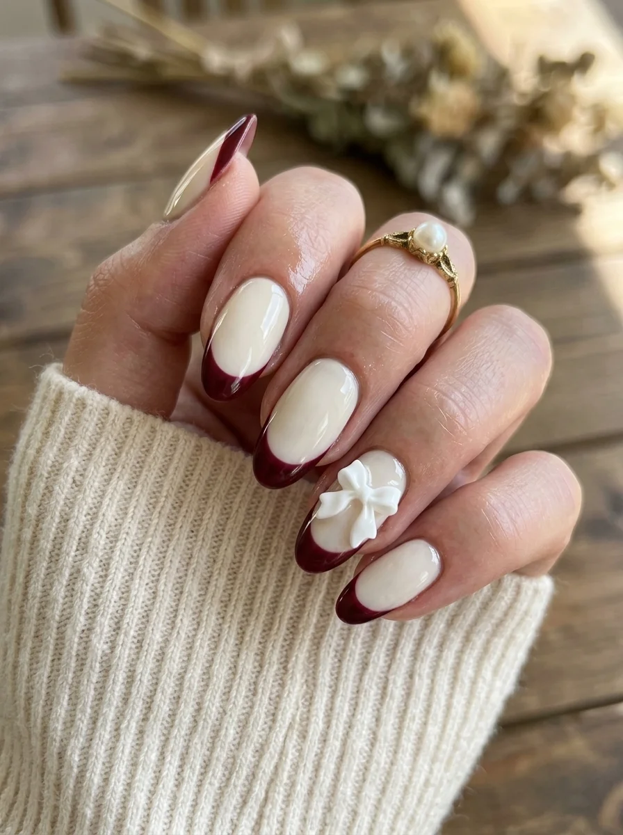
A classic French structure with a single sculptural accent.
Overview:
Burgundy French tips are already a step beyond the classic white. The deep wine color sharpens the smile line and gives the French structure a moodier, more autumnal quality. On a milky white base, the burgundy reads as rich and deliberate rather than seasonal. It's a French manicure that works in November just as well as in June.
The 3D bow charm on the ring finger is the design's curveball. Without it, you have colored French tips, which is perfectly fine but expected. The bow introduces a sculptural element that changes the entire read from "colored French" to "designed set with a focal point." The white bow against the burgundy tip creates a color contrast that draws the eye directly to the accent nail.
The practical reality of 3D charms: they snag on everything. Hair, scarves, knitwear, pillowcases. Sealing the edges with a thick bead of gel around the base of the charm helps, but it doesn't eliminate the problem. Budget about a week of wear before something catches. If you work with your hands a lot, consider swapping the 3D charm for a hand-painted bow illustration instead.
Design Breakdown:
Classic French structure with one sculptural accent nail. The bow charm is the focal point.
Base Color: Milky white or sheer nude for the French base.
Nail Shape: Medium almond. The curved tip complements both the French smile line and the organic shape of the bow.
Design Element: Deep burgundy French tips on four nails. 3D white bow charm on the ring finger.
Finish: High-gloss top coat on all nails. Extra top coat around the base of the bow charm to seal the edges.
Get The Look at Home:
The French tips and the charm attachment are separate rounds. Do the tips first.
- Milky base: Two coats on all nails. Let dry fully.
- Burgundy tips: Using a French liner brush, paint the smile line from sidewall to center on each nail. Two thin coats for full opacity.
- Attach the bow: On the ring finger, apply a small bead of nail art gel or jewelry gel to the back of the bow charm. Press it onto the nail near the cuticle area. Cure under a UV lamp.
- Seal the edges: Using a detail brush, apply top coat around the base of the bow to prevent lifting and snagging.
- Cleanup: An angled brush dipped in acetone sharpens the French smile line on every nail.
- Final seal: One coat of top coat on all nails (avoiding the top of the bow to preserve its texture).
17.Rose Gold French Tips
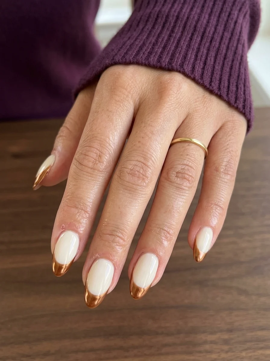
A metallic French that catches light with every hand movement.
Overview:
A metallic French tip is one of those upgrades that looks like it requires significantly more skill than it actually does. The technique is identical to a classic white French. You're just swapping the white for a rose gold chrome or metallic polish. The result looks expensive because metallic tips are associated with salon-level detail work, even though the application is no harder than any other colored French.
The milky white base is doing more work than it appears. It creates a soft, diffused transition between the natural nail and the metallic tip. A clear base would make the chrome tip look disconnected from the nail. A fully opaque white would create a harsher boundary. The milky tone sits in between, making the metallic tip feel like a natural extension of the nail rather than a sticker placed on top.
The chrome or metallic polish used for the tips needs to be opaque in one or two coats. Thin, watery metallic formulas require multiple passes, and each pass increases the chance of wobbly lines. Look for a formula specifically marketed as "one-coat" metallic. OPI and Essie both make rose gold formulas that cover well in a single layer.
Design Breakdown:
Classic French structure with a metallic tip color. The chrome finish is the upgrade.
Base Color: Milky white or sheer nude. Close to the natural nail color but with a soft, diffused opacity.
Nail Shape: Medium almond. The curved tip makes the French smile line easier to paint than a straight-across square shape.
Design Element: Rose gold metallic or chrome French tips on every nail. The tips should be thin and precise.
Finish: High-gloss top coat to seal the metallic and amplify the shine.
Get The Look at Home:
The two-stroke French method (sidewall to center, then repeat from the other side) is more forgiving than trying to paint the entire curve in one pass.
- Milky base: Two coats on all nails. Let dry fully.
- First stroke: Load a French liner brush with rose gold metallic polish. Start from one sidewall and sweep to the center of the nail.
- Second stroke: Start from the other sidewall and sweep to meet the first stroke at the center. This two-stroke method creates a more consistent curve.
- Second coat on tips: Apply a second thin layer of rose gold to the tips for full opacity.
- Cleanup: An angled brush dipped in acetone sharpens the smile line. This step is non-negotiable for a clean French.
- Seal: One coat of top coat over everything. Cap the free edge to prevent the metallic from chipping at the tip.
20 Stunning Half Up Half Down Hairstyles for Prom Night 2026 💃✨
18.Brown Cat Eye
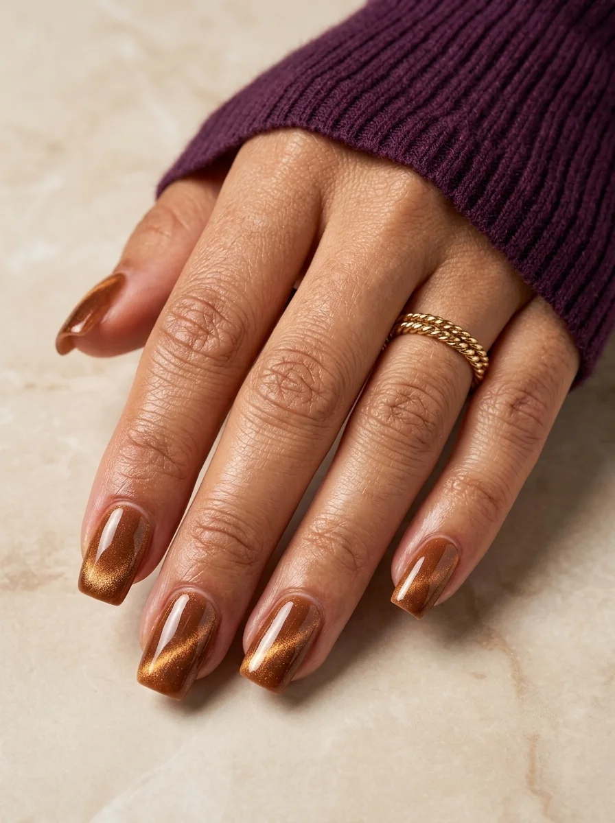
A warm, glowing cat eye that looks like liquid amber.
Overview:
Brown cat-eye polish creates a magnetic shimmer that looks like light trapped in amber. The warm copper-brown base absorbs light while the magnetic particles concentrate it into a diagonal band that moves as your hand shifts. The result is a color that looks like it has something glowing underneath the surface, which is a quality that flat brown polishes simply cannot achieve.
Short square nails are an unexpected but effective canvas for cat-eye. Most cat-eye photos show long almonds where the magnetic band has room to travel across a large surface. On short nails, the band is concentrated into a smaller area, which actually makes it appear more intense. The light doesn't disperse across a long surface; it pools in a tight, bright line that catches attention immediately.
The warm brown tone is more wearable than many cat-eye colors. Red cat-eye can feel dramatic. Green cat-eye can feel costume-like. Brown reads as a sophisticated neutral that happens to have a magnetic party trick. It pairs with basically everything in a fall wardrobe without requiring any thought.
Design Breakdown:
Single-color magnetic polish on a compact shape. The concentrated light band is the focal point.
Base Color: Warm brown or copper cat-eye magnetic polish. Two coats for full opacity.
Nail Shape: Short square. The compact shape concentrates the magnetic shimmer into a tighter, more intense band.
Design Element: None. The cat-eye magnetic effect provides all the visual interest.
Finish: High-gloss top coat to amplify the magnetic shimmer and deepen the brown base.
Get The Look at Home:
The magnet needs to be held steady and close. Movement during magnetizing creates a blurry, diffuse band instead of a sharp line.
- Base coat: Apply a standard base coat and let it dry.
- First coat: Apply a thin layer of brown cat-eye polish. Let it dry for two minutes.
- Second coat and magnet: Apply the second coat. Immediately hold the magnet 3-5mm above the nail, angled diagonally. Hold steady for 10-15 seconds.
- Repeat per nail: Work one nail at a time while the polish is still wet.
- Dry time: Let the polish dry fully before applying top coat. Rushing this step can shift the magnetic particles.
- Top coat: One thick coat of glossy top coat. Apply gently to avoid disturbing the magnetic band.
19.Rose & Floral Art
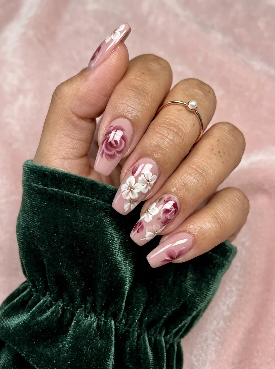
Detailed botanical roses that look like they belong in a vintage frame.
Overview:
Hand-painted roses on nails are one of the highest-skill nail art techniques, because a rose is not a simple shape. It requires layered petals, tonal shading, and enough brush control to suggest the organic complexity of a real flower without painting every individual petal. These roses hit that balance. They're detailed enough to read as roses from arm's length, but loose enough that the brushwork is visible up close. That visible hand is part of the charm.
The sheer pink base is essential. An opaque base would compete with the detailed floral art for attention. The transparency lets the roses and white flowers sit on something that recedes visually, which makes the botanical illustration the clear focal point. It also means growth-out is nearly invisible for the first two weeks, which is a practical bonus for a design this detailed.
The white flowers interspersed with the roses add contrast and keep the set from reading as one-note. Without them, you'd have burgundy roses on pink, which is beautiful but predictable. The white flowers break the pattern and add a lightness that balances the darker rose tones.
Design Breakdown:
Detailed botanical illustration on a transparent canvas. The roses are the technical centerpiece.
Base Color: Sheer milky pink. The natural nail should be visible through the base.
Nail Shape: Long coffin. The flat, extended surface provides the canvas needed for detailed floral illustration.
Design Element: Hand-painted roses in burgundy and mauve tones, white five-petal flowers with gold bead centers, and green leaves scattered across all nails.
Finish: High-gloss top coat to protect the detailed brushwork and add depth to the colors.
Get The Look at Home:
Paint the roses in layers: dark base, then lighter petals on top. Each layer adds dimension.
- Sheer base: Two coats of milky pink on all nails. Let dry fully.
- Rose base shapes: Using a small brush and dark burgundy, paint irregular rounded shapes where you want each rose. These are the shadow layer.
- Petal layers: Mix a lighter mauve or pink. Paint curved strokes around the dark center to suggest overlapping petals. Three to four petals per rose.
- White flowers: Using white polish and a small brush, paint five-petal flowers in the spaces between the roses. Add a tiny gold bead or dot in each center.
- Leaves: Using a medium green, paint small almond-shaped leaves along the edges of the flowers. Alternate with a darker green for depth.
- Seal: Two coats of top coat to smooth the raised texture of the layered floral art.
29 Trendy Pink Summer Nails for 2026 💅
20.Gold Glitter Gradient
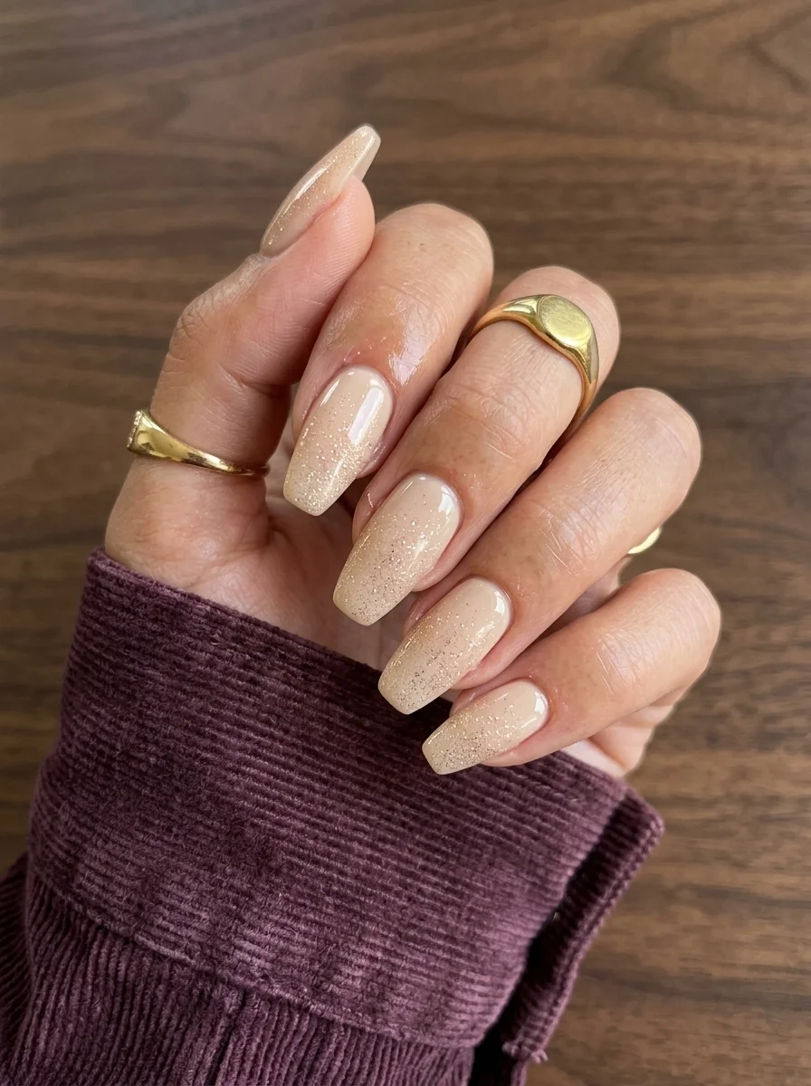
A glitter fade that catches light without overwhelming the neutral base.
Overview:
Glitter gradient nails solve the problem that full-glitter nails create: too much sparkle. When every nail is fully covered in glitter, the effect can feel like a costume. Concentrating the glitter at the tips and fading it toward the cuticle creates a transition zone where the sparkle is dense at one end and absent at the other. Your eye reads the gradient rather than the glitter, which makes the design feel intentional rather than excessive.
The nude base underneath is doing critical work. It provides a warm, skin-toned canvas that the gold glitter sits on top of. The glitter picks up the warmth of the nude and amplifies it, which is why this combination reads as elegant rather than flashy. A white or clear base would make the gold feel disconnected from the nail. The nude grounds it.
The sponge technique is the key to a smooth gradient. Brushing glitter polish directly onto the nail creates dense, clumpy coverage at the tip that abruptly transitions to bare nail. Sponging the glitter on filters out most of the clear base liquid and deposits only the glitter particles, creating a much more gradual fade. Two to three sponge passes builds the density gradually.
Design Breakdown:
Glitter concentration gradient over a neutral base. The transition from sparkle to bare is the design.
Base Color: Warm nude or beige. Opaque enough to look deliberate, sheer enough to feel soft.
Nail Shape: Long coffin. The extended surface gives the gradient room to develop naturally.
Design Element: Gold glitter concentrated at the tips, fading toward the cuticle. The glitter is densest at the free edge and disappears by the mid-point of the nail.
Finish: Two coats of thick top coat to encapsulate the glitter and create a smooth surface.
Get The Look at Home:
Sponging glitter is less messy than brushing it on, and it creates a much smoother gradient. Use a dense cosmetic sponge.
- Nude base: Two coats of warm nude on all nails. Let dry fully.
- Sponge setup: Paint a stripe of gold glitter polish onto a dense cosmetic sponge. Dab the sponge on paper once to remove the initial excess liquid.
- First pass: Press the sponge onto the tip of the nail with the glitter concentrated at the free edge. Dab gently, letting the glitter fade as you move toward the center.
- Build density: Re-apply glitter to the sponge and repeat two to three times, concentrating on the tip area. Each pass adds more glitter particles.
- Check the fade: The transition from dense glitter to bare nude should be gradual. If there's a hard line, dab the boundary area with a clean section of sponge.
- Encapsulate: Two coats of thick, self-leveling top coat. Run your finger over the nail after each coat. If you feel grit, add another layer.
21.Sheer Pink Ombre
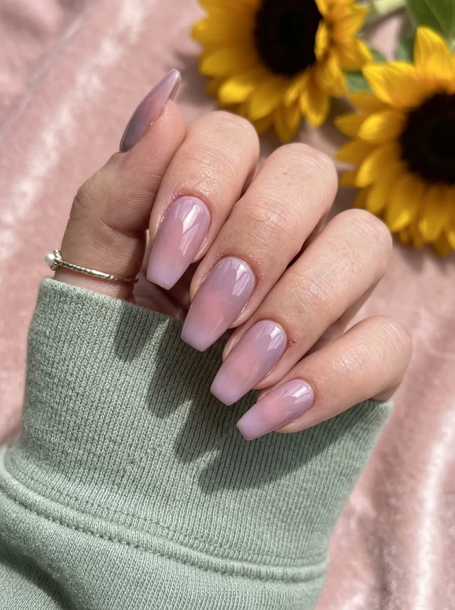
A soft, ethereal gradient that looks like morning light through sheer curtains.
Overview:
Sheer ombre nails are one of those designs that look effortless but depend entirely on the blend. The transition from milky pink at the cuticle to soft lavender at the tip needs to be seamless, with no visible line where the two colors meet. The colors here are so close in value (both are pastels, both roughly the same lightness) that the gradient reads as a subtle shift in temperature rather than a dramatic color change. That subtlety is the point.
The translucent quality of both colors means the natural nail shows through slightly, which gives the gradient a lit-from-within quality that opaque polishes can't replicate. The light passes through the color, bounces off the nail surface, and comes back out, which makes the pink and lavender look like they're glowing. This is why sheer polishes work better for soft gradients than opaque ones.
The coffin shape provides a long, flat canvas that lets the gradient develop across a significant surface area. On shorter nails, the transition from pink to lavender would compress into a thin band that barely registers. The coffin length gives each color room to exist before the next one begins.
Design Breakdown:
Two-color sheer gradient. The blend quality is the entire design.
Base Color: Sheer milky pink at the cuticle transitioning to sheer lavender at the tip. Both colors should be translucent.
Nail Shape: Long coffin. The extended length gives the subtle gradient room to develop.
Design Element: Sponge-applied ombre. No additional art or embellishment.
Finish: High-gloss top coat to blend the transition and amplify the translucent glow.
Get The Look at Home:
The colors are so close in value that the sponge needs to be barely damp. Too much polish creates a hard line instead of a blend.
- Pink base: Two coats of sheer milky pink on all nails. Let dry fully.
- Sponge setup: Paint a thin stripe of pink and a thin stripe of lavender side by side on a makeup sponge. Dab on paper first to remove most of the liquid.
- First pass: Press the sponge onto the nail with pink at the cuticle and lavender at the tip. Dab gently. The first layer will be barely visible.
- Build gradually: Re-apply polish to the sponge and repeat three to four times. Let each pass dry for thirty seconds. The gradient builds slowly with sheer colors.
- Blend the transition: If a hard line appears between the colors, dab just the transition zone with a clean sponge.
- Seal: Two coats of glossy top coat to smooth the sponge texture and intensify the colors.
35 Cute & Sporty Athletic Hairstyles for Women (2026)
22.Sunflower & Daisy Field
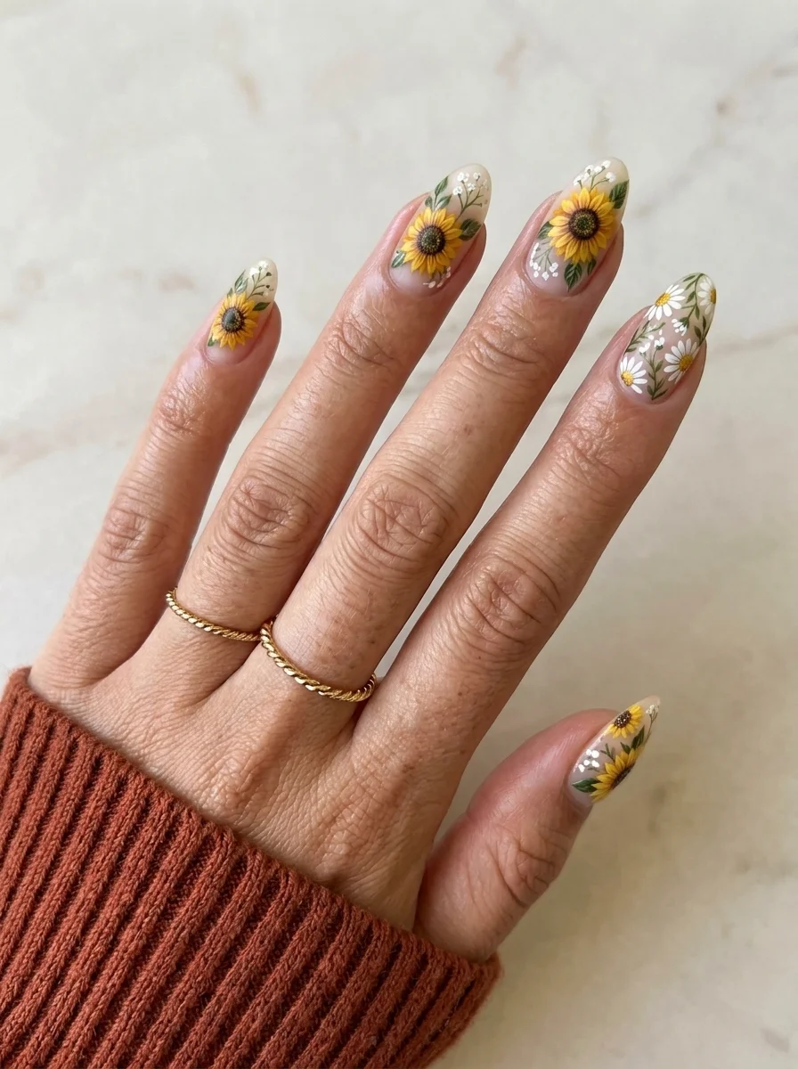
A wildflower meadow scattered across all ten nails.
Overview:
Mixing two flower types on the same hand creates a more natural, meadow-like effect than using only one. In a real field, sunflowers and daisies grow side by side at different heights and angles. This design mimics that organic randomness. The sunflowers provide bold yellow focal points; the daisies fill the spaces between them with smaller, lighter shapes. The result reads as a botanical scene rather than a repeated stamp.
The nude base is the right choice because it mimics the color of dry earth or sand. The flowers appear to grow out of the nail rather than sitting on top of a colored surface. A white base would make the daisies disappear into the background. A green base would fight with the leaves. The nude stays out of the way and lets the botanical art be the focus.
The leaf work between the flowers does more than add green. It creates visual connections between the individual blooms, tying them into a cohesive scene rather than a collection of isolated flowers. Without the leaves, the flowers would float in empty space. With them, every nail looks complete.
Design Breakdown:
Two flower types on a neutral canvas, connected by leaf accents. The variety creates a natural meadow effect.
Base Color: Warm nude or beige. Close to the natural nail tone.
Nail Shape: Medium almond. The curved shape complements the organic flower forms.
Design Element: Hand-painted sunflowers (yellow petals, brown centers) and white daisies (white petals, yellow centers) scattered across all nails. Green leaf accents between the flowers.
Finish: High-gloss top coat to protect the detailed brushwork and saturate the colors.
Get The Look at Home:
Paint the sunflowers first since they're larger and need more space. Fill in with daisies afterward.
- Nude base: Two coats of warm nude. Let dry fully.
- Sunflower centers: Using a dotting tool and brown polish, place dots where you want each sunflower. Two to three per nail.
- Sunflower petals: Using a striper brush and bright yellow, flick short strokes outward from each brown center. Six to eight petals per flower.
- Daisies: In the spaces between sunflowers, paint small white five-petal flowers with yellow centers. Keep them smaller than the sunflowers.
- Leaves: Using a medium green, add small leaf shapes along the edges of the flowers. One or two leaves per flower is plenty.
- Seal: One thick coat of top coat to smooth the raised texture of the layered floral art.
23.Brown & Gold Abstract
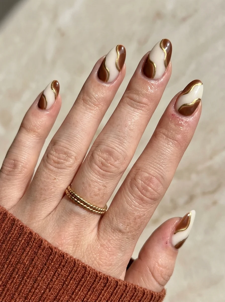
Organic brown shapes elevated by gold metallic outlining.
Overview:
Abstract swirls on nails can easily look like accidental smudges. The gold outlining is what saves this design from that fate. Each brown shape is bordered by a thin gold metallic line that defines its edges and transforms what would be a vague brown blob into a deliberate, graphic element. The gold acts like the leading in stained glass, containing the organic shapes within crisp metallic boundaries.
The white base creates maximum contrast for both the brown and the gold. On a nude or colored base, the brown swirls would lose some their definition and the gold outlining would blend into the background. The stark white keeps everything legible and gives the design a modern, graphic quality.
The swirl shapes themselves should feel organic and flowing, not geometric. Each shape is different from the others, which prevents the design from reading as a repeated stamp. The variety in shape and size across the nails is what makes the abstract quality work. Uniform shapes would read as a pattern. Irregular shapes read as art.
Design Breakdown:
Organic shapes with metallic definition. The gold outline elevates abstract blobs into deliberate design elements.
Base Color: Bright, opaque white. The contrast is essential for both the brown and the gold to read clearly.
Nail Shape: Medium almond. The curved shape complements the flowing, organic swirl forms.
Design Element: Abstract brown swirl shapes outlined in gold metallic polish. Each nail carries one to two shapes.
Finish: High-gloss top coat to seal the metallic outlining and smooth the surface.
Get The Look at Home:
Paint the brown shapes first, let them dry, then outline in gold. The gold line needs a dry surface to stay crisp.
- White base: Two coats of opaque white on all nails. Let dry fully.
- Brown shapes: Using a small brush and warm brown polish, paint organic, flowing shapes on each nail. Vary the size and position. One to two shapes per nail.
- Dry completely: Wait at least five minutes. The gold outline will smear if the brown is tacky.
- Gold outline: Using a thin liner brush and gold metallic polish, trace the edge of each brown shape. Keep the line consistent in width.
- Check consistency: The gold lines should feel similar across all nails. Inconsistent line weight makes the design look unfinished.
- Seal: One coat of top coat, applied carefully to avoid dragging the gold outlining.
30 Stunning Vacation Nail Ideas for Your Next Getaway in 2026 💅
24.Watercolor Floral
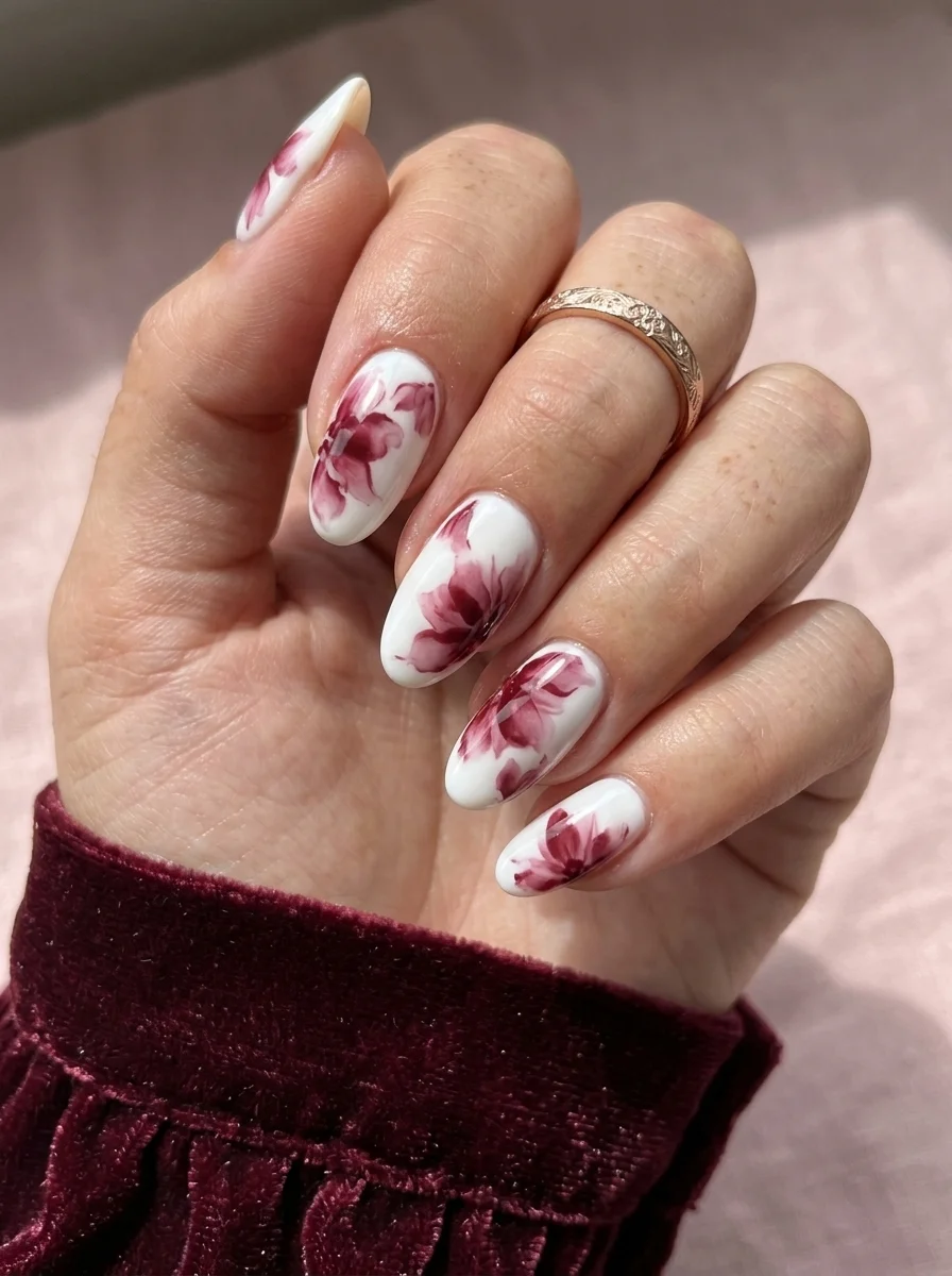
Soft, painterly flowers that look like they belong on fine china.
Overview:
Watercolor floral nails use a technique where polish is thinned with alcohol or blooming gel to create soft, diffused edges that mimic actual watercolor painting. The burgundy-mauve flowers here have blurred borders that bleed gently into the white base, creating a softness that hand-painted crisp-edge florals can't replicate. The effect is closer to a botanical illustration on aged paper than to typical nail art.
The color choice matters. Burgundy-mauve is a muted, sophisticated tone that reads as autumnal without being obviously seasonal. A brighter red would feel like Valentine's Day. A darker plum would feel too heavy against the white base. This particular shade balances warm and cool, which makes the flowers feel like they belong in a museum rather than on a greeting card.
The technique is one of the few nail art methods where less control produces better results. The "blooming" effect happens when you intentionally allow the color to spread and blur on a wet surface. The loosest, most gestural application usually looks the most professional. Trying to control the spread produces hard edges that defeat the watercolor purpose.
Design Breakdown:
Alcohol-thinned or blooming gel floral technique. The soft edges are the entire aesthetic.
Base Color: Bright, opaque white. The clean canvas makes the burgundy-mauve flowers stand out.
Nail Shape: Medium almond. The curved shape complements the organic, flowing quality of watercolor art.
Design Element: Burgundy-mauve floral shapes with deliberately blurred, diffused edges. The flowers vary in size and position across the nails.
Finish: Thick glossy top coat to smooth the surface and intensify the color saturation.
Get The Look at Home:
Use blooming gel if you have it. It's more forgiving than the alcohol method for beginners.
- White base: Two coats of opaque white on all nails. Let dry fully.
- Blooming gel layer (optional): Brush a thin layer of blooming gel over the white. Do NOT cure yet.
- Drop the color: Using a detail brush, place small blobs of burgundy-mauve polish onto the wet blooming surface (or directly onto the dry white if not using blooming gel). The colors will spread outward.
- Assist with alcohol (if not using blooming gel): Dip a clean brush in 70% isopropyl alcohol and gently tap near each color blob. The alcohol thins the surrounding polish and causes the color to bleed.
- Stop early: The biggest mistake is adding more color. Two to three blobs per nail is plenty. The white space between flowers is part of the design.
- Cure or dry: If using gel, cure. If using regular polish, wait at least ten minutes.
- Seal: Two coats of thick top coat to smooth the surface and lock in the diffused edges.
25.Sage & Gold Stripe
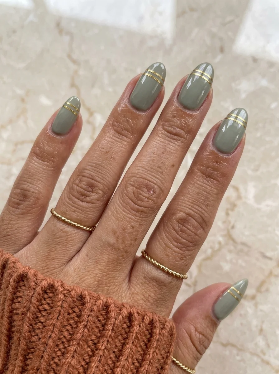
Muted sage with a whisper of gold for understated fall elegance.
Overview:
Sage green is one of those colors that works across every season but feels particularly rooted in fall. It reads as earthy without being heavy, muted without being boring. The grey undertone in the green gives it a sophistication that brighter greens lack, which is why sage works in professional settings where neon or lime would feel out of place.
The gold metallic stripes near the tips are the design's entire embellishment. Two thin parallel lines, barely a millimeter wide, placed just above the free edge. The gold adds a warmth that complements the sage's cool undertone, creating a subtle push-pull between warm and cool that keeps the design from feeling flat. The stripes also create a visual endpoint for the nail, drawing the eye toward the tip.
The restraint is what makes this design work. It would be easy to add more gold, more stripes, more embellishment. But the power of this set is in its simplicity. The sage does the atmospheric work; the gold does the accent work. Nothing else is needed. Sometimes the best design decision is knowing when to stop.
Design Breakdown:
Solid muted base with minimal metallic accent. The simplicity is the design principle.
Base Color: Creamy, opaque sage green. Something with grey undertones, not too bright or too olive.
Nail Shape: Medium almond. The curved tip complements the organic quality of the sage.
Design Element: Two thin parallel gold metallic stripes placed horizontally near the tip of each nail.
Finish: High-gloss top coat to seal the stripes and amplify the sage color.
Get The Look at Home:
Striping tape is almost mandatory for lines this thin and precise. Freehand rarely produces consistent results at this scale.
- Sage base: Two coats of sage green on all nails. Let dry fully. Sage formulas can be slightly chalky, so thin layers prevent streaking.
- Tape placement: Cut two thin strips of gold striping tape. Press them horizontally across each nail, roughly 3mm apart, positioned just above the free edge.
- Smooth the tape: Press each strip firmly from edge to edge with a cuticle pusher or orange stick. Air bubbles under the tape cause lifting.
- Trim the ends: Snip the tape about 0.5mm inside the nail border on both sides. Tape that reaches the edge peels off within a day.
- Seal: Two coats of top coat over everything. The first coat locks the tape; the second creates a smooth surface over the raised stripes.
26 Best Hiking Hairstyles That Survive the Trail and Look Good in Photos
26.Neutral French Tips
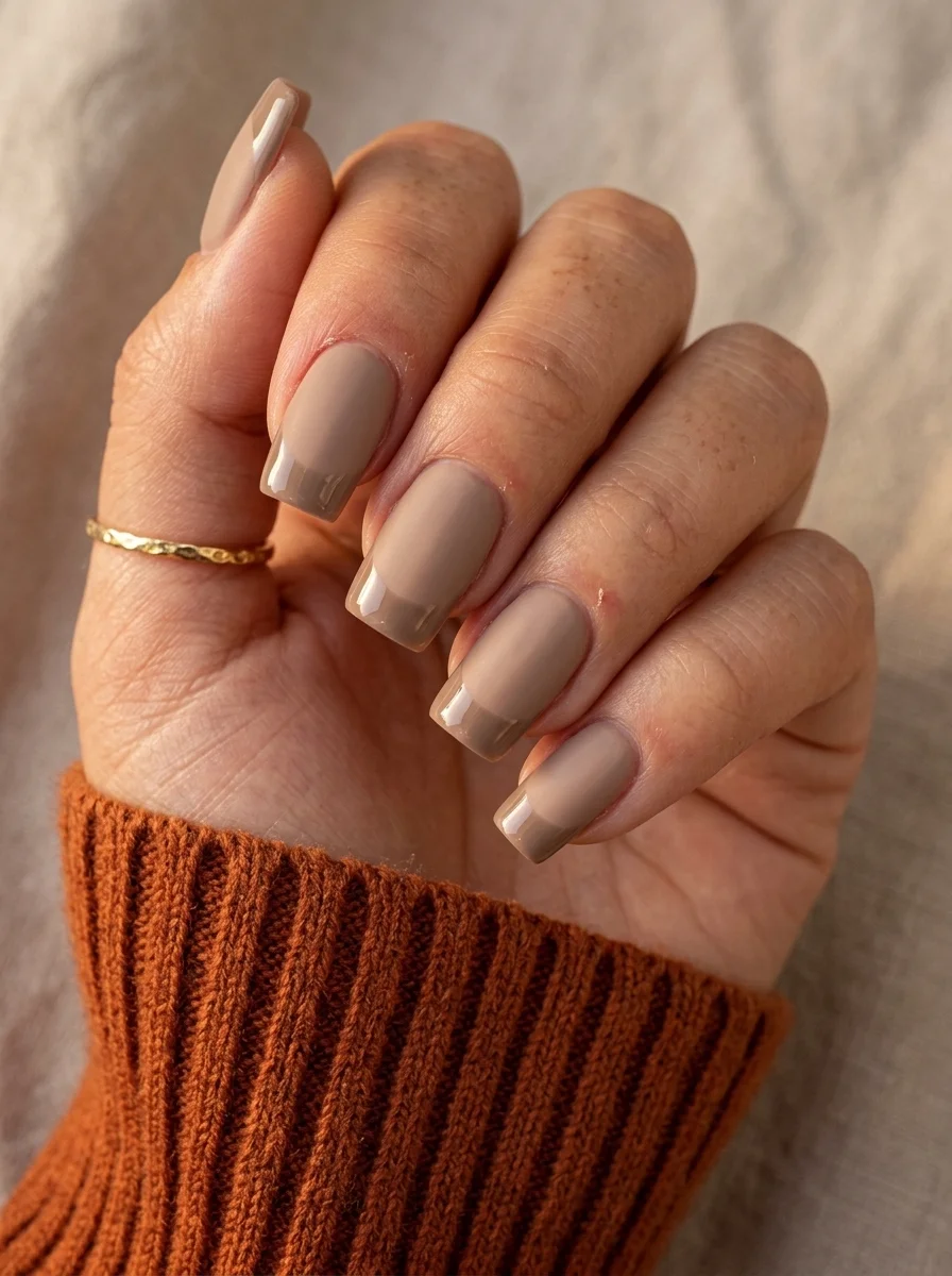
A tonal French that reads as modern rather than classic.
Overview:
A French tip doesn't have to be white. This tonal version uses a lighter neutral for the tips against a deeper nude base, creating a French structure that's visible but subtle. The contrast between the two neutral tones is low enough that the design reads as a color choice rather than a pattern. From across a room, these look like solid nude nails. Up close, the French architecture reveals itself.
The modern take on the French is less about the stark white-on-pink contrast and more about tonal harmony. These two neutrals share warm undertones, which means the transition from base to tip feels like a natural progression rather than a hard boundary. It's the difference between a classic French and a French that's been updated for people who find the original too predictable.
Short square is the right shape for this understated approach. The flat tip gives the French line a clean, geometric edge, but the compact length keeps the design from feeling dramatic. It's a French manicure for people who want structure without statement.
Design Breakdown:
Two-tone neutral French. The low contrast between base and tip is the design choice.
Base Color: Warm nude or taupe. Deeper than the tip color.
Nail Shape: Short square. Clean, modern proportions that complement the understated color palette.
Design Element: Lighter neutral French tips on every nail. The tip color is one or two shades lighter than the base.
Finish: High-gloss top coat to unify the two neutral tones under a single sheen.
Get The Look at Home:
The low contrast between colors means the smile line needs to be extra clean. Any wobble is visible because there's no high-contrast color to hide it.
- Nude base: Two coats of warm nude or taupe on all nails. Let dry fully.
- Lighter tips: Using a French liner brush and a lighter neutral polish, paint the smile line from sidewall to center. Two-stroke method for consistency.
- Second coat on tips: Apply a second thin layer of the lighter neutral to the tips for full opacity.
- Cleanup: An angled brush dipped in acetone sharpens the smile line. On a low-contrast design, this step is even more important than usual.
- Compare all nails: Hold your hand at arm's length. The tip thickness should be consistent across all fingers.
- Seal: One coat of glossy top coat. Cap the free edge.
27.Orange Plaid
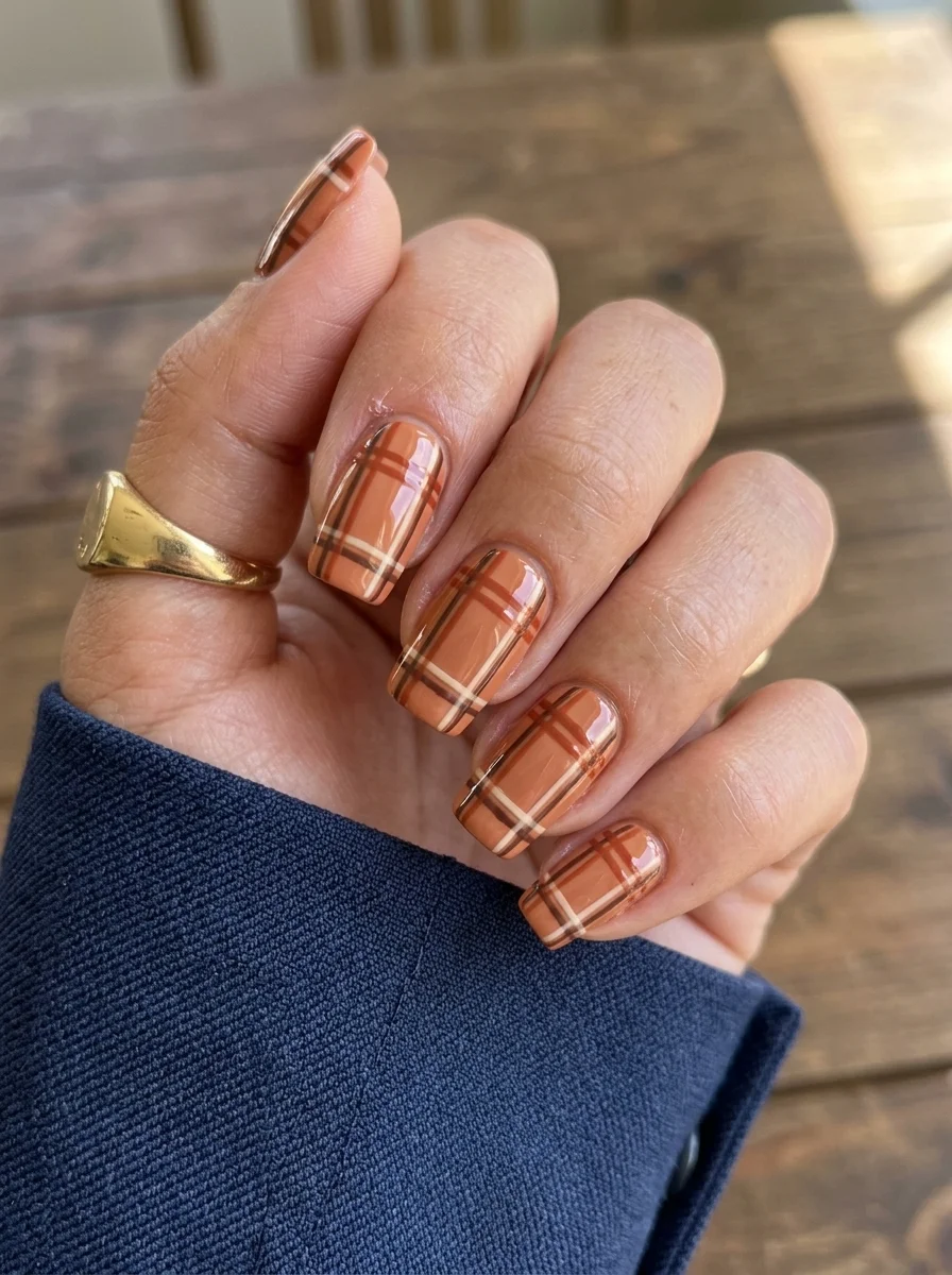
Full-coverage plaid that looks like your favorite flannel shirt.
Overview:
Full-coverage plaid on every nail is a bold choice. The pattern is visually dense, and when it covers the entire nail surface, there's no negative space for the eye to rest. This works here because the color palette stays narrow: burnt orange, dark brown, and cream. Three colors, all warm, all sharing similar undertones. The result reads as a textile rather than a pattern, which is the entire point of plaid nail art.
The burnt orange base is what makes this feel like fall rather than holiday. Traditional red-and-green plaid reads as Christmas. This orange-brown-cream combination reads as a flannel shirt, which is a specific and intentional seasonal reference. The color does the seasonal heavy lifting; the plaid pattern does the textural work.
Short square is the ideal shape for full-coverage plaid. The flat surface provides a stable canvas for the grid pattern, and the short length keeps the dense pattern from overwhelming the hand. On long nails, full plaid can feel costume-like. On short nails, it feels like an accent.
Design Breakdown:
Full-coverage plaid grid over a colored base. The pattern density is the design.
Base Color: Burnt orange or warm terracotta. Opaque in two coats.
Nail Shape: Short square. The flat surface provides a stable canvas for the plaid grid.
Design Element: Plaid grid pattern using darker brown and cream lines over the orange base. The lines cross to create the characteristic plaid overlap squares.
Finish: High-gloss top coat to smooth the layered stripe texture.
Get The Look at Home:
Do all horizontal lines first across every nail, let them dry completely, then do all vertical lines. Patience between layers prevents smearing.
- Orange base: Two coats of burnt orange on all nails. Let dry fully.
- Horizontal lines: Using a striper brush and dark brown polish, paint thin horizontal lines spaced about 2-3mm apart. Let dry completely.
- Vertical lines: Paint vertical lines at the same spacing. Where they cross the horizontal lines, the doubled-up color creates darker squares.
- Cream accents: Add thin cream-colored lines between the brown lines for a more complex plaid pattern.
- Consistency check: Compare the line spacing across all nails. Uneven spacing makes the plaid look sloppy.
- Seal: Two coats of top coat to level out the raised stripe texture.
34 Stunning Summer Butterfly Nails for Women in 2026 🦋
28.Deep Burgundy Cat Eye
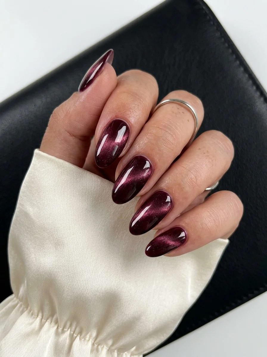
A darker, more intense cat eye that looks like light trapped in garnet.
Overview:
This is the deeper, moodier cousin of the earlier burgundy cat eye. Where that one leaned warm and approachable, this version pushes darker, almost into oxblood territory. The magnetic shimmer concentrates into a tighter, more defined band that glows against the near-black base. Under indoor lighting, these read as a dark, almost gothic red. In sunlight, the cat-eye band ignites with a crimson fire that transforms the entire nail.
The almond shape is perfect for this particular cat eye because the tapered tip creates a natural termination point for the magnetic light band. The band travels from the cuticle area toward the tip, narrowing as it goes, which creates a sense of movement that a square shape wouldn't provide. The curved surface also means the light band wraps around the nail rather than sitting as a flat line, which adds to the three-dimensional quality.
Dark cat-eye polishes are more forgiving during application than light ones. The deep pigment hides minor inconsistencies in the magnetic band, and the contrast between the dark base and the shimmer makes the effect more visible even if the magnet placement isn't perfect. If you're new to cat-eye polish, starting with a dark color like this is a good way to learn the technique.
Design Breakdown:
Single-color magnetic polish, darker and more intense than the earlier burgundy cat eye. The concentrated shimmer band is the focal point.
Base Color: Deep burgundy or oxblood cat-eye magnetic polish. Two coats for full opacity.
Nail Shape: Medium almond. The tapered tip creates a natural endpoint for the magnetic light band.
Design Element: None. The cat-eye magnetic effect provides all the visual interest.
Finish: High-gloss top coat to amplify the magnetic shimmer and deepen the dark base.
Get The Look at Home:
The magnet angle determines where the light band sits. Experiment with different angles to find the band position you prefer.
- Base coat: Apply a standard base coat and let it dry completely.
- First coat: Apply a thin layer of deep burgundy cat-eye polish. Let it dry for two minutes.
- Second coat and magnet: Apply the second coat. Immediately hold the magnet 3-5mm above the nail, angled to create a diagonal band. Hold steady for 10-15 seconds.
- Repeat per nail: Work one nail at a time. The polish must be wet when magnetized.
- Dry fully: Let each nail dry completely before moving to the next to avoid bumping the magnetic particles.
- Top coat: One thick coat of glossy top coat. Apply gently in a single stroke per nail to avoid disturbing the magnetic band.
Fall nails don't have to be predictable. The designs here range from simple solid colors that let the season's palette do the talking to intricate hand-painted botanicals and chrome finishes that catch the light. The warm undertones that define fall, from burgundy to copper to forest green, are some of the most flattering colors in the nail polish spectrum.
Save your favorite designs to your Pinterest board so you have them ready for your next salon visit or at-home manicure session. Your next autumn-ready set is just one appointment away.