Nail Trends
32 September Nail Designs for Fall 2026
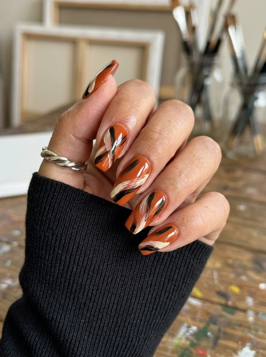
September is the month where summer's bright neons give way to something richer, warmer, and more intentional. The nail designs trending this month reflect that shift: deep burgundies, earthy terracottas, forest greens, and warm browns dominate the palette, with gold metallic accents adding just enough sparkle to keep things interesting. Whether you're drawn to minimalist pinstripes or maximalist snakeskin textures, this collection has something for every mood and occasion.
Finding Your September Shade: Color Theory for Autumn Nails
The colors that dominate September nail trends share a common quality: warmth with depth. Unlike summer's bright primaries or winter's cool jewel tones, September shades sit in that transitional zone where earth tones meet rich saturated hues. Warm undertones (golden, olive, or peach skin) naturally harmonize with the terracottas, cognacs, and amber shades that define this month's palette. If you have cool undertones (pink or blue veins), the burgundies, navy, and deep purples will complement your complexion without washing you out.
Nail shape also determines how September designs register. A tapered medium almond or oval shape provides a gentle curve that works beautifully for organic patterns like marble, wood grain, and botanical prints. Structured square or coffin shapes complement geometric designs like checkerboards, plaid, and color blocking. The shape you choose sets the tone for the entire design.
1.Burgundy Leopard French Tips
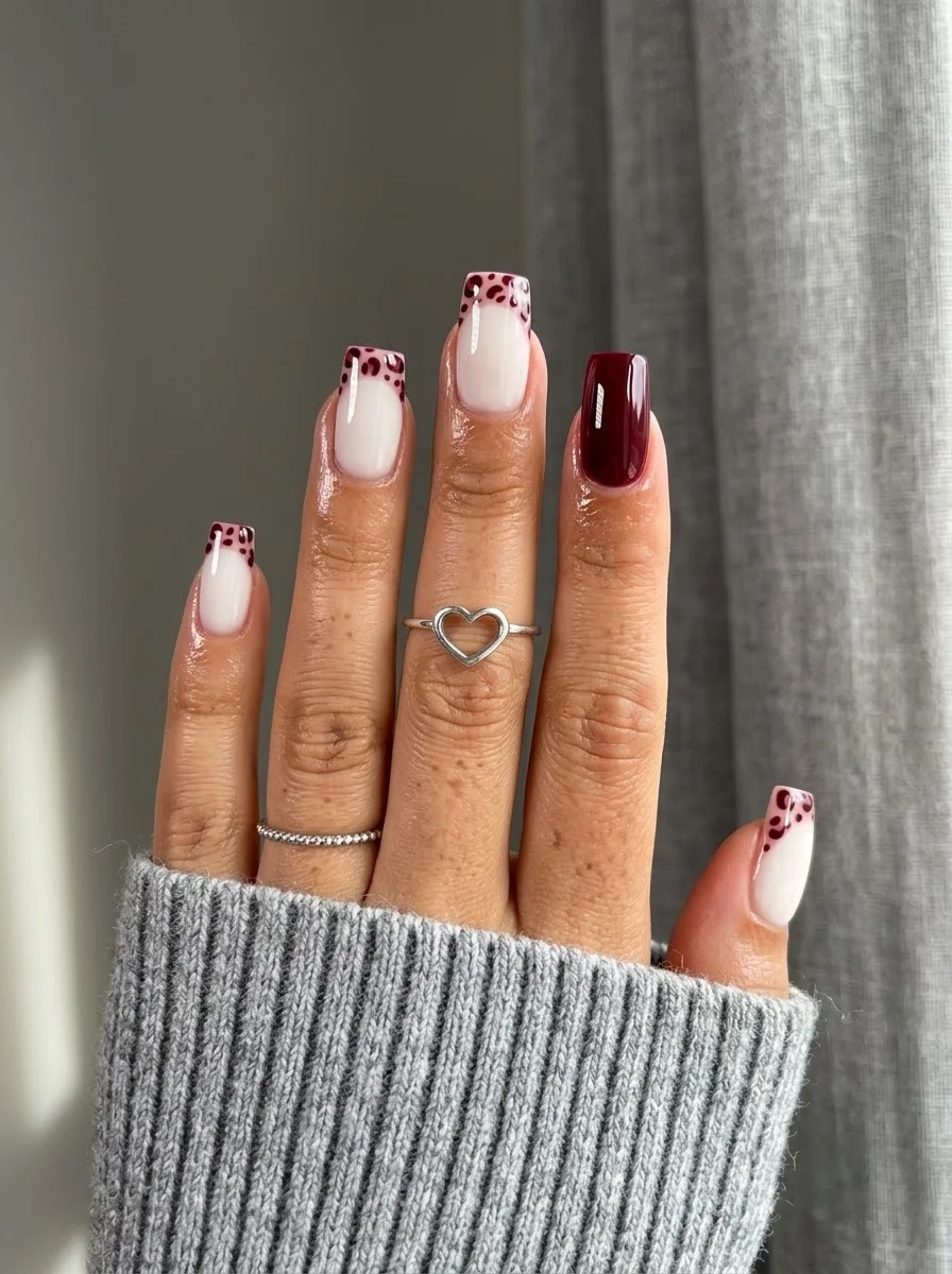
A moody twist on the French tip that trades classic white for wild print.
Overview:
Leopard print on nails has a reputation for looking busy, but confining it to the French tip section changes the equation entirely. The milky white base keeps the overall look clean, and the burgundy leopard spots on the tips add just enough edge without overwhelming the hand. It's the kind of design that reads as "polished" from a distance and reveals its personality up close.
The solid burgundy accent nail on the index finger anchors the whole set. Without it, the leopard tips might feel like they're floating without a color story. The deep wine red ties the spots together and gives your eye a place to rest. It's a small structural choice that makes the difference between a cohesive design and a pattern that happens to be on your nails.
One thing to know: burgundy polish stains cuticles more aggressively than most colors. Budget an extra five minutes for cleanup, and consider applying a peel-off base coat on the accent nail if you change manicures frequently. The deep pigment is worth the hassle, but it's better to plan for it.
Design Breakdown:
A French tip variation that uses print instead of solid color for the tip section.
Base Color: Milky, semi-sheer white. Opaque enough to hide the natural nail line but soft enough that the burgundy spots don't look harsh against it.
Nail Shape: Long coffin. The flat tip gives the leopard print room to read as a deliberate pattern rather than random spots.
Design Element: Burgundy leopard spots concentrated on the French tip area of four nails. One solid burgundy accent nail on the index finger.
Finish: High-gloss top coat to unify the printed tips with the sheer base.
Get The Look at Home:
The leopard spots need to be irregular to look natural. Perfectly round dots read as polka dots, not animal print.
- Milky base: Two coats of semi-sheer white. Let each dry fully. The base needs to be smooth so the French line stays crisp.
- Map the tips: Using a French liner brush and burgundy polish, paint the smile line from sidewall to center on each nail. Fill in the tip area.
- Leopard spots: While the burgundy tip is still slightly tacky, use a dotting tool to place irregular dark brown or black spots over the burgundy. Keep them clustered within the tip area.
- Accent nail: On the index finger, paint the entire nail burgundy. Two thin coats for full opacity.
- Cleanup: An angled brush dipped in acetone sharpens the French smile line. This step is non-negotiable on a sheer base.
- Seal: Two coats of top coat. The first locks the print; the second smooths the surface.
25 Top Curly Hairstyle Trends for 2026 ➰✨
2.Matcha Marble Swirl
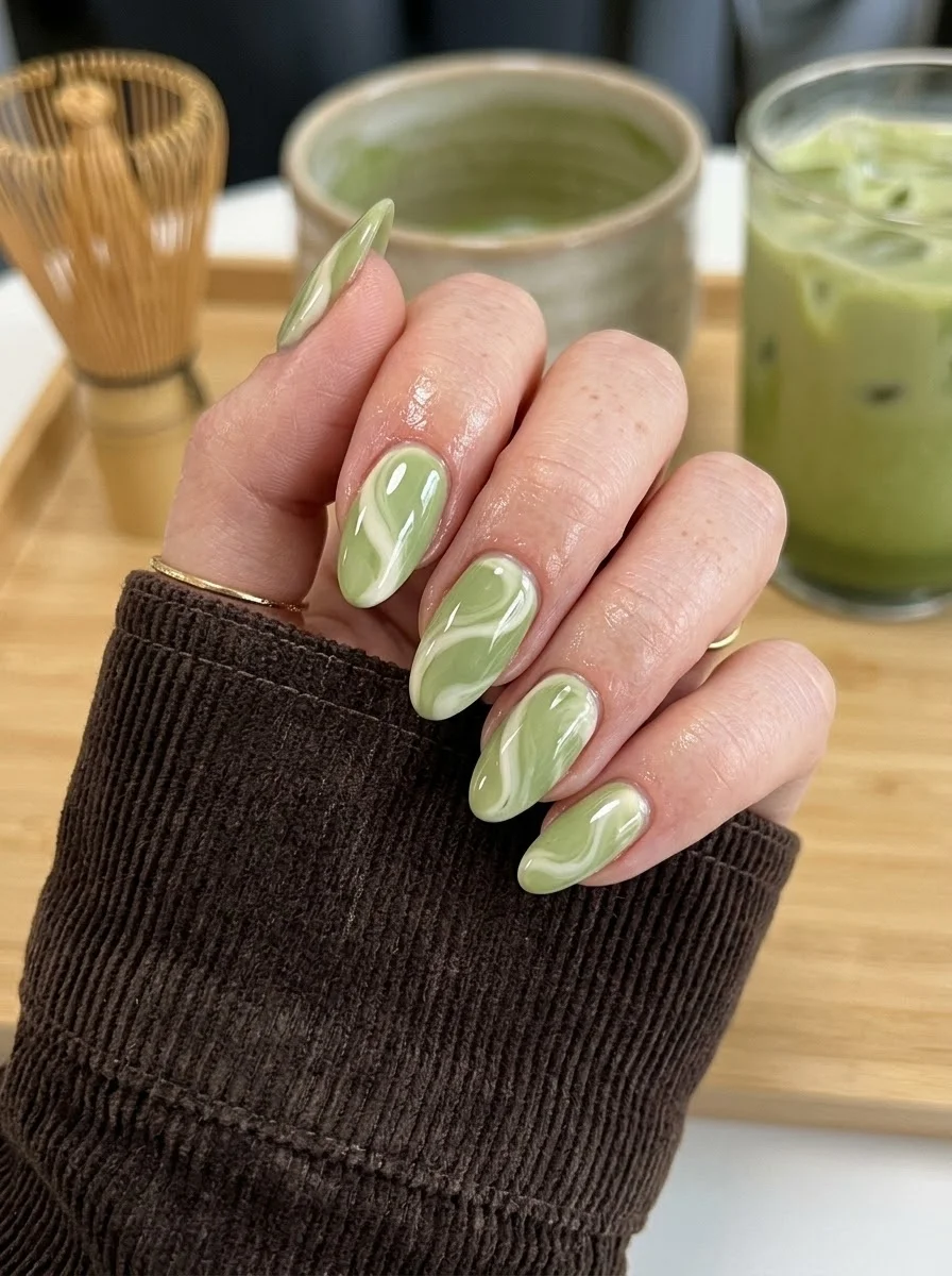
A calming, creamy design inspired by your favorite matcha latte.
Overview:
Sage green and white marble is one of those combinations that sounds simple but depends entirely on the execution. The swirl needs to look organic, like cream folding into tea, rather than like someone dragged a toothpick through wet polish. The difference is in the pressure and direction of your strokes.
What makes this design work for September is the temperature of the green. It's not a bright spring mint or a dark forest shade. It sits in that warm, muted zone that reads as "transitioning seasons" without committing fully to autumn. The white swirls keep it light enough to carry into early fall without looking out of place next to a cup of hot matcha.
The almond shape is essential here. The curved tip softens the marble pattern and makes the swirls look like they're flowing toward the point. On a square or coffin shape, the same pattern would look more geometric and less organic. If you want the "poured cream" effect, the shape matters as much as the technique.
Design Breakdown:
Wet-on-wet marble technique using two colors. The "imperfections" make it better.
Base Color: Creamy, opaque sage or matcha green. Something between pistachio and moss, not neon, not olive.
Nail Shape: Medium almond. The tapered tip complements the flowing, organic nature of the marble swirls.
Design Element: White swirls dragged through the wet green base to create a marbled, latte-like effect. Each nail will look slightly different.
Finish: High-gloss top coat. The shine creates the "liquid" illusion that makes the marble look like it's still moving.
Get The Look at Home:
This is a wet-on-wet technique. Work quickly and resist the urge to over-blend.
- Green base: Apply one thin coat of sage green. Let it dry fully.
- Wet layer: Apply a second thin coat of green. Do NOT wait for it to dry. You're working into this wet surface.
- Drop the white: Using a dotting tool or thin brush, place small drops or lines of white polish onto the wet green. Two to three per nail is plenty.
- Drag, don't swirl: Use a toothpick or detailing brush to pull the white in one or two directions. Three or four drags per nail maximum. Over-mixing turns it into muddy grey.
- Clean skin immediately: Use a flat brush dipped in acetone to remove the mess around your cuticles before it sets.
- Top coat after full dry: Wait at least ten minutes, then apply a thick glossy top coat. Rushing this step smears the marble.
3.Burgundy Polka Dots on Mustard Nails
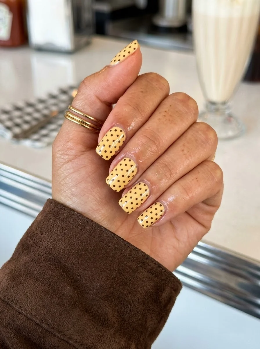
A retro-inspired dot pattern with just enough sparkle to catch the light.
Overview:
Polka dots on nails are either charming or childish, and the difference usually comes down to the base color. Mustard yellow instead of primary yellow immediately ages the pattern in the best way. It reads "vintage" rather than "birthday party," which makes the design wearable for adults who still want something playful.
The dots are the main event here. The burgundy creates a strong contrast against the warm mustard, making the pattern pop without relying on harsh black lines. The irregular placement—some dots closer together, others more spaced out—keeps it feeling organic rather than machine-made.
Yellow polish is notoriously streaky. The dot pattern actually helps here because it breaks up the surface and hides minor unevenness in the base coat. That said, you still want at least three thin coats of yellow for full opacity. Streaky yellow underneath burgundy dots looks worse than streaky yellow on its own.
Design Breakdown:
A retro pattern elevated by a sophisticated base color and subtle sparkle.
Base Color: Warm, opaque mustard yellow. Not neon, not pastel. Think marigold or turmeric, not highlighter.
Nail Shape: Short square. The flat shape reinforces the retro, graphic quality of the polka dots.
Design Element: Uniform burgundy polka dots scattered across all nails.
Finish: High-gloss top coat. The shine makes the yellow look saturated and the burgundy dots pop.
Get The Look at Home:
- Yellow base: Three thin coats of mustard yellow. Let each coat dry fully. The base needs to be flawless because the dots draw attention to the surface.
- Polka dots: Using a medium dotting tool and burgundy polish, press straight down and lift straight up. Don't twist. Space the dots roughly 3mm apart in a staggered pattern.
- Dry check: Wait at least five minutes. Burgundy polish on yellow smears instantly if the surface is even slightly tacky.
- First top coat: Apply one coat of glossy top coat. Let it sit for about 30 seconds until it's tacky but not wet.
- Seal: One more coat of top coat over everything.
27 Stunning June Nail Ideas for 2026 💅
4.Emerald Celestial Night
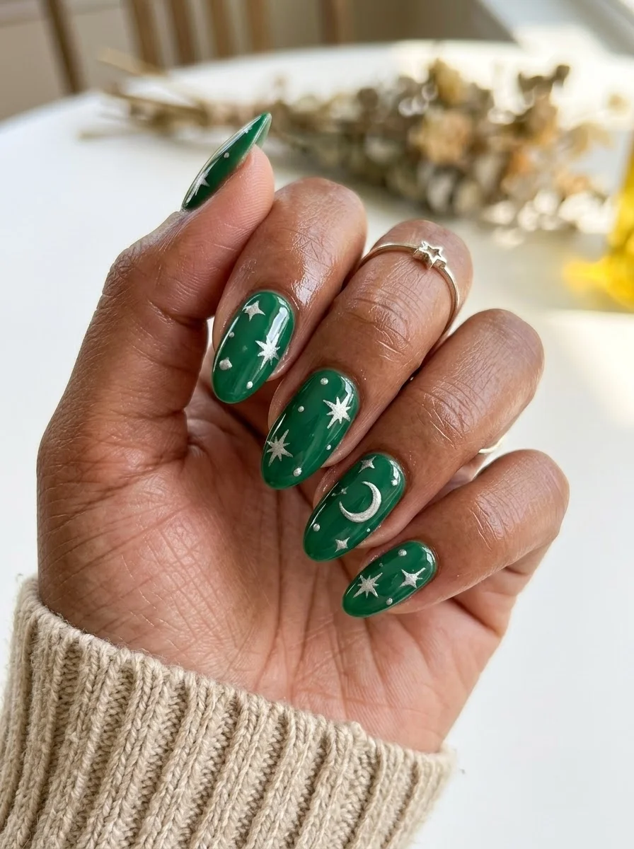
A moody, witchy design that feels like a clear autumn night sky.
Overview:
Deep emerald green with silver celestial art is one of those combinations that looks complicated but is actually one of the more forgiving designs on this list. The dark base hides imperfections in the silver linework, and the celestial shapes (moons and starbursts) are simple enough that slight irregularity reads as hand-painted charm rather than mistakes.
The mix of crescent moons and multi-pointed starbursts gives each nail something different to look at. If every nail had the same moon in the same position, the design would feel stamped and repetitive. Varying the celestial elements across the hand creates a "night sky" effect where each nail is a different window into the same scene.
Silver on dark green is a high-contrast pairing that photographs beautifully but can look harsh under certain lighting. Under warm indoor lights, the silver warms up and the green deepens. In natural daylight, both colors pop more aggressively. If you're concerned about the contrast, gold celestial art on the same green base creates a softer, warmer version of the same design.
Design Breakdown:
Dark base with metallic celestial illustration. High contrast, moody atmosphere.
Base Color: Deep, opaque emerald green. Rich and jewel-toned, not muted or olive.
Nail Shape: Medium oval. The curved shape echoes the organic curves of crescent moons and softens the sharp starburst points.
Design Element: Silver crescent moons and multi-pointed starbursts hand-painted across all nails. Placement varies per nail.
Finish: High-gloss top coat to make the silver shimmer and the green look like polished gemstone.
Get The Look at Home:
The silver linework needs a very thin brush. Thick lines overpower the delicate celestial shapes.
- Green base: Two coats of emerald green. Let each dry fully. Dark green polish can stain, so use a base coat.
- Moon shapes: Using a thin liner brush and silver polish, paint crescent moon shapes on three to four nails. Vary the size and position on each nail.
- Starbursts: On the remaining nails, paint small cross shapes with additional diagonal lines to create multi-pointed stars. Keep them small, about 3-4mm across.
- Scattered dots: Add tiny silver dots between the moons and stars to suggest distant star. Three to five per nail.
- Dry time: Wait at least five minutes before top coating. Silver metallic polish smears easily.
- Seal: One thick coat of top coat, applied in a single stroke per nail to avoid dragging the silver.
5.Cognac Leaf Print
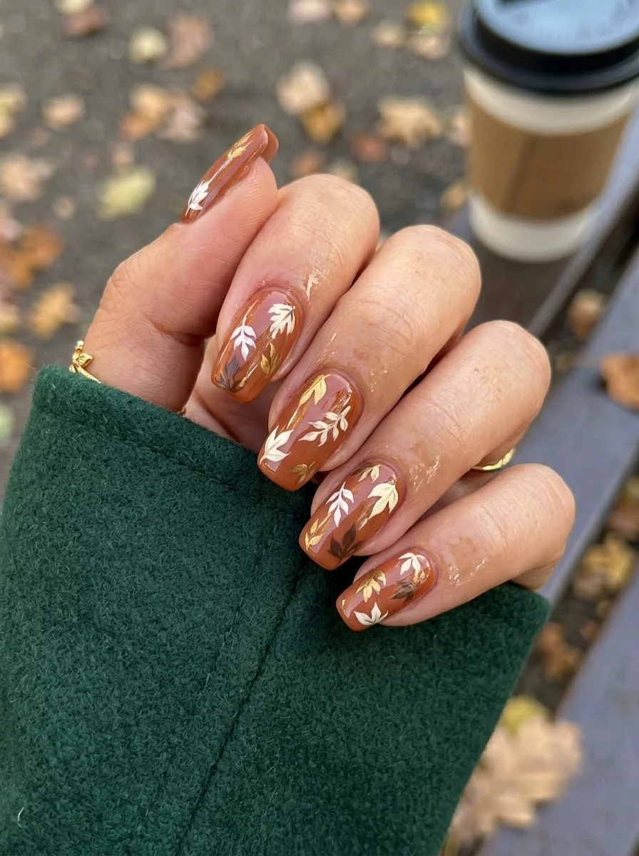
An autumnal botanical print that looks like a page from a field guide.
Overview:
Brown nail art that doesn't look like chocolate or tree bark is harder than it should be. This cognac base sidesteps both associations by going warm and translucent, more like amber or aged leather than flat brown. The leaf prints layered on top create a design that feels genuinely autumnal without being a Halloween costume.
The variety of leaf shapes and colors (cream, gold, darker brown) prevents the pattern from reading as a repeated stamp. Each nail has a slightly different arrangement, which makes the set feel curated rather than copy-pasted. The gold leaves catch light differently than the cream ones, adding a subtle dimension that a single-color print would miss.
Squaoval is the right shape here. The rounded edges complement the organic leaf forms, and the shorter length keeps the botanical print from looking busy. On long nails, the leaves would need to shrink to fit, and at that scale, the individual shapes become illegible.
Design Breakdown:
Warm tonal base with multi-colored botanical illustration. The narrow palette keeps it cohesive.
Base Color: Warm, translucent cognac or caramel brown. Not opaque cream, not flat chocolate.
Nail Shape: Rounded Square. The curved shape echoes the natural forms of leaves and ferns.
Design Element: Hand-painted leaf and fern motifs in cream, gold, and darker brown scattered across all nails. Each nail carries a different arrangement.
Finish: High-gloss top coat to give the brown base a polished, lacquered quality.
Get The Look at Home:
Paint all the leaves in one color across all nails, then go back and add the next color. This is faster than finishing one nail at a time.
- Cognac base: Two coats of warm brown. Let each dry fully.
- Cream leaves first: Using a thin liner brush and cream or off-white polish, paint simple leaf shapes scattered across the nails. Almond-shaped leaves with a single center line.
- Gold leaves: Add gold metallic leaves in the gaps between the cream ones. Three to four per nail.
- Dark brown accents: Paint a few smaller, darker brown leaves or fern fronds to add depth. These should be thinner and more delicate than the cream and gold leaves.
- Stem lines: Connect some of the leaves with thin brown lines using a liner brush. Let the lines wobble slightly, straight stems look artificial.
- Seal: Float the top coat over the art without dragging. Botanical detail work is delicate.
28 Easy Back to School Hairstyles for 2026 📚✏️
6.Terracotta Kintsugi
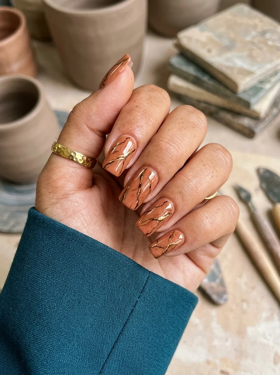
Japanese pottery aesthetics meet warm earth tones for a design that feels handmade.
Overview:
Kintsugi, the Japanese art of repairing broken pottery with gold, has been showing up in fashion and interiors for years. Translating it to nails requires a base color that reads as "clay" or "ceramic," and this terracotta shade nails that reference perfectly. The gold veining looks like cracks filled with liquid metal, which is exactly the effect you want.
The organic, irregular nature of the gold lines is what makes this design work. Perfectly straight gold lines would look like striping tape. Slightly wobbly, branching lines look like actual fractures in a ceramic surface. If you're doing this freehand, the less controlled your linework, the more authentic it looks.
Medium square is the right shape for this design. The flat edges reinforce the "tile" or "ceramic" reference, and the straight lines of the nail shape contrast nicely with the organic gold veining. On almond or oval nails, the same design would feel less grounded.
Design Breakdown:
Earth-toned base with metallic fracture lines. The gold creates the illusion of repaired cracks.
Base Color: Warm terracotta or clay brown. Opaque and creamy, not translucent.
Nail Shape: Medium square. The flat edges complement the geometric "tile" reference.
Design Element: Gold metallic veining painted in irregular, branching lines across all nails. Each nail has a unique pattern.
Finish: High-gloss top coat to make the gold shimmer and the terracotta look like polished ceramic.
Get The Look at Home:
The gold lines should be thin and irregular. Thick lines look like stripes, not cracks.
- Terracotta base: Two coats of clay brown. Let each dry fully.
- Map the cracks: Using a thin liner brush and gold metallic polish, paint irregular lines across each nail. Start from one edge and branch outward. Let the lines wobble and split.
- Branch work: From the main "crack" lines, add smaller branching lines. Two to three branches per main line is plenty.
- Vary per nail: Each nail should have a different crack pattern. Some nails get one main line with branches; others get two shorter lines.
- Dry time: Gold metallic polish takes longer to dry than cream formulas. Wait at least five minutes before top coating.
- Seal: Two coats of top coat. The first locks the gold; the second smooths the surface.
7.Burnt Orange Abstract Strokes
An artistic, painterly design that looks like abstract expressionism on your fingertips.
Overview:
Abstract brush stroke nails are one of the few designs where imprecision is the entire point. The strokes should look gestural, like someone dragged a loaded brush across the nail in a single confident motion. The burnt orange base provides enough warmth and depth that the black, cream, and white strokes read as deliberate color choices rather than random smudges.
The color combination works because each stroke color serves a different visual purpose. The black creates contrast and depth. The cream softens the orange. The white adds highlights that catch light. Remove any one of these three and the design loses its balance. All three together create a layered composition that looks more complex than it actually is to execute.
Long almond or coffin is the right canvas for this design. The extended nail surface gives each stroke room to travel, which is critical for the gestural quality. On short nails, the strokes get compressed and lose their sweeping, calligraphic energy. If you want this design to look intentional, you need the length.
Design Breakdown:
Layered brush strokes in a warm palette. The key is confident, single-pass application.
Base Color: Rich, opaque burnt orange or terracotta. Warm and saturated, not pastel or neon.
Nail Shape: Long almond or Coffin. The tapered tip provides the canvas needed for sweeping brush strokes.
Design Element: Abstract brush strokes in black, cream, and white layered across all nails. Each nail has a unique arrangement.
Finish: High-gloss top coat to unify the layered strokes and make the colors look saturated.
Get The Look at Home:
Each stroke should be one confident pass. Going back over the same stroke muddies the colors.
- Orange base: Two coats of burnt orange. Let each dry fully.
- Black strokes first: Using a flat brush loaded with black polish, make two to three bold, sweeping strokes across each nail. Vary the angle and length.
- Cream strokes: Layer cream or off-white strokes over and alongside the black. Let some overlap, leave some separate.
- White highlights: Add thin white strokes as final accents. These should be lighter and shorter than the black and cream strokes.
- Don't overwork: Stop adding strokes when each nail has three to five visible lines. More than that and the design starts to look muddy.
- Seal: Two coats of top coat to smooth the raised texture of the layered strokes.
35 Fun Birthday Nail Designs for 2026 🎂
8.Cream and Brown Checkerboard
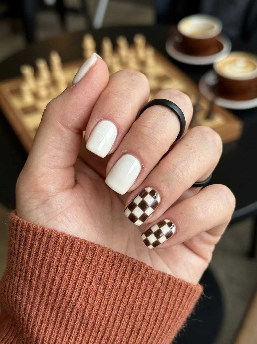
A graphic, minimalist design with a warm autumnal twist on the classic checkerboard.
Overview:
Checkerboard nails are a graphic statement that can easily overwhelm a hand if every nail carries the pattern. This design solves that problem by limiting the checkerboard to two accent nails and keeping the remaining three as solid cream. The restraint is what makes it wearable. The solid nails provide breathing room, and the patterned nails become focal points rather than visual noise.
Brown and cream instead of the traditional black and white softens the graphic quality and makes the design feel autumnal rather than mod. The warm tones work better with fall wardrobes and skin tones than the stark contrast of black on white. It's the same pattern, just dressed for the season.
Short square is the right shape for checkerboard. The flat surface provides a stable grid, and the short length keeps the pattern proportional. On longer nails, the squares get larger and the checkerboard starts to look like a racing flag rather than a textile reference.
Design Breakdown:
Limited pattern application with solid-color rest. The contrast between patterned and solid nails creates the design.
Base Color: Bright, opaque cream or off-white on all nails. The cream serves as both the solid color and the lighter square in the checkerboard.
Nail Shape: Short square. The flat surface provides a clean grid for the checkerboard pattern.
Design Element: Brown and cream checkerboard pattern on two accent nails (ring and pinky). Remaining nails are solid cream.
Finish: High-gloss top coat to make the cream look like polished porcelain.
Get The Look at Home:
The checkerboard requires a steady hand or striping tape. Freehand works if you accept a slightly handmade look.
- Cream base: Two coats of opaque cream on all nails. Let each dry fully.
- Grid lines: On the accent nails, use a thin liner brush and brown polish to paint a grid. Three horizontal lines and three vertical lines create a 4x4 checkerboard.
- Fill alternating squares: Fill in every other square with brown polish. Work from one corner and alternate like a chess board.
- Clean edges: Use an angled brush dipped in acetone to sharpen the grid lines. Straight lines are critical for the graphic effect.
- Solid nails: The remaining three nails stay as solid cream. If needed, add a third coat for full opacity.
- Seal: One thick coat of top coat to smooth the raised texture of the checkerboard squares.
9.Navy Kintsugi with Gold Veins
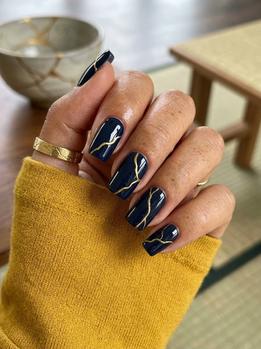
Deep midnight blue meets liquid gold for a luxurious take on the pottery repair art.
Overview:
Navy and gold is a combination that reads as expensive regardless of context. The deep blue provides a saturated, almost black backdrop that makes the gold veining pop with maximum contrast. It's the same kintsugi concept as the terracotta version, but the mood shifts from earthy and organic to sleek and luxurious.
The gold lines on navy create a visual effect similar to lightning across a night sky. The organic, branching pattern feels dynamic rather than decorative, which gives the design energy that a more controlled pattern would lack. Each nail looks like a tiny abstract painting.
One practical note: navy polish is notoriously difficult to remove. It stains cuticles and lifts poorly with regular remover. Budget an extra five minutes for cleanup. A peel-off base coat on the navy nails makes removal dramatically easier if you change manicures frequently. OPI "Russian Navy" or Essie "Butler Please" give full, streak-free coverage in two coats.
Design Breakdown:
Dark, saturated base with metallic fracture lines. Maximum contrast between blue and gold.
Base Color: Deep, opaque navy blue. Rich and jewel-toned, not grey or muted.
Nail Shape: Medium oval. The curved shape softens the sharp contrast and adds elegance.
Design Element: Gold metallic veining in irregular, branching lines across all nails. Each nail has a unique crack pattern.
Finish: High-gloss top coat to make the navy look like polished onyx and the gold shimmer.
Get The Look at Home:
The gold lines need to be thin and irregular. Practice the branching motion on paper first.
- Navy base: Two coats of deep navy. Let each dry fully. Use a base coat to prevent staining.
- Main crack lines: Using a thin liner brush and gold metallic polish, paint one or two main lines across each nail. Start from one edge and let the line wobble naturally.
- Branching: From the main lines, add smaller branches that split off at random angles. Two to three branches per main line.
- Vary the density: Some nails get dense veining with many branches; others get sparse, single-line cracks. The variation makes the set feel organic.
- Dry time: Gold metallic polish takes longer to set. Wait at least five minutes before top coating.
- Seal: Two coats of top coat to smooth the surface and protect the gold from chipping.
34 Stunning Summer First Date Hairstyles for 2026 💕☀️
10.Forest Plaid
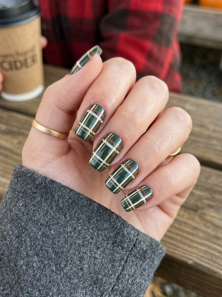
A preppy, cozy design that pairs perfectly with flannel season.
Overview:
Plaid on nails walks a fine line between "preppy" and "busy." This forest green version lands on the right side because the color palette stays tight: green, cream, rust, and a darker green for the thinner accent lines. Every color in the plaid shares a warm undertone, which creates cohesion across the pattern even though the lines cross at multiple angles.
The plaid works better on square or squaoval nails than on oval or almond shapes because the square shape softens the geometric grid. On a square or squaoval nail, the lines need to be perfectly straight or the whole pattern looks off.
This is a design where patience pays off. Each set of lines needs to dry before the next set goes on, or the colors bleed into each other and the plaid turns muddy. Budget at least 45 minutes for the full set, and resist the urge to rush the drying time between layers.
Design Breakdown:
Multi-line plaid pattern using a tight four-color warm palette.
Base Color: Deep, opaque forest green. Rich and saturated, not muted or olive.
Nail Shape: Square or squaoval. The straight edges allow the geometric grid to sit flat and crisp.
Design Element: Plaid grid using cream, rust, and darker green lines over the forest green base. Thicker lines for the main grid, thinner lines for accent.
Finish: High-gloss top coat to smooth the layered line texture and make the colors look saturated.
Get The Look at Home:
Work in color layers. All cream lines first, then rust, then dark green. Let each layer dry before the next.
- Green base: Two coats of forest green. Let each dry fully.
- Cream lines: Using a striper brush and cream polish, paint thin horizontal lines spaced about 3mm apart. Let dry completely.
- Cream vertical lines: Paint vertical lines at the same spacing, creating a cream grid over the green. Let dry.
- Rust accent lines: Paint thinner rust-colored lines between the cream lines, both horizontal and vertical. Let dry.
- Dark green accent: Add the thinnest lines in a darker green along the center of some cream lines for depth.
- Seal: Two coats of top coat to smooth the raised line texture.
11.Nude and Copper Leaf
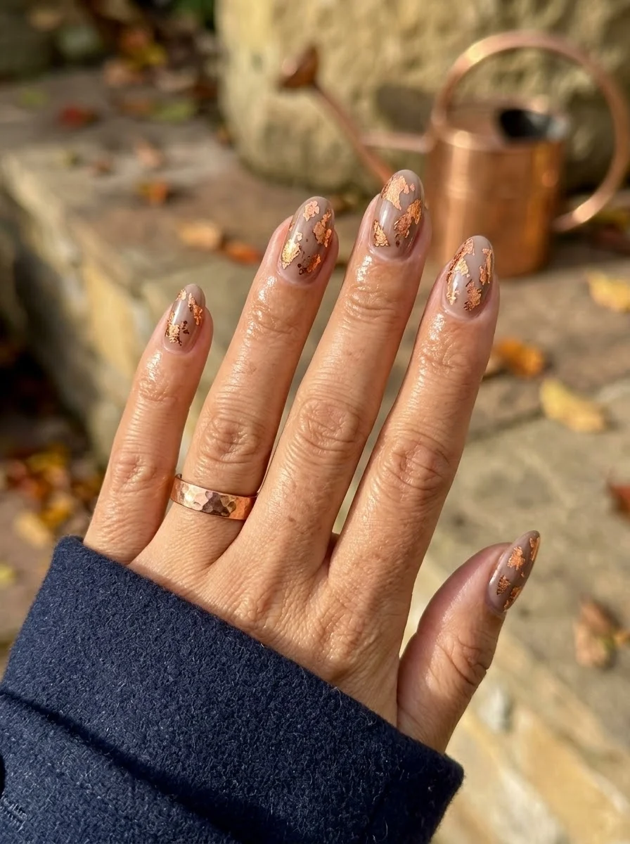
Delicate metallic accents that catch light without committing to full coverage.
Overview:
Gold and copper leaf on sheer nude is one of those designs that photographs beautifully in every lighting condition. The translucent base lets the natural nail show through, which makes the metallic fragments look like they're floating on bare skin rather than sitting on top of polish. The effect is ethereal in a way that solid metallic nails can't replicate.
The irregular shape of the leaf fragments is what makes this design work. Each piece lands differently, creating an organic, scattered pattern that looks accidental in the best possible way. If you tried to achieve the same effect with metallic polish dots or stripes, it would look deliberate and controlled. The leaf fragments look like they just happened to land there.
Copper works better here than gold for most skin tones. Gold leaf on nude can read as yellowish, especially on warmer skin. Copper has enough red in its undertone to complement a wider range of complexions without washing anyone out. It also reads as more autumnal, which fits the September timeline.
Design Breakdown:
Transparent base with organic metallic fragments. The negative space is as important as the leaf placement.
Base Color: Sheer nude or milky pink. The natural nail should be visible through the base.
Nail Shape: Medium almond. The tapered tip echoes the delicate, wispy quality of the leaf fragments.
Design Element: Irregular copper or rose gold leaf fragments scattered across all nails. Concentrated more toward the tips, fading toward the cuticle.
Finish: High-gloss top coat to seal the leaf fragments and create a smooth surface.
Get The Look at Home:
The leaf fragments are fragile. Handle them with tweezers and press them flat before sealing.
- Nude base: Two coats of sheer nude or milky pink. Let each dry fully.
- Tacky layer: Apply a thin coat of top coat and let it sit for 30 seconds until tacky but not wet. This gives the leaf something to adhere to.
- Leaf placement: Using tweezers, pick up small copper leaf fragments and press them onto the tacky surface. Scatter them randomly, concentrating more pieces toward the tips.
- Press flat: Use a clean finger or a silicone tool to press the leaf fragments flat against the nail. Raised edges will catch and peel.
- Seal: Two coats of top coat. The first encapsulates the leaf; the second smooths the surface. Cap the free edge to prevent lifting.
34 Cutest Butter Yellow Nail Designs for 2026 🧈
12.Burgundy Pinstripe
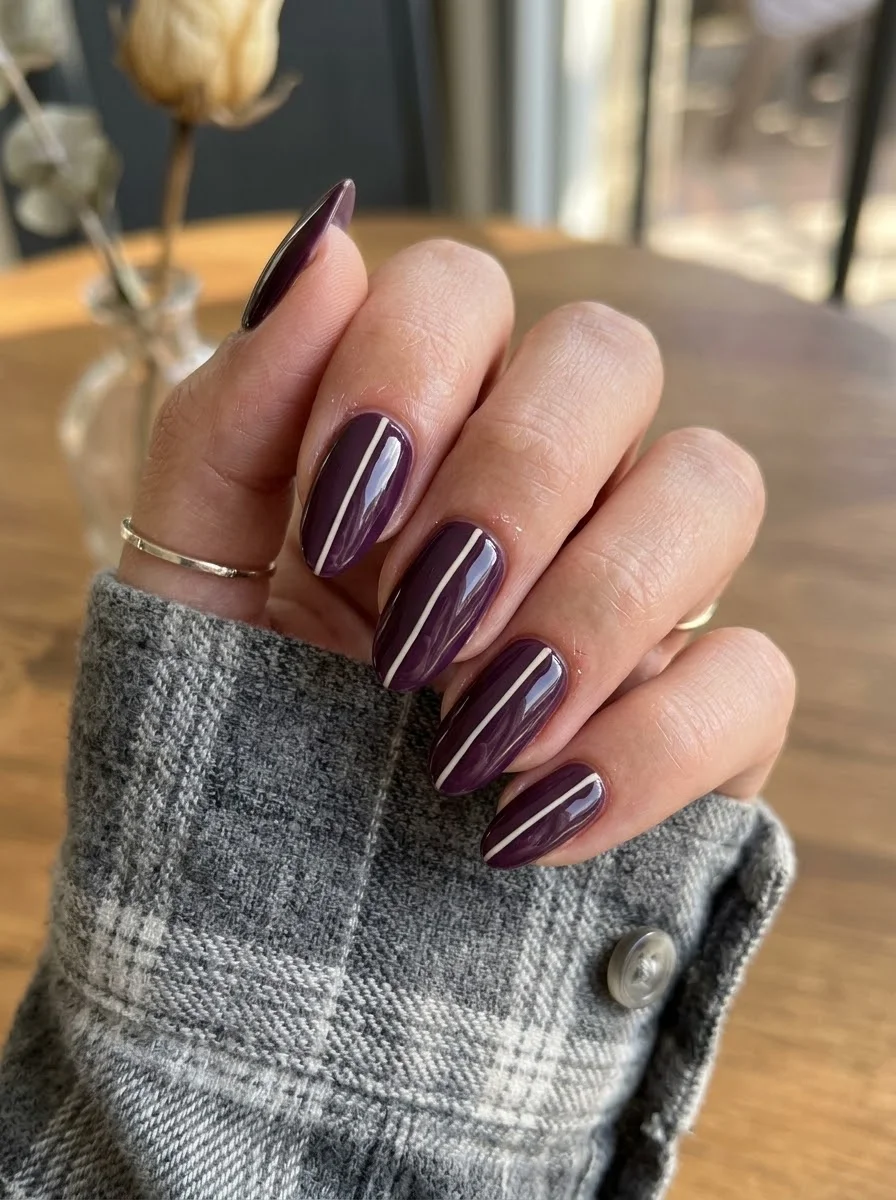
A minimalist stripe that adds structure to a rich, moody base color.
Overview:
A single thin white line down the center of a dark nail is one of the simplest designs you can execute, but the effect is surprisingly sophisticated. The pinstripe creates a visual axis that elongates the nail and adds structure to what would otherwise be a solid block of color. It's the nail equivalent of a pinstripe suit: understated, sharp, and quietly expensive-looking.
The vertical orientation matters. A horizontal stripe across a nail cuts it in half and makes it look wider. A vertical stripe draws the eye upward and makes the nail look longer and more elegant. On oval or almond shapes, the pinstripe follows the natural curve of the nail and creates a seamless, flowing line from cuticle to tip.
The white needs to be thin enough that it reads as a line rather than a stripe. If it's wider than about 0.5mm, the design shifts from "pinstripe" to "racing stripe," which is a completely different aesthetic. A striper brush with a very fine tip is essential here. Regular brush widths are too thick.
Design Breakdown:
Single-line minimalist design on a dark base. Precision is everything.
Base Color: Deep, opaque burgundy or wine red. Rich and saturated, not bright cherry.
Nail Shape: Medium oval. The curved shape complements the vertical line and elongates the nail.
Design Element: One thin white vertical pinstripe down the center of each nail. Consistent width across all nails.
Finish: High-gloss top coat to make the burgundy look like polished garnet.
Get The Look at Home:
The line needs to be straight and consistent. Practice on paper first if you're new to striper brushes.
- Burgundy base: Two coats of deep wine red. Let each dry fully. The surface needs to be completely smooth for the line to sit cleanly.
- Line setup: Load a very fine striper brush with white polish. Wipe most of the polish off on the bottle neck, leaving just enough for a thin, controlled line.
- The pinstripe: Starting from the cuticle, draw a single straight line down the center of each nail to the tip. Use one confident stroke. If you need to reconnect, overlap slightly rather than starting a new line.
- Cleanup: If the line wanders, use a clean brush dipped in acetone to correct the edge. Do this immediately before the white sets.
- Dry time: Wait at least five minutes before top coating. White on dark colors smears easily.
- Seal: One thick coat of top coat, applied in a single stroke to avoid dragging the line.
13.Dark Burgundy Cat Eye
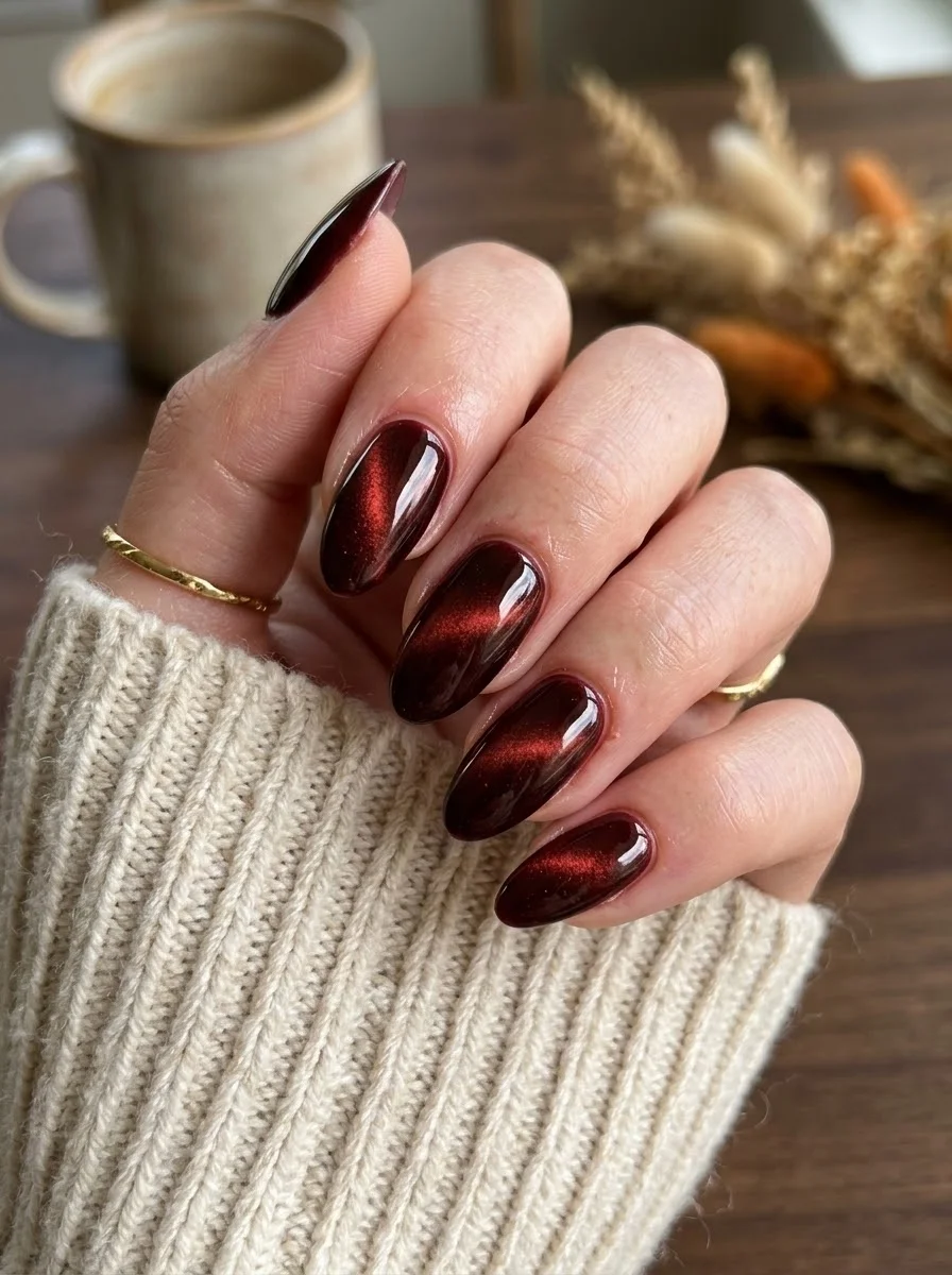
A magnetic polish that creates depth and movement with every shift of your hand.
Overview:
Cat-eye polish uses magnetic particles suspended in the formula to create a line of light that shifts as you move your hand. The effect is subtle in photos but mesmerizing in person. On this dark burgundy base, the magnetic shimmer creates a red-to-black gradient that looks like light passing through a ruby.
The technique requires a magnet held over the wet polish for 10-15 seconds after application. The magnet pulls the metallic particles into a concentrated line, creating the "cat eye" effect. Without the magnet, you just have a shimmery burgundy. With it, the nail has dimension and movement that changes with every angle.
This is a design that looks better in person than in photos. Camera sensors struggle to capture the magnetic shift, so the effect often reads as flat shimmer in pictures. If you're choosing this design, do it for your own enjoyment rather than for Instagram. That said, the deep burgundy base color is gorgeous on its own even without the magnetic effect.
Design Breakdown:
Magnetic polish technique. The magnet creates the design, not your brush.
Base Color: Dark burgundy or wine cat-eye magnetic polish. The formula contains suspended metallic particles.
Nail Shape: Medium almond. The curved surface maximizes the light-shifting effect of the magnetic particles.
Design Element: The cat-eye magnetic line created by holding a magnet over the wet polish. No hand-painted art required.
Finish: High-gloss top coat to seal the magnetic effect and add depth.
Get The Look at Home:
You need a cat-eye magnet. Regular fridge magnets are too weak. Nail supply shops sell purpose-built cat-eye magnets for under ten dollars.
- Base coat: Apply a standard base coat. Let it dry fully.
- First cat-eye coat: Apply one thin coat of the magnetic polish. Immediately hold the magnet about 5mm above the nail for 10-15 seconds. The magnet should be parallel to the nail surface.
- Second coat: Apply a second coat of magnetic polish. Again, immediately hold the magnet in place for 10-15 seconds. The effect intensifies with each layer.
- Don't touch: Keep your hand still for at least 30 seconds after removing the magnet. The particles need time to set in position.
- Cure if gel: If using gel formula, cure under the lamp after each coat. If using regular polish, let each coat dry fully before the next.
- Seal: One coat of high-gloss top coat. The shine enhances the magnetic shift.
21 Stunning Concert Hairstyles for Women 2026 🎶✨
14.Classic Tortoiseshell
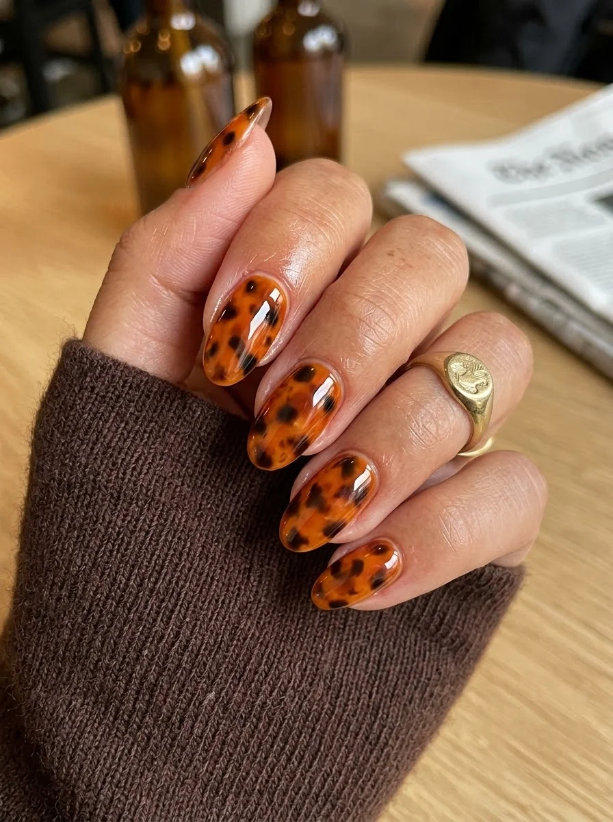
A warm, organic pattern that looks like polished amber straight from nature.
Overview:
Tortoiseshell nail art is one of those designs that looks impossibly complex but is actually built from three simple elements: an amber base, brown spots, and darker brown or black accents layered on top. The translucent quality of the amber base is what sells the effect. It creates depth that makes the spots look submerged rather than painted on the surface.
The pattern works because tortoiseshell is inherently irregular. No two real tortoiseshell pieces look the same, so your nails shouldn't either. Embrace the variation. Some nails will have more dark spots, others will be more amber. The inconsistency is what makes the set look organic rather than stamped.
The warm amber tones make this one of the most versatile designs on this list. It pairs with virtually every fall outfit color, from earth tones to jewel tones to neutrals. It's the nail equivalent of a tortoiseshell sunglasses frame: classic, warm, and universally flattering.
Design Breakdown:
Layered spot technique over a translucent base. Depth comes from layering, not complexity.
Base Color: Translucent amber or warm honey. Not opaque yellow, not flat brown. The transparency is critical for the depth effect.
Nail Shape: Medium oval. The curved shape complements the organic, rounded spots.
Design Element: Irregular brown and black spots layered over the amber base. Some spots overlap, creating darker areas of concentration.
Finish: High-gloss top coat to create the "polished gemstone" illusion.
Get The Look at Home:
Work in translucent layers. The depth comes from building up spots, not from painting them all at once.
- Amber base: Two coats of translucent amber or honey polish. Let each dry fully. The base should be sheer enough to see through.
- Brown spots: Using a dotting tool and medium brown polish, place irregular blobs across each nail. Vary the sizes and don't space them evenly. Some should cluster, others should stand alone.
- Dark accents: While the brown spots are still slightly tacky, add smaller dark brown or black spots on top of and around the brown ones. This creates the layered depth.
- Blend edges: Use a clean brush to slightly blur the edges of some spots. Perfectly sharp spots look like polka dots, not tortoiseshell.
- Optional third layer: Add a few more amber spots over everything to push some of the dark spots deeper into the design.
- Seal: Two coats of top coat to smooth the surface and enhance the translucent depth.
15.Cherry Red with Gold Leaf Accent
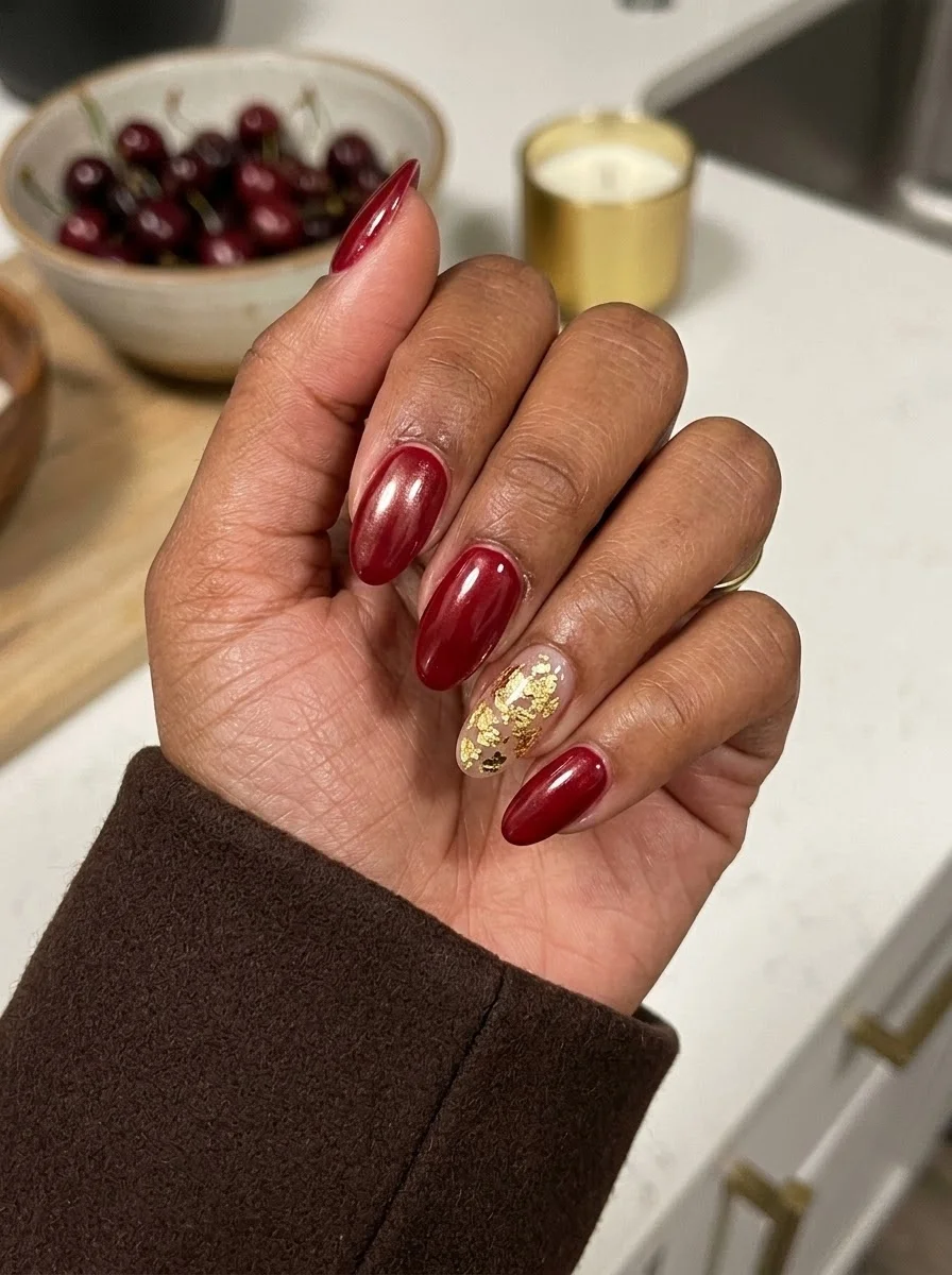
A bold red mani with one luxe metallic moment.
Overview:
Deep cherry red is one of those colors that needs no explanation. It's universally recognized, seasonally appropriate, and effortlessly sophisticated. Adding a gold leaf accent nail doesn't change the fundamental character of the set. It just adds one moment of visual interest that elevates the whole thing from "nice red nails" to "designed set."
The gold leaf sits on a sheer nude base on the ring finger, which creates a deliberate contrast against the solid red on the other four nails. The nude background makes the gold fragments look like they're floating, which is more visually interesting than placing gold leaf directly on red. The two textures, glossy red and metallic gold, create a push-pull that keeps the eye moving across the hand.
Cherry red polish with any shimmer or metallic quality reads as more modern than flat cream red. The subtle shimmer in this particular shade catches light and gives the color dimension that a flat red would lack. It's the difference between a red plastic cup and a red glass vase: same color, completely different quality.
Design Breakdown:
Solid color with one metallic accent. The contrast between the two finishes creates the design.
Base Color: Deep cherry red with subtle shimmer on four nails. Sheer nude on the ring finger accent.
Nail Shape: Medium oval. The classic shape complements the timeless red color.
Design Element: Solid red on four nails. Gold leaf fragments scattered on a sheer nude base on the ring finger.
Finish: High-gloss top coat on all nails. The shine unifies the red and gold finishes.
Get The Look at Home:
Do all the red nails first, then tackle the accent nail. It's easier to work with one technique at a time.
- Red nails: Two coats of cherry red on four nails. Let each dry fully.
- Accent base: Two coats of sheer nude on the ring finger. Let dry.
- Tacky layer: Apply a thin coat of top coat on the accent nail and let it sit for 30 seconds until tacky.
- Gold leaf: Using tweezers, press small gold leaf fragments onto the tacky surface. Scatter randomly, concentrating toward the center of the nail.
- Press flat: Use a clean finger to press the leaf fragments flat. Raised edges will snag.
- Seal: Two coats of top coat over all nails. The accent nail needs the extra coat to encapsulate the leaf texture.
29 Stunning Summer Almond Nails for Women in 2026 💅
16.Cognac French Tips
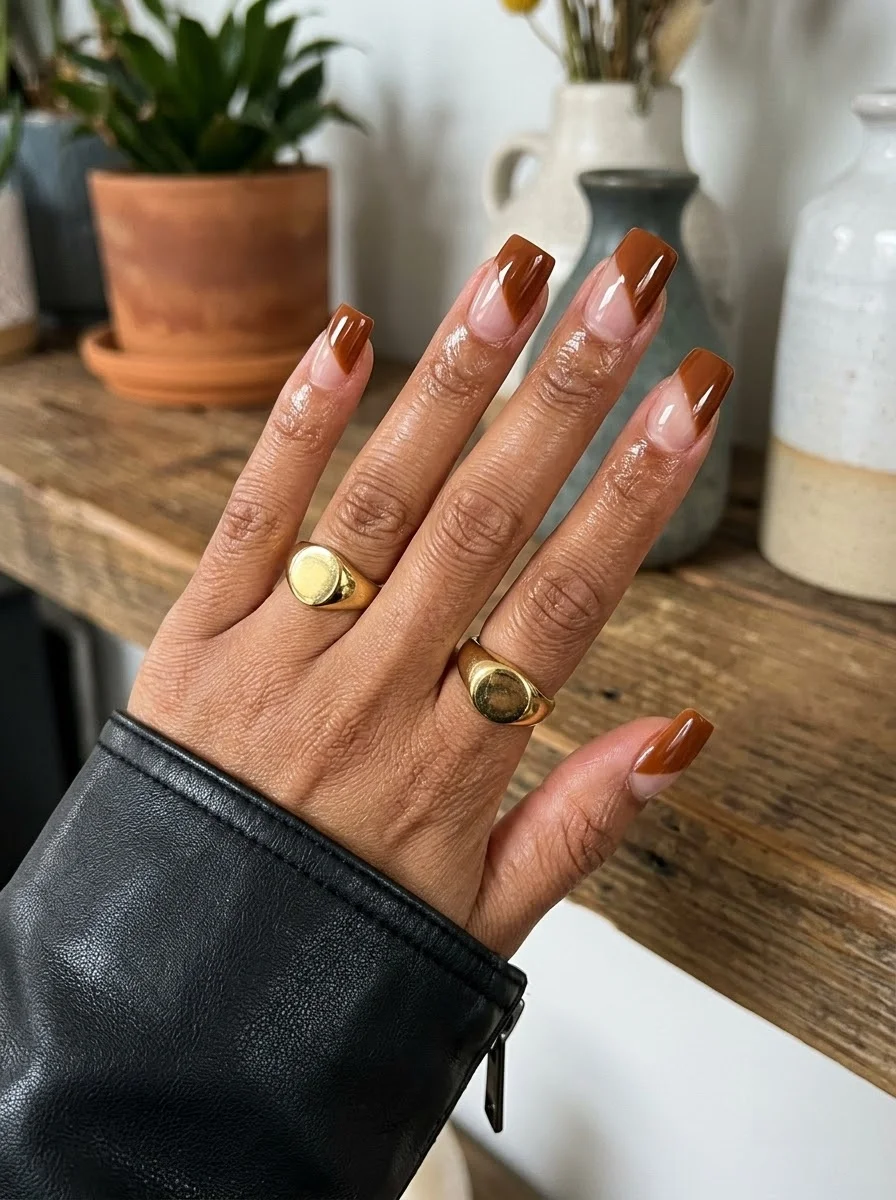
A warm-weather French that trades white for autumn's favorite brown.
Overview:
Brown French tips are the direct upgrade for anyone who finds classic white French too safe for fall. The warm cognac shade reads as rich and deliberate without being as heavy as dark chocolate or as casual as taupe. It's the color of a good leather bag, and it translates to nails with the same sense of understated quality.
The long square shape is essential here. The flat tip gives the brown French line a clean, geometric edge that a rounded shape would soften. The length also gives the tip enough surface area to register as a deliberate color choice rather than grown-out nude polish. Anything shorter than medium length and the brown tips start to look like an accident.
The nude base needs to match your natural nail bed closely. A nude that's too pink or too beige will create a visible line where the base meets your skin, which distracts from the French tip. Test potential nude shades on one nail before committing to the full set.
Design Breakdown:
Classic French structure with a warm brown tip. Clean lines and precise proportions.
Base Color: Sheer nude or milky pink that matches the natural nail bed.
Nail Shape: Long square. The flat tip creates a sharp, modern French line.
Design Element: Warm cognac or caramel brown French tips on all nails. Consistent tip thickness across all fingers.
Finish: High-gloss top coat to make the brown look like polished caramel.
Get The Look at Home:
The smile line is everything. Take your time with the curve and clean it up before the brown sets.
- Nude base: Two coats on all nails. Let dry completely.
- Brown tips: Using a French liner brush and cognac polish, paint the smile line from sidewall to center on each nail. The two-stroke method (one from each side meeting in the middle) is more forgiving than one continuous curve.
- Fill the tip: After establishing the smile line, fill in the tip area with brown polish. One coat is enough if the formula is pigmented.
- Cleanup: An angled brush dipped in acetone sharpens the smile line. This step is non-negotiable on a sheer base.
- Compare both hands: Hold them side by side. The tip thickness should be consistent across all fingers.
- Seal: One thick coat of top coat. Cap the free edge to prevent chipping at the tips.
17.Burgundy Velvet Shimmer
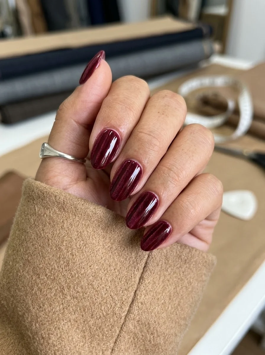
A dimensional red that shifts between matte and shimmer with every movement.
Overview:
Velvet finish nails use fine shimmer particles arranged in vertical lines to create the illusion of fabric texture. The effect is subtle in photos but striking in person. As you tilt your hand, the shimmer lines catch light at different angles, creating a shifting, almost holographic quality that flat cream polish can't achieve.
The burgundy base does double duty here. It provides the rich, dark backdrop that makes the shimmer visible, and it reads as a sophisticated color choice on its own. Remove the shimmer lines and you still have beautiful burgundy nails. Add them and you have burgundy with depth and movement.
The vertical orientation of the shimmer lines elongates the nail visually. Horizontal shimmer would widen the nail and make it look stubby. Vertical lines draw the eye from cuticle to tip, creating the illusion of length. This is particularly effective on oval and almond shapes where the curve of the nail enhances the linear effect.
Design Breakdown:
Dark base with linear shimmer effect. The direction of the shimmer lines determines the visual proportions.
Base Color: Deep burgundy or wine with fine shimmer particles arranged in vertical lines.
Nail Shape: Medium oval. The curved surface maximizes the light-shifting effect.
Design Element: The velvet shimmer effect created by the polish formula. No hand-painted art required.
Finish: High-gloss top coat to seal the shimmer and add depth to the burgundy base.
Get The Look at Home:
Velvet polishes often need a magnet to align the shimmer particles. Follow the brand's specific instructions for magnet placement.
- Base coat: Apply a standard base coat. Let it dry fully.
- First coat: Apply one thin coat of the velvet burgundy polish. Let it dry for two minutes.
- Second coat with magnet: Apply a second coat. Immediately hold the magnet vertically along the center of the nail for 10-15 seconds. The shimmer particles will align into vertical lines.
- Keep still: Don't move your hand for at least 30 seconds after removing the magnet. The particles need time to set.
- Cure if gel: If using gel formula, cure under the lamp after each coat.
- Seal: One coat of high-gloss top coat to enhance the velvet effect.
30 Stunning Mother of the Groom Hairstyle Ideas for 2026 💍✨
18.Wood Grain Texture
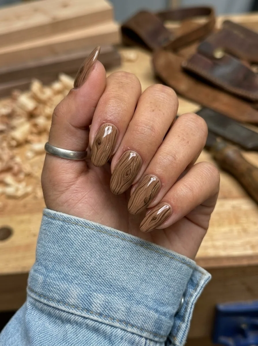
A nature-inspired design that mimics the organic beauty of natural wood.
Overview:
Wood grain nail art is one of the more unusual designs on this list, and that's exactly why it works. The concentric ring pattern in warm browns creates a design that's immediately recognizable as "wood" but abstract enough to function as wearable art. It's the nail equivalent of a live-edge wood table: natural, warm, and conversation-starting.
The technique involves layering curved lines in varying shades of brown and cream to mimic the growth rings found in natural wood. The key is keeping the lines slightly irregular. Perfectly parallel, evenly spaced lines look like a topographic map, not wood grain. Real wood has variations in ring spacing and direction, and your nails should too.
The warm brown palette makes this design surprisingly versatile. It pairs well with earth tones, denim, and neutral wardrobes. The organic quality of the pattern also means it doesn't clash with other accessories or patterns. It's more texture than print, which gives it broader compatibility.
Design Breakdown:
Layered curved lines in tonal browns. The irregularity is what makes it look like wood rather than a pattern.
Base Color: Medium warm brown. The foundation color for the grain pattern.
Nail Shape: Medium oval. The curved shape complements the organic ring pattern.
Design Element: Concentric curved lines in darker brown and cream painted over the base to create a wood grain effect. Each nail has a unique ring pattern.
Finish: High-gloss top coat to give the wood a polished, lacquered quality.
Get The Look at Home:
The lines should be thin and slightly wobbly. Use a striper brush that holds enough polish to draw a full curve without re-dipping.
- Brown base: Two coats of medium warm brown. Let each dry fully.
- Ring lines: Using a thin striper brush and darker brown polish, paint curved lines that follow the general shape of the nail. Start from one edge and curve toward the opposite side.
- Vary the spacing: Some rings should be close together, others farther apart. Real wood has irregular ring spacing.
- Cream highlights: Add thin cream or off-white lines between some of the brown rings. These represent the lighter "early wood" in a tree ring.
- Knot detail: On one or two nails, create a small oval "knot" by painting concentric ovals that break the flow of the parallel lines.
- Seal: Two coats of top coat to smooth the raised line texture.
19.Olive Argyle
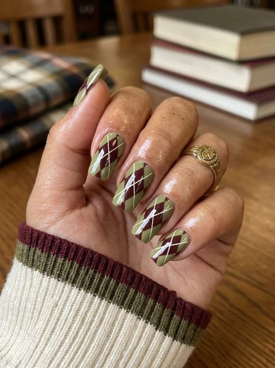
A preppy, academic pattern that feels like your favorite fall sweater.
Overview:
Argyle is one of those patterns that immediately reads as "preppy" or "academic," which makes it a natural fit for September's back-to-school energy. The diamond pattern in olive, burgundy, and cream creates a design that feels like a cashmere sweater translated to nails. It's cozy without being literal.
The overlapping diamond shapes are what make argyle different from simple geometric patterns. The cream lines that cross through the diamonds create the illusion of layered fabric, which gives the design a textile quality that flat diamonds would lack. This is the detail that separates "argyle" from "diamond print."
Medium oval is the right canvas for this design. The curved surface softens the geometric diamonds and makes the pattern feel less rigid. On short square nails, the diamonds get compressed and lose their characteristic shape. You need the length and curve to let the pattern breathe.
Design Breakdown:
Geometric diamond pattern with crossing lines. The layering creates the textile illusion.
Base Color: Muted olive green. Earthy and warm, not neon or military.
Nail Shape: Medium oval. The curved surface softens the geometric pattern.
Design Element: Burgundy diamonds arranged in an argyle pattern with thin cream lines crossing through them diagonally.
Finish: High-gloss top coat to smooth the layered pattern and make the colors look saturated.
Get The Look at Home:
Paint the diamonds first across all nails, then add the crossing lines. This is faster than finishing one nail at a time.
- Olive base: Two coats of olive green. Let each dry fully.
- Diamond shapes: Using a thin liner brush and burgundy polish, paint diamond shapes across each nail. Two to three diamonds per nail, arranged in a staggered grid.
- Fill the diamonds: Fill in the diamond shapes with burgundy polish. Let dry completely.
- Cream crossing lines: Using a very thin striper brush and cream polish, draw diagonal lines that cross through the centers of the diamonds. These lines should be thin and continuous.
- Edge cleanup: Use an angled brush dipped in acetone to sharpen the diamond edges. Clean geometry is critical for the argyle effect.
- Seal: Two coats of top coat to smooth the raised pattern texture.
35 Cute & Trendy Short Summer Nails for 2026 ☀️
20.Sheer Pink Ombre
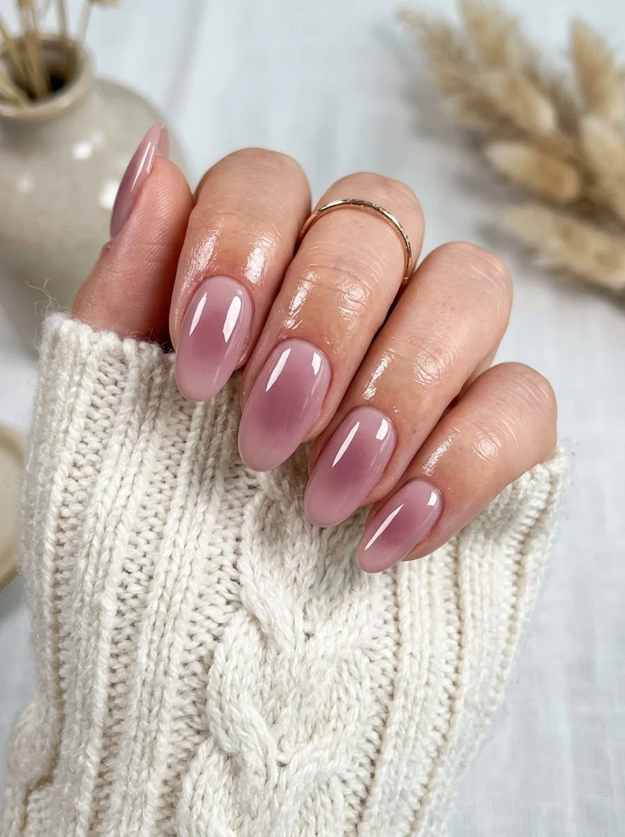
A barely-there gradient that looks like your nails but better.
Overview:
Sheer ombre nails are the quiet luxury of the nail world. The gradient from translucent pink at the cuticle to a slightly deeper mauve at the tips creates a "your nails but better" effect that's sophisticated without being obvious. From a distance, they just look like healthy, well-groomed nails. Up close, the subtle color shift reveals itself.
The technique depends on a sponge to create the seamless blend between the two sheer shades. Unlike opaque ombres where you can see the transition line, sheer formulas blend so softly that the gradient appears to happen naturally. The challenge is building enough opacity at the tips without losing the transparency at the cuticle. Three to four light sponge passes usually does it.
This is one of the most maintenance-friendly designs on the list. The sheer base means growth-out is nearly invisible for the first two weeks, and the lack of detailed art means there's nothing to chip or peel. It's the ideal low-key manicure for anyone who wants something polished without constant upkeep.
Design Breakdown:
Transparent gradient technique. The beauty is in the subtlety.
Base Color: Sheer pink at the cuticle transitioning to a slightly deeper mauve or rose at the tips. Both shades should be translucent.
Nail Shape: Medium oval. The curved shape enhances the gradient's natural flow.
Design Element: Sponge-applied ombre using two sheer shades. No art or embellishment.
Finish: High-gloss top coat to unify the gradient and add depth to the sheer colors.
Get The Look at Home:
The sponge technique matters more with sheer formulas because over-pressing removes color instead of depositing it.
- Light base: One coat of the lighter sheer pink. Let it dry fully.
- Sponge setup: Paint a stripe of the lighter pink and a stripe of the deeper mauve side by side on a makeup sponge. Dab the sponge on paper first to remove the initial excess.
- Build the fade: Press the sponge onto the nail with the mauve concentrated at the tip. Use a light, dabbing motion. Three to four passes builds better opacity than one heavy press.
- Dry between passes: Wait 30 seconds between each sponge pass. Rushing causes the colors to mix into a muddy pink instead of a clean gradient.
- Clean skin: Use a flat brush dipped in acetone to remove the sponge residue from your cuticles before it sets.
- Seal: One coat of high-gloss top coat to blend the gradient and add shine.
21.Burgundy with Dark Wine French Tips
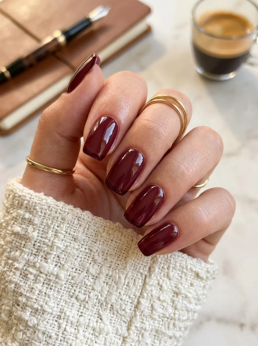
A tone-on-tone French manicure pairing a rich glossy burgundy base with thin dark wine tips.
Overview:
This design takes classic solid glossy burgundy to the next level by incorporating micro-thin dark wine French tips on all nails. The shade pairing creates a subtle, tone-on-tone dimension that reads as understated yet remarkably high-end.
The high-gloss finish unifies the two deep wine shades into a seamless, glass-like surface. Rather than stark contrasting tips, the slight shift in depth between the burgundy base and dark wine tips catches the light beautifully, adding sophisticated detail without visually breaking up the nail length.
Medium to long rounded square nails provide the perfect canvas for this look. The delicate, paper-thin French tips accentuate the free edge cleanly, making it an ideal manicure for both everyday elegance and formal fall occasions.
Design Breakdown:
Tone-on-tone French manicure using deep burgundy and dark wine tones.
Base Color: Solid glossy burgundy red polish with rich, opaque coverage.
Nail Shape: Medium to long rounded square for a clean, elongated line.
Design Element: Micro-thin French tips in a deeper dark wine shade on all nails.
Finish: High-gloss top coat that seals the base and tips with a brilliant shine.
Get The Look at Home:
Tone-on-tone tips require steady, thin lines to keep the effect subtle and refined.
- Base coat: Apply a protective base coat to create a smooth surface.
- Burgundy base: Apply two thin, even coats of solid glossy burgundy polish on all nails and let dry completely.
- Dark wine tips: Dip a fine detail striping brush into dark wine polish and carefully trace a paper-thin French tip along the free edge of each nail.
- Maintain consistency: Keep the tips delicate and micro-thin across all ten nails for a clean, uniform look.
- Clean up: Use a small angled brush dipped in acetone for crisp edges along the smile lines.
- Glossy finish: Seal with a thick, quick-dry high-gloss top coat to smooth over the tips and maximize shine.
20 Stunning Mother of the Bride Hairstyle Ideas for 2026 💍
22.Coffee Gradient Across the Hand
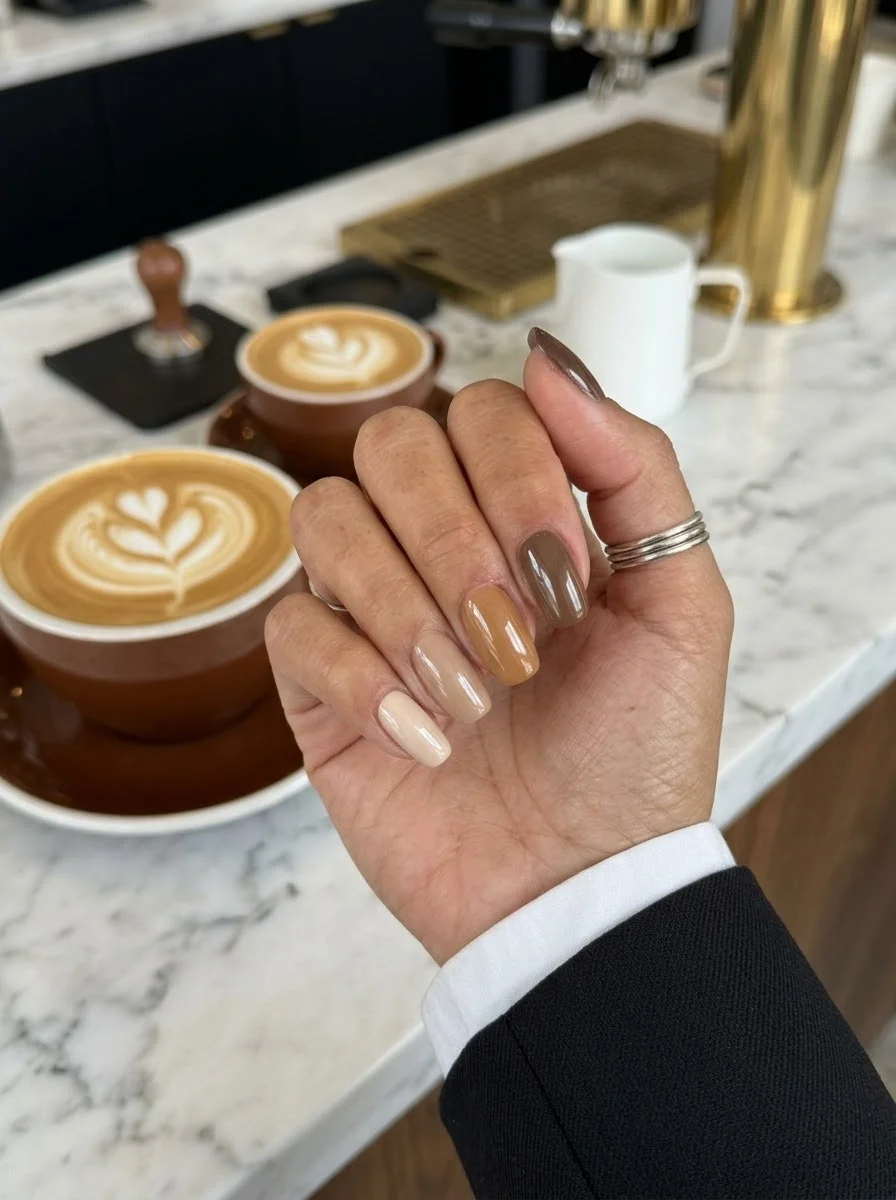
A latte-inspired gradient where each finger represents a different brew strength.
Overview:
The gradient-across-the-hand concept is simpler than it sounds: each nail gets a different shade from the same color family, creating a gradient that reads across the entire hand rather than on individual nails. Here, the shades move from creamy white on the pinky to deep mocha on the thumb, mimicking the progression from milk to espresso in a coffee drink.
What makes this design clever is that each nail is a solid color. There's no blending, no sponge work, no art. The design exists only in the relationship between the shades. It's one of the easiest techniques on this list, but it reads as thoughtful and curated because the color progression is deliberate.
The warm neutral palette works across virtually every skin tone because the shades are drawn from the brown family, which naturally complements warm, cool, and neutral undertones. It's the safest "interesting" manicure you can wear.
Design Breakdown:
Five solid colors arranged in a gradient across the hand. No art, no technique, just color selection.
Base Color: Five shades ranging from creamy white to deep mocha. Each nail gets one shade, progressing from lightest on the pinky to darkest on the thumb.
Nail Shape: Short oval. Clean, practical, and modern.
Design Element: None. The gradient exists in the color arrangement across the hand.
Finish: High-gloss top coat to unify the five shades.
Get The Look at Home:
The hardest part is selecting five shades that read as a cohesive gradient rather than random browns. Lay them out before painting.
- Color selection: Choose five shades: cream white, warm beige, light taupe, caramel, and deep mocha. Test them on paper first to confirm the gradient reads smoothly.
- Assign fingers: Pinky gets cream, ring gets beige, middle gets taupe, index gets caramel, thumb gets mocha.
- Two coats each: Apply two coats of each shade to its designated nail. Let each coat dry fully.
- Consistency check: Hold both hands side by side. The gradient should flow in the same direction on both hands.
- Cleanup: Clean the cuticles on each nail after the color is applied.
- Seal: One coat of top coat on all nails. The shine unifies the five different shades.
23.Cobalt Blue Bubble Textures
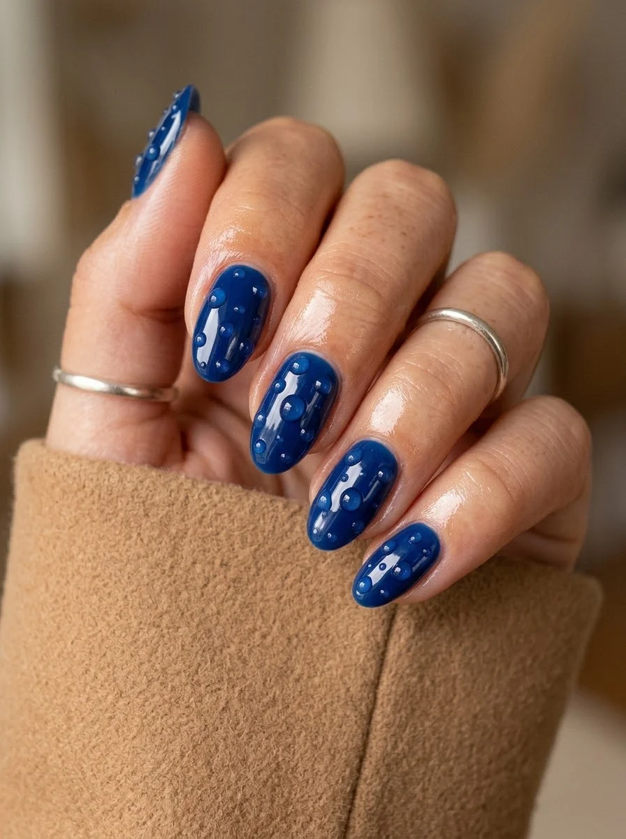
A tactile, sculptural design that begs to be touched.
Overview:
3D textured nails are polarizing. They catch on hair, snag on knitwear, and make typing slightly more interesting. But the visual effect is undeniable. These raised bubble textures on a cobalt blue base look like water droplets frozen on the surface of the nail, or like the texture of certain sea creatures. It's alien and beautiful in equal measure.
The cobalt blue is the right color for this technique. The saturated, electric blue creates enough contrast with the raised textures that each bubble casts a tiny shadow, enhancing the 3D effect. A lighter blue would flatten the texture. A darker blue would hide it. Cobalt sits in the sweet spot where the texture is fully visible.
Practical warning: these textures will catch on everything for the first two days until the edges smooth out slightly. Sealing the base of each bubble with a thick bead of top coat reduces snagging, but it doesn't eliminate it. Budget about a week of wear before the texture settles. If you work with your hands a lot, this might not be the design for you.
Design Breakdown:
Sculptural 3D technique on a saturated base. The texture IS the design.
Base Color: Bright, opaque cobalt blue. Electric and saturated, not navy or pastel.
Nail Shape: Medium oval. The curved surface gives the bubbles room to exist without looking cramped.
Design Element: Raised 3D bubble or droplet textures created with building gel or thick top coat over the blue base.
Finish: High-gloss top coat over everything to seal the texture and add shine.
Get The Look at Home:
You need building gel or a thick no-wipe top coat for the 3D effect. Regular polish won't hold its shape.
- Blue base: Two coats of cobalt blue. Let each dry fully or cure if using gel.
- Build the bubbles: Using a dotting tool and thick clear building gel, place individual raised drops on the nail. Vary the sizes, two large and three to four small per nail.
- Cure immediately: If using UV gel, cure under the lamp right away so the drops don't flatten and spread.
- Placement strategy: Scatter the bubbles across the nail surface. Don't cluster them all in one area.
- Edge seal: Using a detail brush, apply top coat around the base of each bubble. This reduces snagging.
- Full gloss: One coat of top coat over the entire nail to unify the finish.
28 Back to School Nail Art Designs for the New Semester (2026) 💅
24.Amber Cat Eye
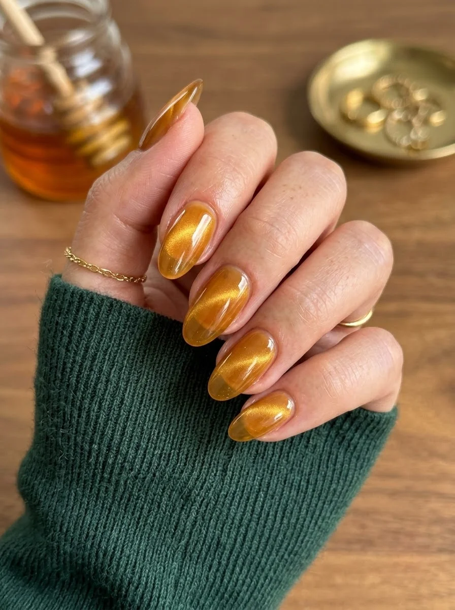
A warm, honey-toned magnetic polish that glows like liquid amber.
Overview:
Amber cat-eye polish creates the illusion of light trapped inside a gemstone. The translucent honey base allows light to pass through, while the magnetic golden particles concentrate into a shimmering line that shifts as you move your hand. The effect is warm, luminous, and genuinely unlike any flat polish finish.
The translucent quality of the base is what separates cat-eye from regular shimmer polish. With shimmer, the particles sit on the surface. With cat-eye, the particles float within the translucent base, creating depth that looks like looking into liquid amber. The magnet pulls them into a concentrated band, which is what creates the "cat eye" line of light.
This particular amber shade reads as autumnal without being overtly "fall themed." It's the color of honey, of maple syrup, of late afternoon sunlight. It works as well in September as it would in December, which makes it one of the more versatile options on this list.
Design Breakdown:
Magnetic technique over a translucent warm base. The magnet creates the design.
Base Color: Translucent amber or honey with suspended golden magnetic particles.
Nail Shape: Medium oval. The curved surface maximizes the light-shifting effect.
Design Element: The cat-eye magnetic line created by holding a magnet over the wet polish. No hand-painted art required.
Finish: High-gloss top coat to seal the magnetic effect and enhance the translucent depth.
Get The Look at Home:
Hold the magnet steady and close to the nail. Moving it or holding it too far away weakens the magnetic line.
- Base coat: Apply a standard base coat. Let it dry fully.
- First coat: Apply one thin coat of the amber cat-eye polish. Immediately hold the magnet 5mm above the nail for 10-15 seconds.
- Second coat: Apply a second coat. Again, immediately hold the magnet in place. The effect intensifies with each layer.
- Keep still: Don't move your hand for at least 30 seconds after removing the magnet.
- Cure if gel: If using gel formula, cure under the lamp after each coat.
- Seal: One coat of high-gloss top coat. The shine makes the amber look like polished gemstone.
25.Dark Purple Marble Swirl
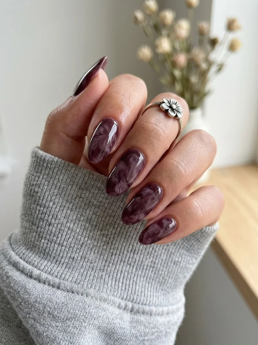
A moody, dramatic marble that looks like amethyst stone.
Overview:
Dark purple marble is what happens when you combine the drama of a deep plum base with the organic movement of a marble technique. The white swirls through the dark purple create a pattern that looks like polished amethyst or charoite stone. It's moody, sophisticated, and unlike any flat purple polish.
The marble technique is forgiving on dark bases because the contrast between the dark purple and white is high enough that even messy swirls read as intentional. Unlike light-on-light marble where imperfections blend in, dark-on-white marble shows every line clearly. This means your swirls need to be confident, but they don't need to be precise.
The deep purple base makes this design more evening-appropriate than most marble variations. A light pink marble reads as daytime and casual. A dark purple marble reads as dinner reservation and cocktail hour. Same technique, completely different mood.
Design Breakdown:
Wet-on-wet marble on a dark base. The high contrast makes every swirl visible.
Base Color: Deep, opaque plum or dark purple. Rich and saturated, not pastel or muted.
Nail Shape: Medium oval. The curved shape complements the organic swirl pattern.
Design Element: White swirls dragged through the wet purple base to create a marbled, stone-like effect. Each nail looks different.
Finish: High-gloss top coat to create the "polished stone" illusion.
Get The Look at Home:
Work quickly. The marble effect happens in the first few seconds after the white touches the wet purple.
- Purple base: Apply one thin coat of dark purple. Let it dry fully.
- Wet layer: Apply a second thin coat. Do NOT wait for it to dry.
- Drop the white: Using a dotting tool, place two to three drops of white polish onto the wet purple. Don't spread them.
- Drag: Use a toothpick to pull the white drops in one or two directions. Three to four drags per nail maximum. The white should look like veins in stone, not like stirred cream.
- Clean skin: Use a flat brush dipped in acetone to clean around the cuticles before the polish sets.
- Top coat after full dry: Wait at least ten minutes, then apply a thick glossy top coat.
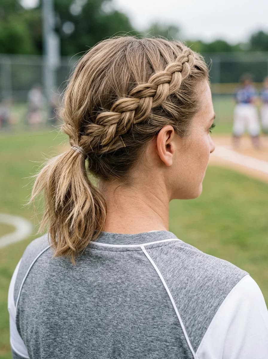
28 Stunning Softball Hairstyle Ideas with Braids for 2026 🥎✨
26.Beige and Gold Color Block
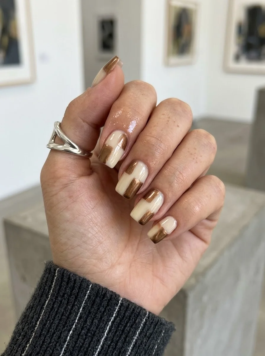
A modern, gallery-worthy design that mixes matte and metallic finishes.
Overview:
Color blocking on nails uses geometric shapes of different colors to create a design that feels architectural rather than decorative. Here, the cream and gold rectangles on each nail look like a Mondrian painting dressed in warm neutrals. The gold adds a metallic flash that breaks up the cream and creates visual interest at every angle.
The geometric precision matters for this design. Clean, straight edges between the cream and gold sections are what make it look intentional rather than sloppy. Striping tape is almost mandatory unless you have exceptionally steady hands. Even then, tape gives you sharper edges than freehand, which matters when the contrast between matte cream and metallic gold is this stark.
Short square is the right canvas for geometric color blocking. The flat, angular shape reinforces the architectural quality of the design. On curved oval nails, the rectangles would warp and lose their geometric precision. The square shape keeps everything structured and clean.
Design Breakdown:
Geometric color blocking using matte and metallic finishes. Clean lines are critical.
Base Color: Cream or off-white as the foundation. Gold metallic as the blocking color.
Nail Shape: Short square. The flat surface provides a stable canvas for geometric shapes.
Design Element: Geometric rectangles in cream and gold metallic on each nail. Each nail has a unique arrangement of blocks.
Finish: High-gloss top coat to unify the two textures and make the gold shimmer.
Get The Look at Home:
Use striping tape to mask clean edges between the cream and gold sections. Freehand works if you accept softer lines.
- Cream base: Two coats of opaque cream on all nails. Let each dry fully.
- Tape masking: Apply striping tape to mark the edges of where you want the gold rectangles. Press the edges firmly.
- Gold application: Paint gold metallic polish within the taped sections. One or two coats for full coverage.
- Peel while wet: Remove the tape immediately, before the gold polish sets. Pull at a low angle to keep the edges clean.
- Vary the layout: Each nail should have a different arrangement of cream and gold rectangles. Some nails get one gold block; others get two.
- Seal: One thick coat of top coat to smooth the raised edges between the two colors.
27.Nude with Brown French Tips
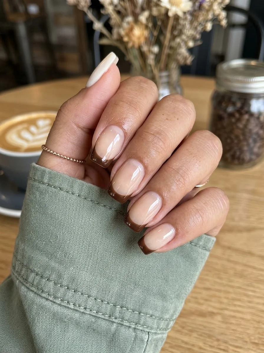
A cozy, coffee-inspired twist on the classic French manicure.
Overview:
Brown French tips are having a moment, and this chocolate shade is one of the most wearable entries. It's warm without being orange, dark without being black, and rich enough to read as a deliberate color choice rather than a muddy version of nude. The sheer base underneath keeps the overall look light and lets the brown tips do the talking.
The medium square shape gives the French line a modern, geometric edge. The flat tip creates a clean, straight smile line that a rounded shape would soften. On almond or oval nails, the same brown tips would feel more casual. On square, they feel structured and intentional.
This is one of those designs that works better in person than in photos. The warmth of the brown against the sheer nude creates a subtle tonal contrast that cameras often flatten. In real life, the tips catch light differently than the base, which gives the design dimension that a single-color manicure would lack.
Design Breakdown:
Classic French structure with a warm brown tip. Clean lines and tonal contrast.
Base Color: Sheer nude or milky pink. The natural nail should be partially visible.
Nail Shape: Medium square. The flat tip creates a sharp, modern French line.
Design Element: Chocolate brown French tips on all nails. Consistent tip thickness across all fingers.
Finish: High-gloss top coat to make the brown look like polished chocolate.
Get The Look at Home:
The smile line is the design. Take your time with the curve and clean it before the brown sets.
- Nude base: Two coats on all nails. Let dry completely.
- Brown tips: Using a French liner brush and chocolate brown polish, paint the smile line from sidewall to center. Two-stroke method is more forgiving than one continuous curve.
- Fill the tip: After establishing the smile line, fill in the tip area with brown polish.
- Cleanup: An angled brush dipped in acetone sharpens the smile line. This step is non-negotiable on a sheer base.
- Compare both hands: The tip thickness should be consistent across all fingers on both hands.
- Seal: One thick coat of top coat. Cap the free edge to prevent chipping.
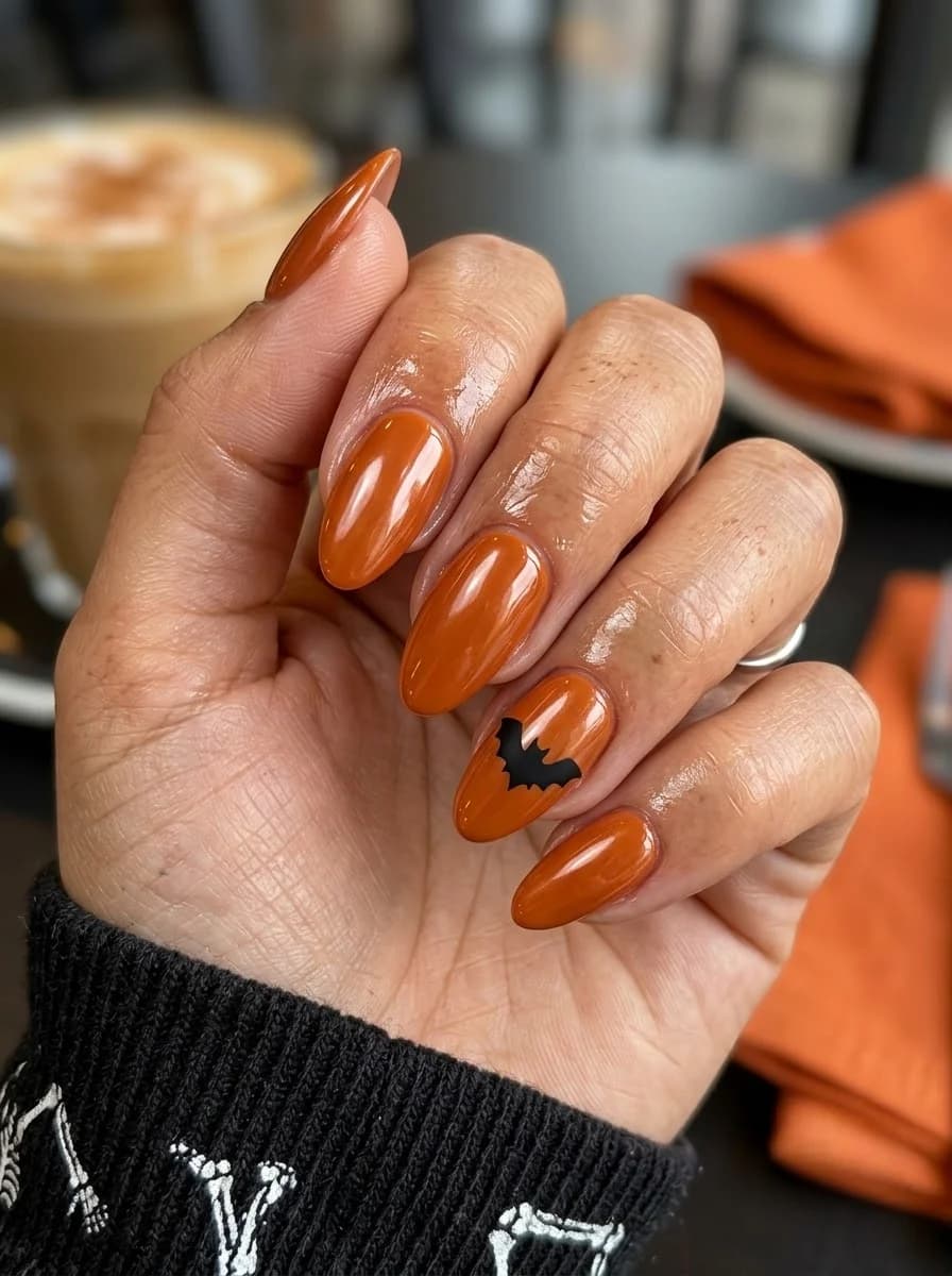
31 Spooky Halloween Nail Art Designs for Fall (2026) 💅
28.Grey Barcode
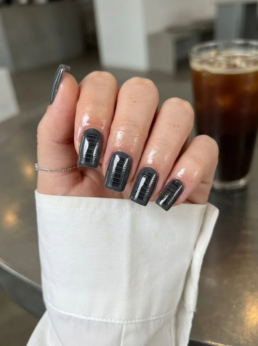
An industrial, minimalist design that turns your nails into a graphic statement.
Overview:
Barcode nails are one of those designs that sound strange but look surprisingly chic. The thin vertical lines in varying widths create a pattern that's immediately recognizable as "barcode" without being literal about it. On a neutral grey base, the effect is modern, industrial, and unexpectedly sophisticated.
The varying line widths are what make this design work. If every line were the same thickness, the pattern would read as "stripes" rather than "barcode." The mix of thin and slightly thicker lines creates the irregular rhythm that your eye associates with actual barcodes. This variation also prevents the pattern from looking too uniform or mechanical.
Grey is the ideal base color for this design. It's neutral enough to let the black lines dominate visually, but warm enough that the overall effect doesn't feel cold or sterile. A white base would make the barcode look clinical. A black base would hide the lines. Grey sits in the middle where the pattern is fully visible but the overall mood stays relaxed.
Design Breakdown:
Graphic linear pattern on a neutral base. Line width variation creates the barcode effect.
Base Color: Medium grey. Not too light, not too dark. Warm- toned rather than blue-toned.
Nail Shape: Short square. The flat surface provides a stable canvas for the vertical lines.
Design Element: Thin black vertical lines in varying widths across all nails. Some lines are hairline thin, others slightly wider.
Finish: High-gloss top coat to make the grey look like polished concrete.
Get The Look at Home:
The lines need to be vertical and parallel. Even a slight angle breaks the barcode illusion.
- Grey base: Two coats of medium grey. Let each dry fully.
- Line mapping: Using a very thin striper brush and black polish, start from one edge of the nail and paint vertical lines toward the other edge.
- Vary the width: Alternate between hairline-thin lines and slightly wider lines. The variation is what creates the barcode effect.
- Spacing: Leave small gaps between lines. The grey base should be visible between each line.
- Consistency: The lines should be roughly parallel across all nails. Use the nail's natural edges as guides.
- Seal: One thick coat of top coat, applied in a single stroke to avoid dragging the lines.
29.Burgundy Diagonal Tips with Gold Accent
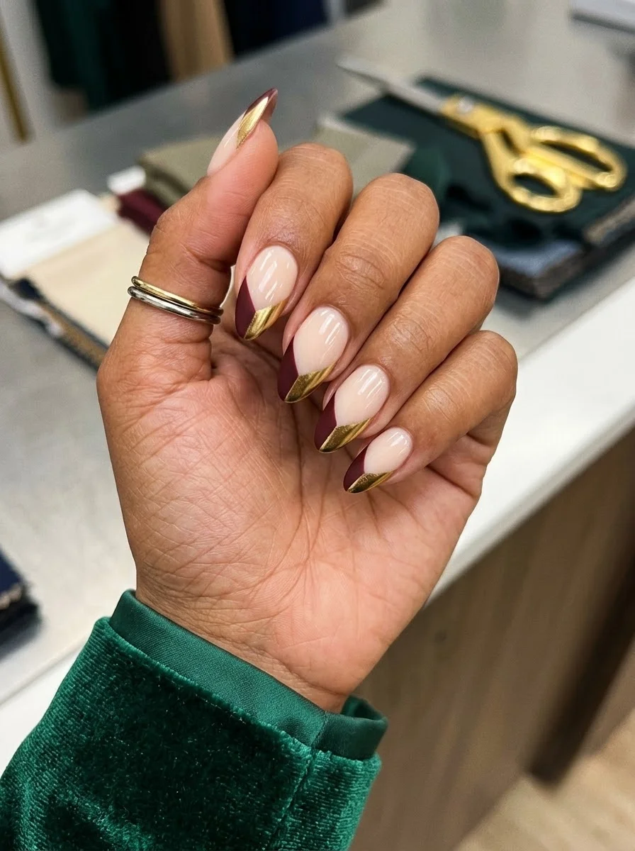
A geometric French with a luxe metallic separator line.
Overview:
Diagonal French tips are a step beyond the classic curved smile line. The angled border between the nude base and the burgundy tip creates a more dynamic, modern silhouette that draws the eye across the nail rather than straight across. Adding a gold metallic line at the border elevates the design from "colored French" to something with genuine luxury detail.
The gold line serves a practical purpose beyond decoration. It hides the seam between the nude and burgundy, which is where most French tips look imperfect. Even a slightly wobbly smile line looks intentional when there's a metallic border covering the transition. It's a design trick that makes the whole set look more polished.
The burgundy used here is deep enough to read as sophisticated rather than bright. On the diagonal tip, the darker color creates a strong geometric shape that contrasts with the sheer nude base. The result is a design that feels structured and intentional, like architecture translated to nails.
Design Breakdown:
Geometric French variation with a metallic separator. The gold line hides imperfections.
Base Color: Sheer nude or milky pink. The natural nail should be partially visible.
Nail Shape: Medium oval. The curved shape softens the geometric diagonal.
Design Element: Diagonal burgundy tips on all nails with a thin gold metallic line painted along the border between nude and burgundy.
Finish: High-gloss top coat to unify the three textures.
Get The Look at Home:
The diagonal line is easier to execute than a curved smile line because it's straight. Use the nail's edge as a guide.
- Nude base: Two coats on all nails. Let dry completely.
- Diagonal tips: Using a liner brush and burgundy polish, paint a diagonal line from one sidewall to the opposite corner. Fill in the tip area.
- Cleanup: Use an angled brush dipped in acetone to sharpen the diagonal edge.
- Gold line: Using a very thin striper brush and gold metallic polish, paint a thin line along the diagonal border between the nude and burgundy.
- Consistency: The diagonal angle should be roughly the same across all nails.
- Seal: Two coats of top coat. The first locks the gold; the second smooths the surface.
30+ Chic Pool Party Hairstyles for Summer 2026 🌊👙
30.Black and Gold Tweed
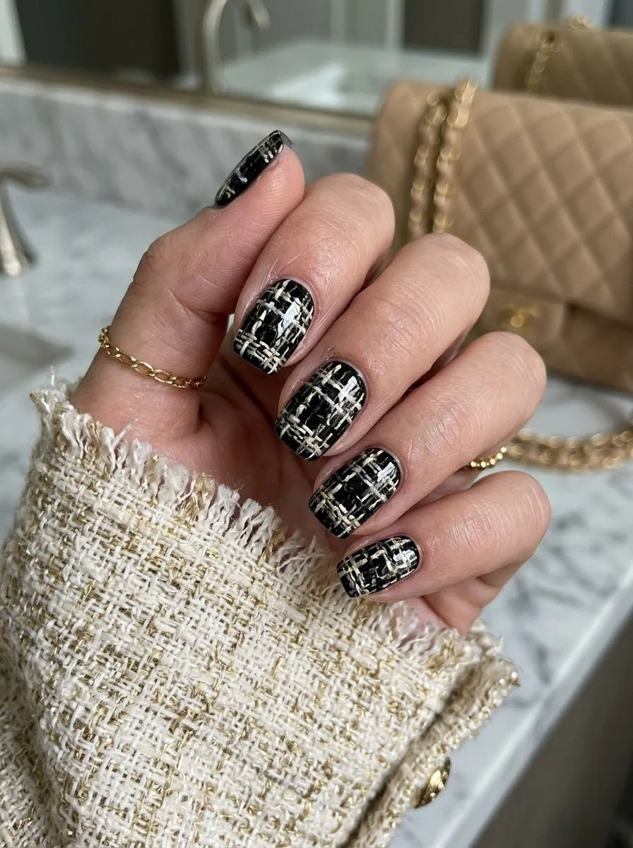
A luxe, textile-inspired design that mimics the look of boucle fabric.
Overview:
Tweed or boucle nail art translates the woven texture of fabric into a visual pattern on the nail. The black base with gold and cream intersecting lines creates the illusion of woven threads, which gives the design a textile quality that flat patterns can't achieve. It's the nail equivalent of a Chanel jacket: classic, textured, and quietly expensive.
The key to making tweed look like tweed rather than plaid is the line quality. Tweed lines should be slightly irregular, with varying thickness and occasional breaks. Perfectly straight, uniform lines read as plaid or grid. Slightly wobbly, overlapping lines read as woven fabric. The imperfection is the point.
The gold metallic lines catch light differently than the cream lines, which creates a subtle dimension within the weave. From a distance, the pattern reads as a rich, textured black. Up close, the individual gold and cream threads reveal themselves. This dual reading is what makes the design interesting at multiple distances.
Design Breakdown:
Woven line pattern using metallic and matte threads over a dark base. Irregularity creates the textile effect.
Base Color: Deep, opaque black. The dark backdrop makes the gold and cream lines pop.
Nail Shape: Short square. The flat surface provides a stable canvas for the woven pattern.
Design Element: Intersecting gold metallic and cream lines painted in a woven, tweed-like pattern across all nails.
Finish: High-gloss top coat to smooth the raised line texture and make the gold shimmer.
Get The Look at Home:
Paint all lines in one color first, then add the second color. Don't try to alternate colors as you go.
- Black base: Two coats of opaque black. Let each dry fully.
- Cream horizontal lines: Using a striper brush and cream polish, paint thin, slightly irregular horizontal lines across each nail. Let them wobble and vary in thickness.
- Cream vertical lines: Paint vertical lines at roughly the same spacing. Where they cross the horizontal lines, the pattern starts to look woven.
- Gold accent lines: Add gold metallic lines alongside some of the cream lines. Not every line needs gold, just enough to create sparkle.
- Break the grid: Add a few shorter lines that don't span the full nail. These create the irregular, hand-woven quality.
- Seal: Two coats of top coat to smooth the raised line texture.
31.Chocolate Drip
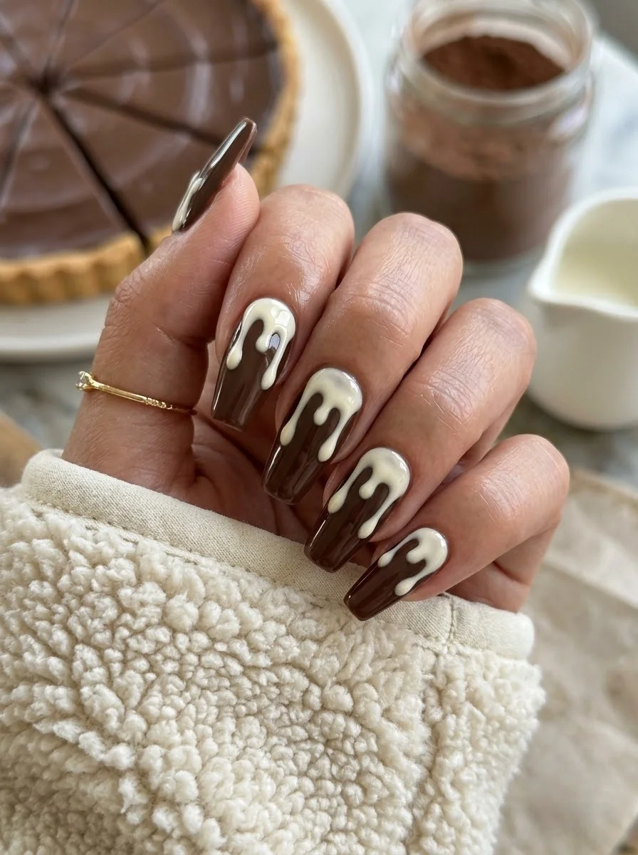
A decadent, dessert-inspired design that looks like melted chocolate and cream.
Overview:
Drip nails use a thick, viscous polish or building gel to create the illusion of liquid dripping down the nail surface. Here, the cream drips over a chocolate brown base create a design that looks like melted white chocolate or cream poured over a brownie. It's playful, sculptural, and genuinely eye-catching.
The drip effect requires a thick formula that holds its shape. Regular polish is too thin and will spread into a flat blob instead of maintaining the raised drip profile. Building gel or a thick no-wipe top coat works best because it stays where you place it and creates the dimensional "drip" that makes the design readable.
The color combination is what makes this design work as more than a novelty. Chocolate brown and cream are a classic pairing that transcends the "food reference" and reads as warm and sophisticated. If the drips were neon pink over black, the design would feel costumey. Brown and cream keeps it grounded and wearable.
Design Breakdown:
Sculptural drip technique over a solid base. The 3D element creates the design.
Base Color: Rich, opaque chocolate brown. Warm and creamy, not flat or ashy.
Nail Shape: Long coffin. The flat tip and long sides provide the canvas needed for the drip to travel.
Design Element: Cream or white drip effect created with building gel or thick top coat, originating from the cuticle area and dripping toward the tip.
Finish: High-gloss top coat to seal the drip and make the brown look like melted chocolate.
Get The Look at Home:
You need building gel or a thick no-wipe top coat for the drip effect. Regular polish won't hold its shape.
- Brown base: Two coats of chocolate brown. Let each dry fully or cure if using gel.
- Plan the drips: Decide where each drip will start and end. Three to four drips per nail is the right density.
- Build the drips: Using a dotting tool and thick cream building gel, place a bead at the cuticle area and let it flow toward the tip. Gravity does the work.
- Vary the length: Some drips should reach the tip; others should stop halfway. The variation creates the "pouring" effect.
- Cure immediately: If using UV gel, cure under the lamp right away so the drips don't flatten.
- Seal: One coat of top coat over everything to unify the finish.
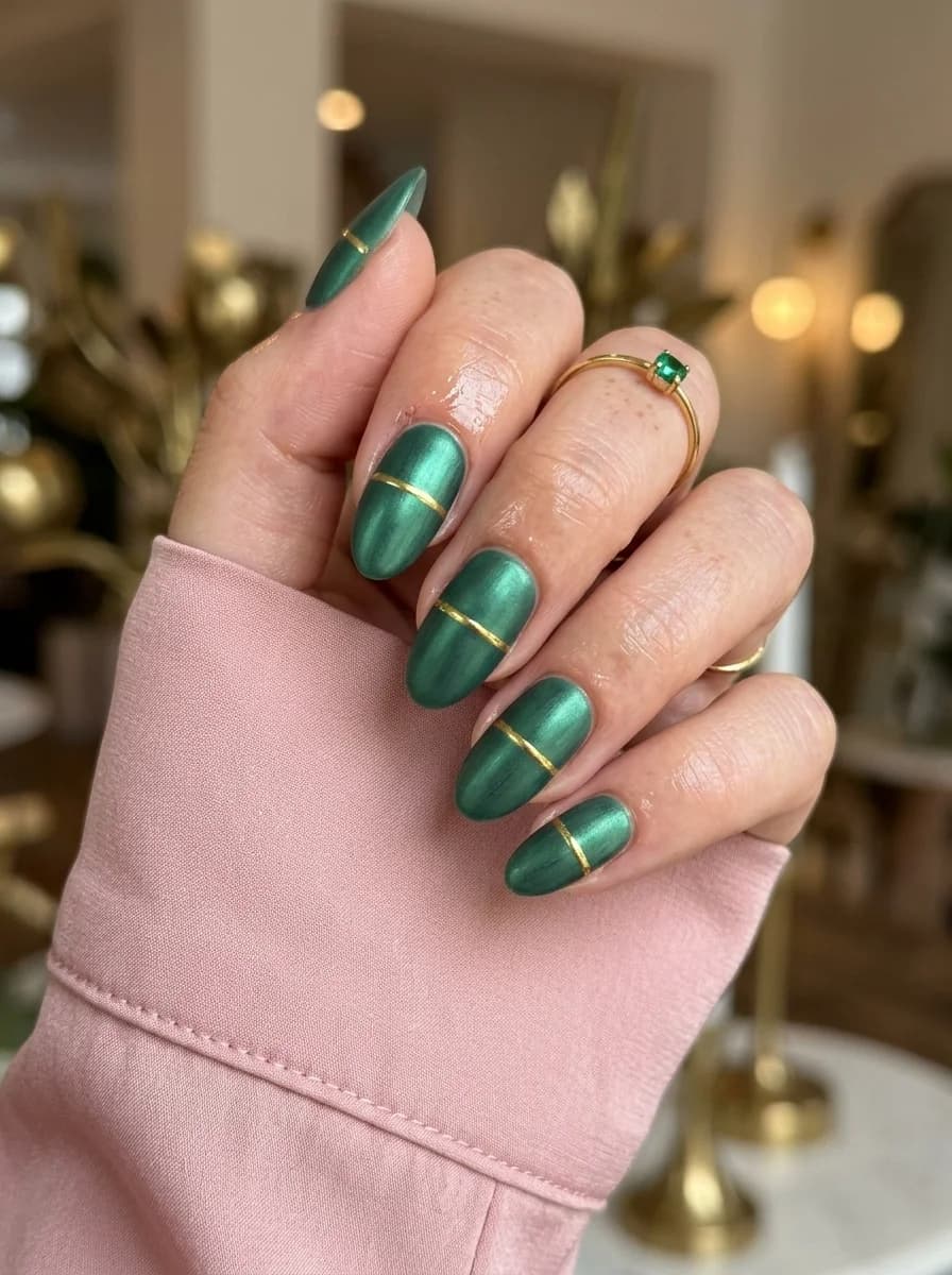
36 Fall Chrome Nails That Capture Autumn's Moody Metallic Side (2026) 💅
32.Purple Snakeskin
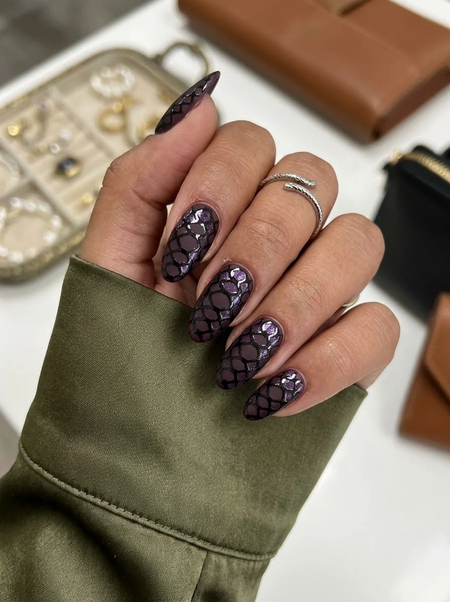
An edgy, textured design that mimics the look of exotic leather.
Overview:
Snakeskin nail art uses a netting or stencil technique to create the overlapping scale pattern found in reptile skin. On this dark purple base, the black scale lines with purple glitter create a design that reads as exotic and luxe rather than costume-like. The glitter within the scales catches light and adds dimension that flat snakeskin prints can't achieve.
The technique involves placing a piece of netting or mesh over the wet polish and then applying a second color over it. The netting acts as a stencil, creating the scale pattern when removed. The key is pressing the netting flat against the nail surface. If it lifts anywhere, the scales in that area will be blurry or missing.
The dark purple base makes this design more wearable than a literal brown snakeskin would be. The purple reads as a fashion color that happens to have a texture, rather than a direct animal reference. It's the difference between wearing snake-print boots and wearing purple boots with a subtle texture. Same pattern, completely different intent.
Design Breakdown:
Stencil technique using netting to create scale texture. The mesh creates the pattern.
Base Color: Deep, opaque purple or aubergine. Rich and jewel-toned, not pastel.
Nail Shape: Medium oval. The curved surface complements the organic scale pattern.
Design Element: Snakeskin scale pattern created by pressing netting into wet polish, with purple glitter within the scales for dimension.
Finish: High-gloss top coat to smooth the netting texture and make the purple look like polished gemstone.
Get The Look at Home:
The netting needs to be pressed flat against the nail. Any lifting creates blurry scales.
- Purple base: Two coats of deep purple. Let each dry fully.
- Netting prep: Cut a small piece of fine mesh netting (fishnet stocking material works well) large enough to cover the nail surface.
- Wet layer: Apply a thin coat of purple glitter polish or top coat. While wet, press the netting firmly onto the nail surface.
- Black over netting: Using a sponge or brush, dab black polish over the netting. The black fills the holes in the mesh, creating the scale pattern.
- Remove netting: Peel the netting off immediately, before the black polish sets. Pull at a low angle.
- Seal: Two coats of top coat to smooth the raised texture and protect the scale pattern.
September nails are all about embracing the transition. The warmth of summer hasn't fully faded, but there's a new richness creeping into the color palette. Deep reds, earthy greens, warm browns, and gold metallics create a mood that's cozy without being heavy, sophisticated without being boring.
Whether you choose a simple solid burgundy or an intricate snakeskin texture, the key is picking something that feels intentional. September is a month of change, and your nails should reflect that energy. Pin your favorites to your Pinterest boards so you have them ready for your next salon visit.
The best part about this collection is its range. There are designs for people who want barely-there sheer gradients and designs for people who want 3D chocolate drips. There are options for five-minute manicures and options that require an hour of patience. Whatever your skill level or time commitment, September has something for you.